4.3 Mapping
Often, data will include a spatial component, and you will want to map the data either for exploratory data analysis or to present interesting aspects of the data to others. R has a range of capabilities for mapping data. The simplest techniques involve using data that includes latitude and longitude values and using these location values as the x and y aesthetics in a regular plot. R also has the ability to work with more complex spatial data objects and import shapefiles through extensions like the sp package.
In this section, we will cover the basics of mapping in R and touch on some of the more advanced possibilities. We will also present some useful packages for making quick but attractive maps in R. R also now has the capability to make interactive maps using the plotly and leaflet packages; in the end of this section, we’ll present these packages and explain a bit more about htmlWidgets in general.
4.3.1 Basics of mapping
4.3.1.1 Creating maps with ggplot2
The most basic way to map data in R is to create a regular ggplot object and map longitude to the x aesthetic and latitude to the y aesthetic. You can use this technique to create maps of geographic areas, like states or countries, and to map locations as points, lines, and other shapes. The ggplot2 package includes a few datasets with geographic information that can be accessed with the map_data function. We’ll pull one of these to use as an example of this basic method of mapping.
You can use the map_data function from the ggplot2 package to pull data for maps at different levels (“usa,” “state,” “world,” “county”). The data you pull give locations of the borders of geographic polygons like states and counties. For example, you can get the polygon location data for U.S. states by running the following code:
library(ggplot2)
us_map <- map_data("state")
head(us_map, 3)
       long      lat group order  region subregion
1 -87.46201 30.38968     1     1 alabama      <NA>
2 -87.48493 30.37249     1     2 alabama      <NA>
3 -87.52503 30.37249     1     3 alabama      <NA>
Notice that the dataframe includes columns with location (long and lat). It also includes a column describing the order in which these points should be connected to form a polygon (order), the name of the state (region), and a group column that separates the points into unique polygons that should be plotted (more on this in a minute).
If you plot the points for a couple of state, mapping longitude to the x aesthetic and latitude to the y aesthetic, you can see that the points show the outline of the state:
us_map %>%
  filter(region %in% c("north carolina", "south carolina")) %>%
  ggplot(aes(x = long, y = lat)) +
  geom_point()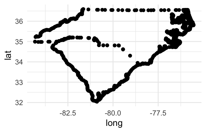
Figure 4.46: Map of Carolinas
If you try to join these points by just using a path geom rather than a points geom, however, you’ll have a problem:
us_map %>%
  filter(region %in% c("north carolina", "south carolina")) %>%
  ggplot(aes(x = long, y = lat)) +
  geom_path()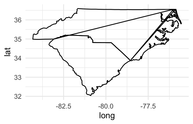
Figure 4.47: Map of Carolinas
If you create a path for all the points in the map, without separating polygons for different geographic groupings (like states or islands), the path will be drawn without picking up the pen between one state’s polygon and the next state’s polygon, resulting in unwanted connecting lines.
Mapping a group aesthetic in the ggplot object fixes this problem. This will plot a separate path or polygon for each separate polygon. In the U.S. states data, each polygon’s group is specified by the group column. No two states share a group, and some states have more than one group (if, for example, they have islands). Here is the code for mapping the group column to the group aesthetic to create the map:
us_map %>%
  filter(region %in% c("north carolina", "south carolina")) %>%
  ggplot(aes(x = long, y = lat, group = group)) +
  geom_path()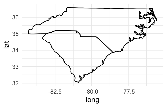
Figure 4.48: Map of Carolinas with grouping
I> You may have noticed that we used a path rather than line geom to plot the state borders in the previous maps. This is because the line geom connects points by their order on the x-axis. While you often want that for statistical graphs, for maps in ggplot2 the x-axis is longitude, and we want to connect the points in a way that outlines the geographic areas. The geom_path function connects the points in the order they appear in the dataframe, which typically gives us the desired plot for mapping geographic areas. You likely will also sometimes want to use a polygon geom for mapping geographic areas, as shown in some of the following examples.
If you would like to set the color inside each geographic area, you should use a polygon geom rather than a path geom. You can then use the fill aesthetic to set the color inside the polygon and the color aesthetic to set the color of the border. For example, to set the interior of the states to blue and the borders to black, you can run:
us_map %>%
  filter(region %in% c("north carolina", "south carolina")) %>%
  ggplot(aes(x = long, y = lat, group = group)) +
  geom_polygon(fill = "lightblue", color = "black")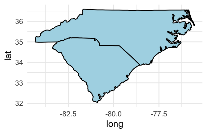
Figure 4.49: Set interior state colors
To get rid of the x- and y-axes and the background grid, you can add the “void” theme to the ggplot output:
us_map %>%
  filter(region %in% c("north carolina", "south carolina")) %>%
  ggplot(aes(x = long, y = lat, group = group)) +
  geom_polygon(fill = "lightblue", color = "black") +
  theme_void()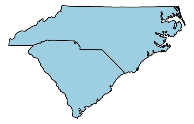
Figure 4.50: Remove background grid
To extend this code to map the full continental U.S., just remove the line of the pipe chain that filtered the state mapping data to North and South Carolina:
us_map %>%
  ggplot(aes(x = long, y = lat, group = group)) +
  geom_polygon(fill = "lightblue", color = "black") +
  theme_void()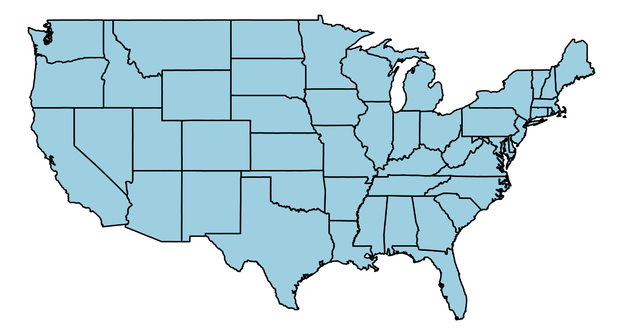
Figure 4.51: Map of entire U.S.
In the previous few graphs, we used a constant aesthetic for the fill color. However, you can map a variable to the fill to create a choropleth map with a ggplot object. For example, the votes.repub dataset in the maps package gives some voting data by state and year:
library(maps)

Attaching package: 'maps'
The following object is masked from 'package:faraway':

    ozone
data(votes.repub)
head(votes.repub)
            1856  1860  1864  1868  1872  1876  1880  1884  1888  1892  1896
Alabama       NA    NA    NA 51.44 53.19 40.02 36.98 38.44 32.28  3.95 28.13
Alaska        NA    NA    NA    NA    NA    NA    NA    NA    NA    NA    NA
Arizona       NA    NA    NA    NA    NA    NA    NA    NA    NA    NA    NA
Arkansas      NA    NA    NA 53.73 52.17 39.88 39.55 40.50 38.07 32.01 25.11
California 18.77 32.96 58.63 50.24 56.38 50.88 48.92 52.08 49.95 43.76 49.13
Colorado      NA    NA    NA    NA    NA    NA 51.28 54.39 55.31 41.13 13.84
            1900  1904  1908  1912  1916  1920  1924  1928  1932  1936  1940
Alabama    34.67 20.65 24.38  8.26 21.97 30.98 27.01 48.49 14.15 12.82 14.34
Alaska        NA    NA    NA    NA    NA    NA    NA    NA    NA    NA    NA
Arizona       NA    NA    NA 12.74 35.37 55.41 41.26 57.57 30.53 26.93 36.01
Arkansas   35.04 40.25 37.31 19.73 28.01 38.73 29.28 39.33 12.91 17.86 20.87
California 54.48 61.90 55.46  0.58 46.26 66.24 57.21 64.70 37.40 31.70 41.35
Colorado   42.04 55.27 46.88 21.88 34.75 59.32 57.02 64.72 41.43 37.09 50.92
            1944  1948  1952  1956  1960 1964 1968 1972  1976
Alabama    18.20 19.04 35.02 39.39 41.75 69.5 14.0 72.4 43.48
Alaska        NA    NA    NA    NA 50.94 34.1 45.3 58.1 62.91
Arizona    40.90 43.82 58.35 60.99 55.52 50.4 54.8 64.7 58.62
Arkansas   29.84 21.02 43.76 45.82 43.06 43.9 30.8 68.9 34.97
California 42.99 47.14 56.39 55.40 50.10 40.9 47.8 55.0 50.89
Colorado   53.21 46.52 60.27 59.49 54.63 38.7 50.5 62.6 55.89
To create a choropleth for one of the years, you can tidy the data, join it with the U.S. data by state, and then map the voting percentages to the fill aesthetic:
library(dplyr)
library(viridis)

votes.repub %>%
  tbl_df() %>%
  mutate(state = rownames(votes.repub),
         state = tolower(state)) %>%
  right_join(us_map, by = c("state" = "region")) %>%
  ggplot(aes(x = long, y = lat, group = group, fill = `1976`)) +
  geom_polygon(color = "black") +
  theme_void() +
  scale_fill_viridis(name = "Republican\nvotes (%)")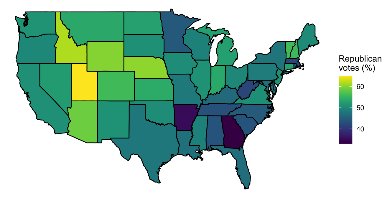
Figure 4.52: Choropleth of voting percentages
A few interesting things about this example are:
- This code uses piping and tidyverse functions to clean the data, merge it with the geographic data, and pipe to ggplot. See earlier sections of this book to find out more about tidying data.
- The
votes.repubdata initially is a matrix. Thetbl_dffunction fromdplyris used to convert it to a tibble. - The state names were originally in the row names of
votes.repub. Themutatefunction is used to move these into a column of the dataframe. The names are then converted to lowercase to allow easier merging with the geographic data. - The voting data includes Alaska and Hawaii, but the geographic data does not. Therefore, we’ve used
right_jointo join the two datasets, so only non-missing values from theus_mapgeographic data will be kept. - Because the column names for the years do not follow the rules for naming R objects (“1976” starts with a number), we’ve surrounded the column name with backticks when calling it in the aesthetic statement.
- We want the borders of the states to always be black, so we’ve set that aesthetic as a constant rather than mapping it to a variable by including it in an
aescall. - We’ve added a void theme (
theme_void) to take out axes and background, and we added a custom color scale from theviridispackage (scale_fill_viridis) to customize the colors used in the choropleth.
If you have data with point locations, you can add those points to a map created with ggplot, too, by adding a point geom. As an example, we’ll use some data related to the popular “Serial” podcast. The podcast covered a murder in Baltimore. David Robinson posted a dataset of locations related to the show on GitHub, which you can read in directly to R to use for some of the mapping examples in this subset:
library(readr)
serial <- read_csv(paste0("https://raw.githubusercontent.com/",
                          "dgrtwo/serial-ggvis/master/input_data/",
                          "serial_podcast_data/serial_map_data.csv"))
head(serial, 3)
# A tibble: 3 x 5
      x     y Type      Name  Description
  <dbl> <dbl> <chr>     <chr> <chr>
1   356   437 cell-site L688  <NA>
2   740   360 cell-site L698  <NA>
3   910   340 cell-site L654  <NA>
He figured out a way to convert the x and y coordinates in this data to latitude and longitude coordinates, and the following code cleans up the data using that algorithm. The murder occurred when cell phones were just becoming popular, and cell phone data was used in the case. The code also adds a column for whether of not the location is a cell tower.
serial <- serial %>%
    mutate(long = -76.8854 + 0.00017022 * x,
           lat  = 39.23822 + 1.371014e-04 * y,
           tower = Type == "cell-site")
serial %>%
  slice(c(1:3, (n() - 3):(n())))
# A tibble: 7 x 8
      x     y Type    Name         Description                  long   lat tower
  <dbl> <dbl> <chr>   <chr>        <chr>                       <dbl> <dbl> <lgl>
1   356   437 cell-s… L688         <NA>                        -76.8  39.3 TRUE
2   740   360 cell-s… L698         <NA>                        -76.8  39.3 TRUE
3   910   340 cell-s… L654         <NA>                        -76.7  39.3 TRUE
4   960   830 base-l… Campfield E… Hae was supposed to pick u… -76.7  39.4 FALSE
5   580  1230 base-l… Owings Mill… Hae worked at the LensCraf… -76.8  39.4 FALSE
6   720   496 base-l… Adnan's hou… <NA>                        -76.8  39.3 FALSE
7   954   410 base-l… Jenn's house <NA>                        -76.7  39.3 FALSE
We can use ggplot to map these data on a base map of Baltimore City and Baltimore County in Maryland. To do so, use the map_data function from ggplot2 to pull the “county” map. By specifying the region parameter as “maryland,” you can limit the returned geographic polygon data Maryland counties.
maryland <- map_data('county', region = 'maryland')
head(maryland)
       long      lat group order   region subregion
1 -78.64992 39.53982     1     1 maryland  allegany
2 -78.70148 39.55128     1     2 maryland  allegany
3 -78.74159 39.57420     1     3 maryland  allegany
4 -78.75878 39.58566     1     4 maryland  allegany
5 -78.74732 39.61430     1     5 maryland  allegany
6 -78.74732 39.63149     1     6 maryland  allegany
This data includes a column named subregion with the county. You can use that column to filter to just the data for Baltimore City (“baltimore city”) or Baltimore County (“baltimore”):
baltimore <- maryland %>%
  filter(subregion %in% c("baltimore city", "baltimore"))
head(baltimore, 3)
       long      lat group order   region subregion
1 -76.88521 39.35074     3   114 maryland baltimore
2 -76.89094 39.37939     3   115 maryland baltimore
3 -76.88521 39.40804     3   116 maryland baltimore
If you create a ggplot object with this data and add a polygon geom, you will have a base map of these two counties:
ggplot(baltimore, aes(x = long, y = lat, group = group)) +
  geom_polygon(fill = "lightblue", color = "black") +
  theme_void()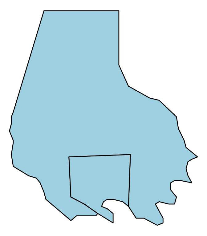
Figure 4.53: ‘Serial’ data
To add the locations from the serial data to this map, you just need to add a point geom, specifying the dataframe to use with the data parameter:
ggplot(baltimore, aes(x = long, y = lat, group = group)) +
  geom_polygon(fill = "lightblue", color = "black") +
  geom_point(data = serial, aes(group = NULL, color = tower)) +
  theme_void() +
  scale_color_manual(name = "Cell tower", values = c("black", "red"))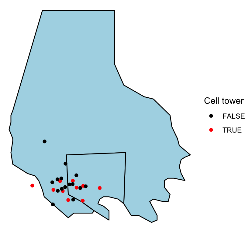
Figure 4.54: ‘Serial’ data
When you add a geom to a ggplot object with mapped aesthetics, the geom will inherit those aesthetics unless you explicitly override them with an aes call in the geom function. That is why we did not have to explicitly map longitude to x and latitude to y in the aes call when adding the points to the map (although, as a note, if the column names for the longitude and latitude columns had been different in the baltimore and serial dataframes, we would have needed to reset these aesthetics when adding the points).
Further, we mapped the group column in the geographic data to the group aesthetic, so the polygons would be plotted correctly. However, the serial dataframe does not have a column for group. Therefore, we need to unset the group aesthetic mapping in the point geom. We do that by specifying group = NULL in the aes statement of the point geom.
Note that we’ve also customized the map a bit by setting constant colors for the fill for the two counties (fill = "lightblue") and by setting the colors and legend name for the points using scale_color_manual. By mapping the color of the points to the tower column in the dataframe, we show points that are cell towers in a different color than all other points.
The ggplot function requires that you input data in a dataframe. In the examples shown in this section, we started with dataframes that included geographic locations (latitude and longitude) as columns. This is the required format of data for mapping with ggplot2 (or with extensions like ggmap). Sometimes, however, you will want to plot geographic data in R that is in a different format. In particular, most R functions that read shapefiles will read the data into a spatial object rather than a dataframe. To map this data with ggplot2 and related packages, you will need to transform the data into a dataframe. You can do this using the fortify function from ggplot2. We’ll cover this process in more detail in a later section, when we present spatial objects.
I> For a great step-by-step example of creating a beautiful map of age distribution in Switzerland with ggplot2, see this blog post by Timo Grossenbacher. This tutorial also provides a good example of customizing ggplot output using grid graphics, which we cover in a later subsection.
4.3.2 ggmap, Google Maps API
In the previous subsection, we used built-in datasets of geographic data to create the background when mapping point locations. This works well for locations for which map_data datasets exist at the appropriate aggregation level. However, there are only a few countries with data at a sub-country level available through this function. Further, you may want to use a base map that includes elements like roads or terrain.
The ggmap package allows you to do this by using tools from Google Maps directly from R. This package allows you to pull a base map from Google Maps and a few other map servers, which you can then plot and to which you can add points, polygons, lines, and other elements using ggplot2 functions. This package uses the Google Maps API, so you should read their terms of service and make sure you follow them if using this package.
You use the get_map function from this package to get base maps for different locations. To tell the function where you would like the map centered, you can either use the longitude and latitude of the center point of the map or you can use a character string to specify a location. If you do the second, get_map will use the Google Maps API to geocode the string to a latitude and longitude and then get the map (think of searching in Google Maps in the search box for a location). This will work well for most cities, and you can also use it with landmarks, but it might fail to geocode less well-known locations. You can also input an address as a character string when pulling a base map and Google will usually be able to successfully geocode and pull the right map. You can use the zoom parameter to set the amount the map is zoomed in on that location; this value should be between 3 and 20, with lower values more zoomed out and higher values more zoomed in.
NOTE: To use the get_map function and other functions in the ggmap package, you need a working Google Maps API Key. In order to create an API key, you need to
- Create a Google account (if you do not already have one)
- Goto the Google Maps Platform Console to create an API key
- Enable the Google Maps Static Map API and the Geocoding API for your account
- Copy the Google Maps API key into your
.Renvironfile and store it under the identifierGOOGLEMAPS_API_KEY.
For example, you can use the following code to pull a map of Beijing:
## install.packages("ggmap")
library(ggmap)

## Need a Google Maps API Key for this to work!
## NOTE: Registering the API key only needs to be done once.
maps_api_key <- Sys.getenv("GOOGLEMAPS_API_KEY")
register_google(key = maps_api_key)

beijing <- get_map("Beijing", zoom = 12)
I> If you find that you’re getting an error like “Error: GeomRasterAnn was built with an incompatible version of ggproto” when you try to use the ggmap package, try reinstalling the package directly from GitHub using install_github("dkahle/ggmap") (you’ll need the devtools package installed and loaded to use install_github).
The get_map function returns a ggmap object. You can plot this object using the ggmap function:
ggmap(beijing)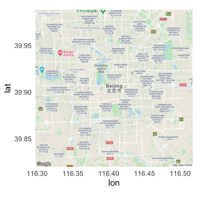
Figure 4.55: Map of Beijing
The output of ggmap is a ggplot object, so you can add elements to it in the same way you would work with any other ggplot object. For example, to set the void theme and add a title, you could run:
ggmap(beijing) +
  theme_void() +
  ggtitle("Beijing, China")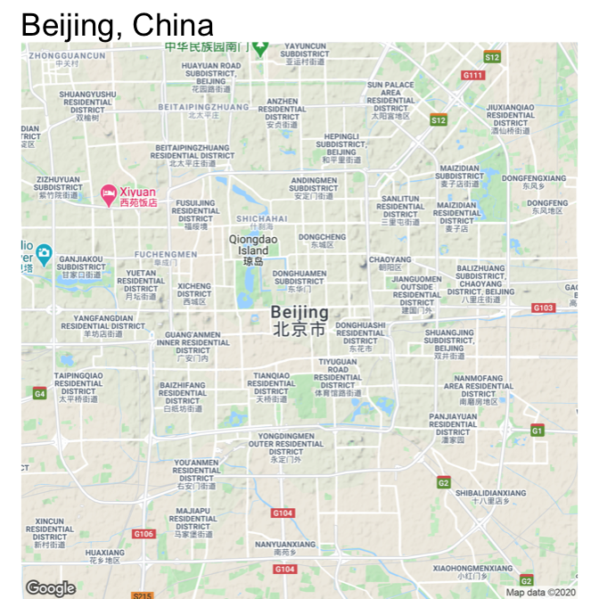
Figure 4.56: Map of Beijing
While the default source for maps with get_map is Google Maps, you can also use the function to pull maps from OpenStreetMap and Stamen Maps. Further, you can specify the type of map, which allows you to pull a variety of maps including street maps and terrain maps. You specify where to get the map using the source parameter and what type of map to use with the maptype parameter.
Here are example maps of Estes Park, in the mountains of Colorado, pulled using different map sources and map types. Also, note that we’ve used the option extent = "device" when calling ggmap, which specifies that the map should fill the whole plot area, instead of leaving room for axis labels and titles. Finally, as with any ggplot object, we can save each map to an object. We do that here so we can plot them together using the grid.arrange function, which we’ll describe in more detail in a later section in this course.
map_1 <- get_map("Estes Park", zoom = 12,
                 source = "google", maptype = "terrain") %>%
  ggmap(extent = "device")

map_2 <- get_map("Estes Park", zoom = 12,
                 source = "stamen", maptype = "watercolor") %>%
  ggmap(extent = "device")

map_3 <- get_map("Estes Park", zoom = 12,
                 source = "google", maptype = "hybrid") %>%
  ggmap(extent = "device")

library(gridExtra)
grid.arrange(map_1, map_2, map_3, nrow = 1) 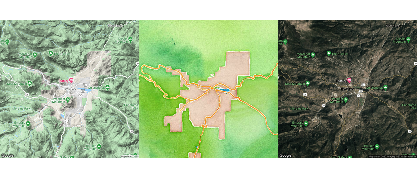
Figure 4.57: Arranging maps with gridExtra package
W> The get_map function is sending a request and getting a response from the Google API. Therefore, this function will not work if your computer is offline or if your computer is not able to access the Google API (for example, because of a firewall).
In the above examples, get_map is pulling a map based on a character string of the location (e.g., “Estes Park”). The get_map function also allows you to request a map based on latitude and longitude. For example, to get a map centered at a longitude of 2.35 degrees and a latitude of 48.86 degrees, you can run:
get_map(c(2.35, 48.86), zoom = 10) %>%
  ggmap(extent = "device")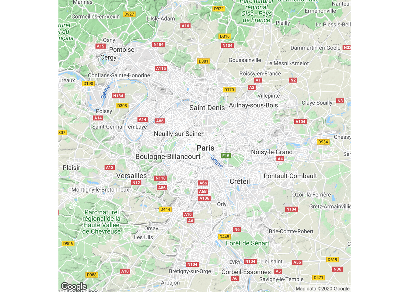
Figure 4.58: Map based on latitude and longitude
Once you have pulled one of these base maps into R, you can add ggplot elements to them, including point and polygon geoms for locations. For example, you could pull in a base map of the Baltimore County area and add the elements we plotted from the serial dataframe in the last subsection:
get_map("Baltimore County", zoom = 10,
        source = "stamen", maptype = "toner") %>%
  ggmap() +
  geom_polygon(data = baltimore, aes(x = long, y = lat, group = group),
               color = "navy", fill = "lightblue", alpha = 0.2) +
  geom_point(data = serial, aes(x = long, y = lat, color = tower)) +
  theme_void() +
  scale_color_manual(name = "Cell tower", values = c("black", "red"))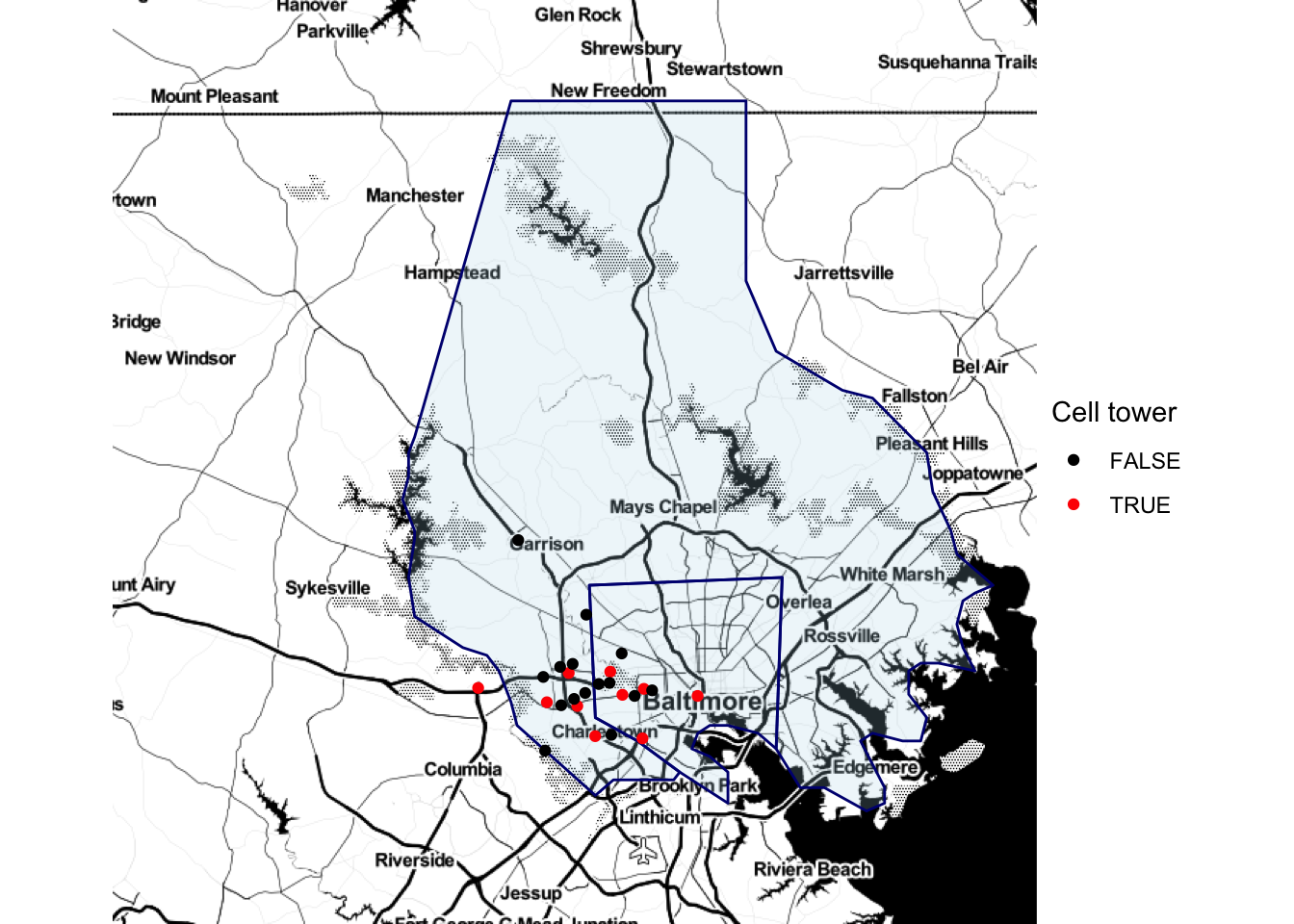
Figure 4.59: Adding ggplot elements to a map
Note that we used alpha to add some transparency to the polygons so you could see the base map through them.
Now that we’ve gone through some examples, here is a step-by-step review of how the mapping process works with ggmap:
- The
get_mapfunction pulls in a base map from the Google Maps API (or another map server like Stamen Maps). The returned value is a ggmap object. - The
ggmapfunction plots this ggmap object and returns a ggplot object. You can use this resulting ggplot object as you would any other ggplot object (e.g., add geoms, change theme). - Call other
ggplot2functions on this output to add locations and customize the map. Map longitude in the data to the x aesthetic and latitude to the y aesthetic. Note that you are adding locations using a new dataframe for the geom. Just as with regular ggplot objects, if you use a new dataframe for a geom, you must specify it with the data parameter for that geom. Because geoms do not take dataframes as their first arguments, you can’t specify the dataframe first without “data =” and rely on position with geoms. (By contrast, the ggplot function does take the data parameter as its first argument, so that’s why you can get away with not using “data =” when specifying a dataframe in the original ggplot call for a regular ggplot object.)
You can use the ggmap package to do a number of other interesting tasks related to geographic data. For example, the package allows you to use the Google Maps API, through the geocode function, to get the latitude and longitude of specific locations based on character strings of the location or its address. For example, you can get the location of the Supreme Court of the United States by calling:
geocode("Supreme Court of the United States")
# A tibble: 1 x 2
    lon   lat
  <dbl> <dbl>
1 -77.0  38.9
You could also get its location by calling its address:
geocode("1 First St NE, Washington, DC")
# A tibble: 1 x 2
    lon   lat
  <dbl> <dbl>
1 -77.0  38.9
You can compute map distances, too, using the mapdist function with two locations:
NOTE: In order to run the code below you need to enable the Google Maps Distance Matrix API for your account.
mapdist("Baltimore, MD",
        "Washington, DC") %>%
  select(from, to, miles)
# A tibble: 1 x 3
  from          to             miles
  <chr>         <chr>          <dbl>
1 Baltimore, MD Washington, DC  40.2
To find out more about how Google Maps is performing this and other tasks, you can read its API documentation.
I> For these GIS-style tasks, the ggmap package is not running its own algorithms but rather using the Google Maps API. This package cannot do other GIS tasks, like finding the centroids or areas of spatial polygons. To use R as a GIS for more substantive tasks, you’ll need to use other R packages, like sp and rgdal.
4.3.3 Mapping US counties and states
If you need to map US states and counties, the choroplethr and choroplethrMaps packages offer functions for fast and straightforward mapping. This package also offers an interesting example of incorporating mapping functions within an R package. You can explore the code for the package, as well as some documentation, at the choroplethr package’s GitHub page: https://github.com/trulia/choroplethr.
I> This subsection is included to illustrate an interesting mapping package that may prove useful to readers mapping US-based data. The package itself is also an interesting example of a package built to facilitate mapping. However, the details of this subsection are not necessary to master to understand the rest of the material on mapping, so you can skip this section if the applications do not appear relevant to your work.
As an example, we’ll use data on county-level population in 2012 that comes as the dataset df_pop_county with the choroplethr package. This dataset gives the population of each county (value) and the county FIPS number (region), which is a unique identification number for each US county.
library(choroplethr)
library(choroplethrMaps)
data(df_pop_county)
df_pop_county %>% slice(1:3)
  region  value
1   1001  54590
2   1003 183226
3   1005  27469
As long as you are using a dataframe with a numeric column named region with each county’s FIPS code and a column named value with the value you’d like to map (population in this case), you can create a choropleth just by running the county_choropleth function on the dataframe.
county_choropleth(df_pop_county)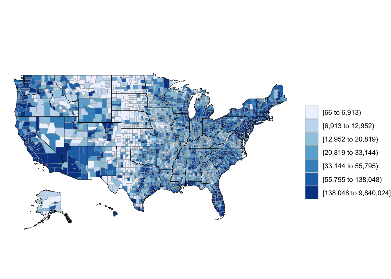
Figure 4.60: Population choropleth map of U.S.
If you want to only plot some of states, you can use the state_zoom argument:
county_choropleth(df_pop_county, state_zoom = c("colorado", "wyoming"))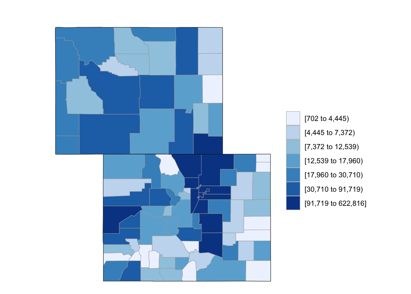
Figure 4.61: Subset some U.S. states
To plot values over a reference map from Google Maps, you can use the reference_map argument:
county_choropleth(df_pop_county, state_zoom = c("north carolina"),
                  reference_map = TRUE)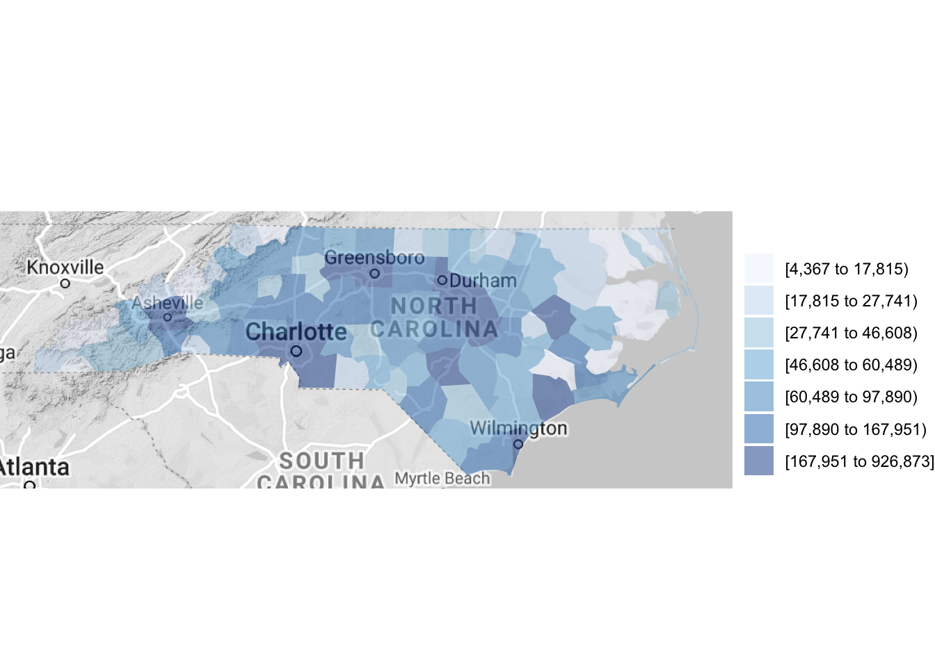
Figure 4.62: Using a reference map
This example is using one of the datasets that comes with the choroplethr package, but you can map any dataset that includes a column with county FIPS and a column with the value you would like to plot. All you have to do is (1) make sure the county FIPS is in a numeric class and (2) name the columns for FIPS and the value to plot as “region” and “value,” respectively (the rename function from dplyr is useful here). For example, here is a dataframe giving storm events that were listed in NOAA’s Storm Events database near Hurricane Floyd’s track:
library(readr)
floyd_events <- read_csv("data/floyd_events.csv")
floyd_events %>% slice(1:3)
# A tibble: 3 x 4
  begin_date end_date   fips  type
  <date>     <date>     <chr> <chr>
1 1999-09-16 1999-09-17 25011 Heavy Rain
2 1999-09-16 1999-09-17 25001 Heavy Rain
3 1999-09-16 1999-09-17 25015 Heavy Rain
You can use the following code to plot the number of events listed for each US county by cleaning and summarizing the data in a pipe chain and then piping the output to the county_choropleth function. The choropleth mapping functions require that each county is included only once, so we used group_by and summarize to collapse the dataframe to have only a single observation for each county.
floyd_events %>%
  group_by(fips) %>%
  dplyr::summarize(n_events = n()) %>%
  mutate(fips = as.numeric(fips)) %>%
  dplyr::rename(region = fips,
         value = n_events) %>%
  county_choropleth(state_zoom = c("north carolina", "virginia"),
                    reference_map = TRUE)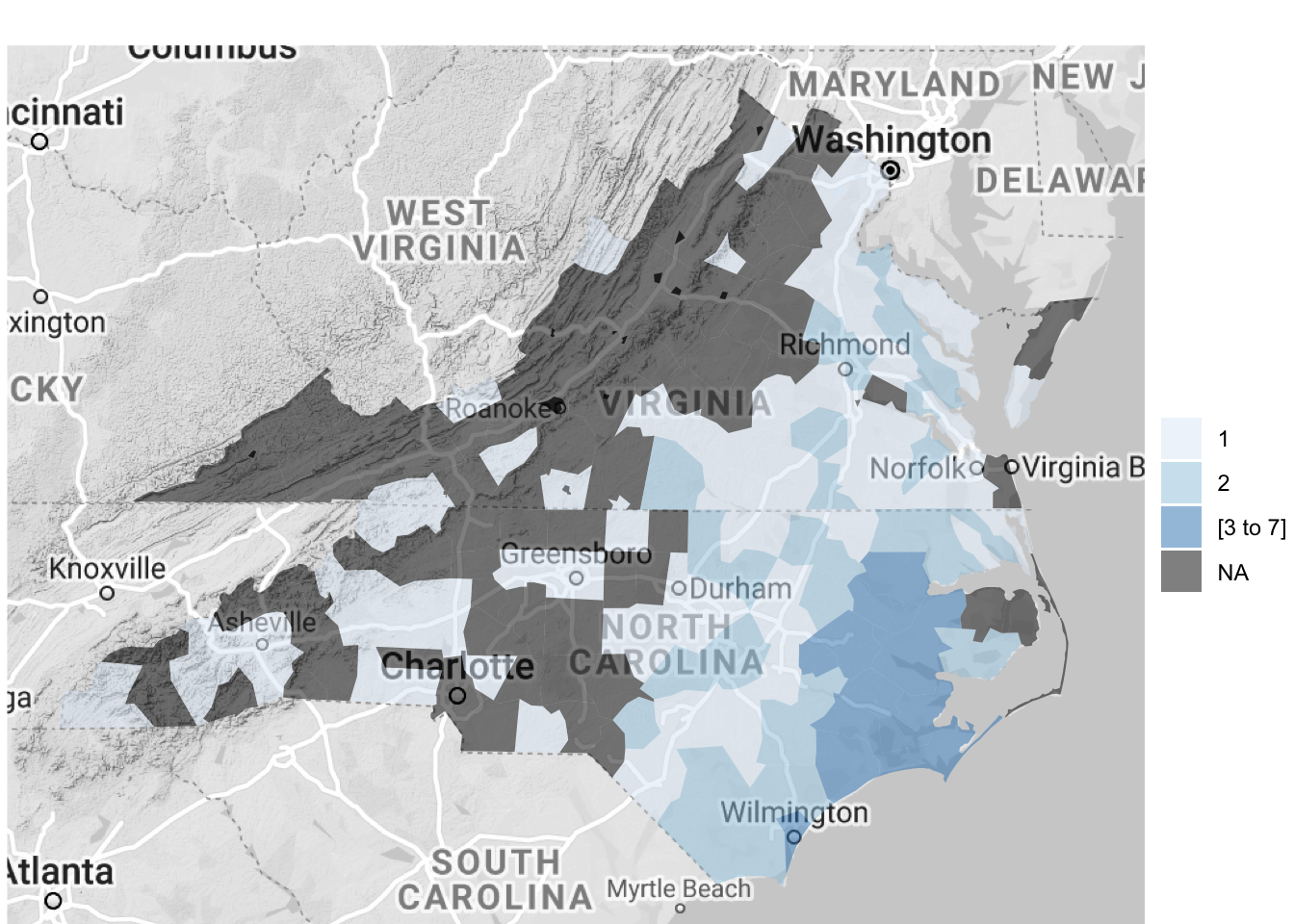
Figure 4.63: Hurricane Floyd data
The map created by county_choropleth (and the other maps created by functions in the choroplethr package) is a ggplot object, so you can add elements to it. For example, to create a map of flood events that includes the track of Hurricane Floyd on the map, you can run:
floyd_track <- read_csv("data/floyd_track.csv")

floyd_events %>%
  dplyr::group_by(fips) %>%
  dplyr::summarize(flood = sum(grepl("Flood", type))) %>%
  dplyr::mutate(fips = as.numeric(fips)) %>%
  dplyr::rename(region = fips,
                value = flood) %>%
  county_choropleth(state_zoom = c("north carolina", "maryland",
                                   "delaware", "new jersey",
                                   "virginia", "south carolina",
                                   "pennsylvania", "new york",
                                   "connecticut", "massachusetts",
                                   "new hampshire", "vermont",
                                   "maine", "rhode island"),
                    reference_map = TRUE) +
  geom_path(data = floyd_track, aes(x = -longitude, y = latitude,
                                    group = NA),
            color = "red")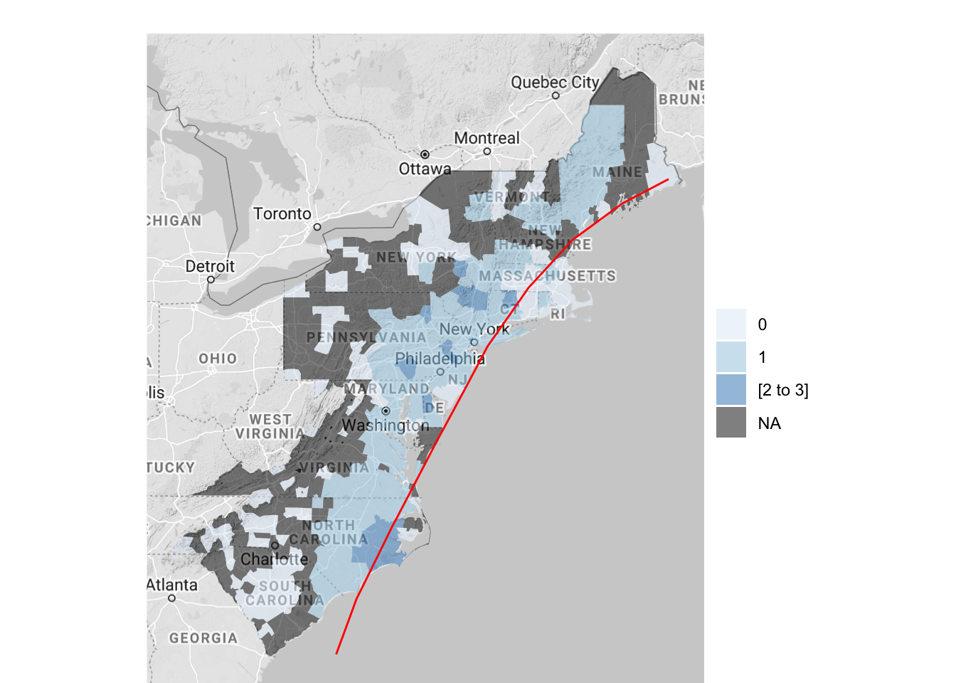
Figure 4.64: Hurricane Floyd data with hurricane track
To create county choropleths with the choroplethr package that are more customized, you can use the package’s CountyChoropleth, which is an R6 object for creating custom county choropleths. To create an object, you can run CountyChoropleth$new with the data you’d like to map. As with county_choropleth, this data should have a column named “region” with county FIPS codes in a numeric class and a column named “values” with the values to plot. To map counties in which a flood event was reported around the time of Floyd, you can start by cleaning your data and then creating an object using CountyChoropleth$new:
floyd_floods <- floyd_events %>%
  filter(grepl("Flood", type)) %>%
  mutate(fips = as.numeric(fips)) %>%
  group_by(fips) %>%
  dplyr::summarize(value = 1) %>%
  ungroup() %>%
  dplyr::rename(region = fips)
`summarise()` ungrouping output (override with `.groups` argument)

floyd_map <- CountyChoropleth$new(floyd_floods)
As a note, in cleaning the data here, we wanted to limit the dataset to only observations where the event type included the word “Flood” (this will pull events listed as “Flood” or “Flash Flood”), so we’ve used the grepl function to filter to just those observations.
Once you have created a basic object using CountyChoropleth, you can use the methods for this type of object to customize the map substantially. For example, you can set the states using the set_zoom method:
floyd_map$set_zoom(c("north carolina", "maryland",
                     "delaware", "new jersey",
                     "virginia", "south carolina",
                     "pennsylvania", "new york",
                     "connecticut", "massachusetts",
                     "new hampshire", "vermont",
                     "maine", "rhode island"))
At any point, you can render the object using the render method (or render_with_reference_map, to plot the map with the Google reference map added):
floyd_map$render()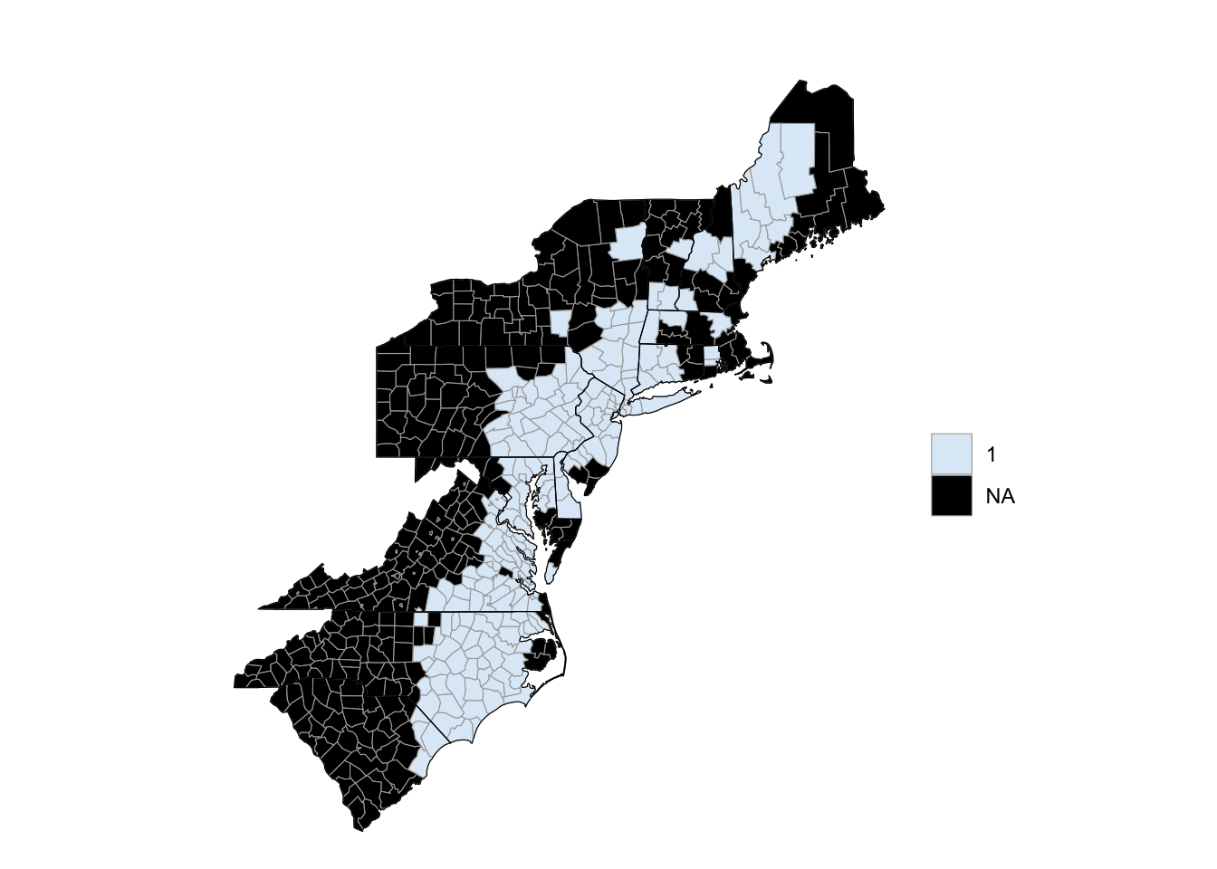
Figure 4.65: Hurricane Floyd flooding
To find out what options are available for this object type, in terms of methods you can use or attributes you can change, you can run:
names(floyd_map)
 [1] ".__enclos_env__"           "add_state_outline"
 [3] "ggplot_sf"                 "projection_sf"
 [5] "ggplot_polygon"            "projection"
 [7] "ggplot_scale"              "warn"
 [9] "legend"                    "title"
[11] "choropleth.df"             "map.df"
[13] "user.df"                   "clone"
[15] "clip"                      "initialize"
[17] "set_zoom"                  "render_state_outline"
[19] "render_helper"             "render"
[21] "set_num_colors"            "get_zoom"
[23] "format_levels"             "theme_inset"
[25] "theme_clean"               "get_scale"
[27] "prepare_map"               "bind"
[29] "discretize"                "render_with_reference_map"
[31] "get_choropleth_as_polygon" "get_reference_map"
[33] "get_y_scale"               "get_x_scale"
[35] "get_bounding_box"          "get_max_lat"
[37] "get_min_lat"               "get_max_long"
[39] "get_min_long"
The following code shows an example of customizing this county choropleth map:
floyd_map$add_state_outline <- TRUE
floyd_map$ggplot_scale <- scale_fill_manual(values = c("yellow"),
                                            guide = FALSE)
floyd_xlim <- floyd_map$get_bounding_box()[c(1, 3)]
floyd_ylim <- floyd_map$get_bounding_box()[c(2, 4)]

a <- floyd_map$render() +
  geom_path(data = floyd_track, aes(x = -longitude, y = latitude,
                                    group = NA),
            color = "red", size = 2, alpha = 0.6) +
            xlim(floyd_map$get_bounding_box()[c(1, 3)]) +
            ylim(floyd_map$get_bounding_box()[c(2, 4)])

b <- floyd_map$render_with_reference_map() +
  geom_path(data = floyd_track, aes(x = -longitude, y = latitude,
                                    group = NA),
            color = "red", size = 2, alpha = 0.6) +
            xlim(floyd_xlim) +
            ylim(floyd_ylim)

library(gridExtra)
grid.arrange(a, b, ncol = 2)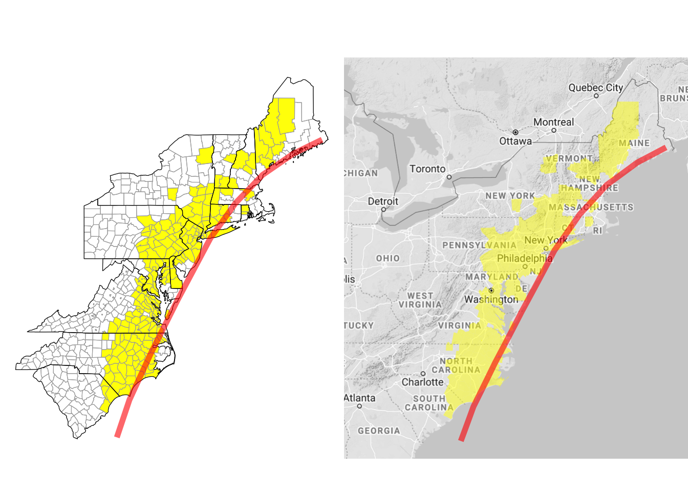
Figure 4.66: Customizing county choropleth
Here, we’ve used $add_state_outline to change the object to include state outlines (this only shows up when you render the map without a background reference map). We’ve also used $ggplot_scale to customize the colors used for plotting counties with flood events and to remove the map legend. The get_bounding_box method pulls the range of latitudes and longitudes for the current map. We’re planning to add the hurricane track to the map, and the hurricane track extends well beyond this range. To later limit the map to these states, we’re using this get_bounding_box method to get these boundaries, and then we’ve used those values for the xlim and ylim functions when we create the final ggplot objects. Finally, the rendered maps are ggplot objects, so to include the hurricane track, we can add ggplot elements to the map using +, as with any ggplot object. We used the grid.arrange function from the gridExtra package to put the two maps (with and without the background Google map) side-by-side.
4.3.4 More advanced mapping – Spatial objects
So far, we have relied on ggplot and related packages for mapping. However, there are other systems for mapping in R. In particular, geographic data in R is often stored in spatial objects (e.g., SpatialPolygons, SpatialPointsDataframe), particularly when it is read in from the shapefiles commonly used to store spatial data outside of R.
In this subsection we will introduce these spatial objects, show how to work with them in R (including how to convert them to dataframes so they can be used with the ggplot-based mapping covered in earlier subsections), and briefly describe shapefiles.
4.3.4.1 Spatial objects in R
R has a series of special object types for spatial data. For many mapping / GIS tasks, you will need your data to be in one of these objects. These spatial objects include objects that just contain geographies (e.g., locations along the borders of countries) or objects that contain geographies and associated attributes of each element of the geography (e.g., county boundaries as well as the population of each country). The most common spatial objects in R are:
SpatialPolygonsSpatialPointsSpatialLinesSpatialPolygonsDataFrameSpatialPointsDataFrameSpatialLinesDataFrame
The tigris package lets you pull spatial data directly from the US Census. This data comes into R as a spatial object. To provide a basic overview of working with spatial object in R, we will use an example spatial object pulled with this package.
I> The tigris package offers a very convenient way to pull a variety of geographic data for the United States. To find out more, check out the article “tigris: An R Package to Access and Work with Geographic Data from the US Census Bureau” in The R Journal.
The tigris package includes a function called tracts that allows you to pull the geographic data on boundaries of U.S. Census tracts. You can use the state and county parameters to limit the result to certain counties, and you can set cb = FALSE if a lower-resolution (and smaller) file is adequate. To pull census tract boundaries for Denver, CO, you can run:
library(tigris)
library(sp)
denver_tracts <- tracts(state = "CO", county = 31, cb = TRUE,
                        class = "sp")

  |
  |                                                                      |   0%
  |
  |=                                                                     |   2%
  |
  |==                                                                    |   3%
  |
  |====                                                                  |   5%
  |
  |====                                                                  |   6%
  |
  |======                                                                |   8%
  |
  |=======                                                               |  10%
  |
  |=======                                                               |  11%
  |
  |=========                                                             |  12%
  |
  |=========                                                             |  13%
  |
  |==========                                                            |  15%
  |
  |===========                                                           |  16%
  |
  |============                                                          |  17%
  |
  |=============                                                         |  19%
  |
  |==============                                                        |  20%
  |
  |===============                                                       |  21%
  |
  |================                                                      |  23%
  |
  |=================                                                     |  24%
  |
  |==================                                                    |  25%
  |
  |==================                                                    |  26%
  |
  |====================                                                  |  28%
  |
  |=====================                                                 |  30%
  |
  |======================                                                |  32%
  |
  |=======================                                               |  33%
  |
  |========================                                              |  34%
  |
  |=========================                                             |  36%
  |
  |==========================                                            |  37%
  |
  |===========================                                           |  39%
  |
  |============================                                          |  39%
  |
  |=============================                                         |  41%
  |
  |==============================                                        |  43%
  |
  |===============================                                       |  44%
  |
  |================================                                      |  45%
  |
  |================================                                      |  46%
  |
  |=================================                                     |  48%
  |
  |===================================                                   |  49%
  |
  |===================================                                   |  50%
  |
  |====================================                                  |  52%
  |
  |=====================================                                 |  53%
  |
  |======================================                                |  54%
  |
  |=======================================                               |  56%
  |
  |========================================                              |  57%
  |
  |=========================================                             |  58%
  |
  |=========================================                             |  59%
  |
  |===========================================                           |  61%
  |
  |============================================                          |  63%
  |
  |==============================================                        |  65%
  |
  |==============================================                        |  66%
  |
  |===============================================                       |  68%
  |
  |================================================                      |  69%
  |
  |=================================================                     |  70%
  |
  |==================================================                    |  72%
  |
  |===================================================                   |  73%
  |
  |====================================================                  |  74%
  |
  |=====================================================                 |  76%
  |
  |======================================================                |  77%
  |
  |=======================================================               |  78%
  |
  |=======================================================               |  79%
  |
  |=========================================================             |  81%
  |
  |==========================================================            |  82%
  |
  |==========================================================            |  83%
  |
  |===========================================================           |  85%
  |
  |============================================================          |  86%
  |
  |=============================================================         |  87%
  |
  |==============================================================        |  89%
  |
  |===============================================================       |  90%
  |
  |================================================================      |  92%
  |
  |=================================================================     |  92%
  |
  |==================================================================    |  94%
  |
  |===================================================================   |  96%
  |
  |====================================================================  |  96%
  |
  |===================================================================== |  98%
  |
  |===================================================================== |  99%
  |
  |======================================================================| 100%
By running class on the returned object, you can see that this function has returned a SpatialPolygonsDataFrame object.
class(denver_tracts)
[1] "SpatialPolygonsDataFrame"
attr(,"package")
[1] "sp"
Spatial objects like this have a plot methods that can be called to plot the object. This means that you can map these census tract boundaries by calling:
plot(denver_tracts)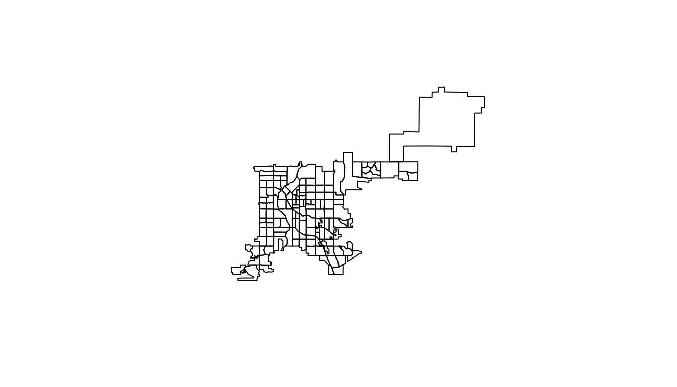
Figure 4.67: Plot of Denver Census tracts
There number of other methods for this specific object type. For example, bbox will print out the bounding box of the spatial object (range of latitudes and longitudes covered by the data).
bbox(denver_tracts)
         min        max
x -105.10990 -104.60030
y   39.61443   39.91425
The is.projected and proj4string functions give you some information about the current Coordinate Reference System of the data (we describe more about Coordinate Reference Systems later in this subsection).
is.projected(denver_tracts)
[1] FALSE
proj4string(denver_tracts)
Warning in proj4string(denver_tracts): CRS object has comment, which is lost in
output
[1] "+proj=longlat +datum=NAD83 +no_defs"
If a spatial object includes attribute data (i.e., is an object type *DataFrame), you can access a “slot” in the spatial object to pull out an attribute dataframe using @. For example, here’s the beginning of the dataframe for the denver_tracts spatial object:
head(denver_tracts@data)
   STATEFP COUNTYFP TRACTCE             AFFGEOID       GEOID  NAME LSAD   ALAND
5       08      031  004103 1400000US08031004103 08031004103 41.03   CT 1899572
6       08      031  004201 1400000US08031004201 08031004201 42.01   CT 1904504
8       08      031  004002 1400000US08031004002 08031004002 40.02   CT 2387896
14      08      031  002703 1400000US08031002703 08031002703 27.03   CT  522372
25      08      031  004503 1400000US08031004503 08031004503 45.03   CT 1017839
39      08      031  015400 1400000US08031015400 08031015400   154   CT 2666535
   AWATER
5       0
6       0
8   51146
14      0
25      0
39      0
For this spatial object, the data includes identifying information (state, county, tract), but also some attribute data (area of the tract that is land, area of the tract that is water).
You can add different layers of spatial objects onto the same plot. To do that, just use add = TRUE for added layers. For example, to add primary roads to the Denver census tract map, you can pull a spatial object with roads using the primary_roads function from the tigris package (note: this data includes roads across the U.S. and so might take a few seconds to download or render) and then use plot with add = TRUE to add the roads to the map:
roads <- primary_roads()
|
| | 0%
|
| | 1%
|
|= | 1%
|
|= | 2%
|
|== | 2%
|
|== | 3%
|
|== | 4%
|
|=== | 4%
|
|=== | 5%
|
|==== | 5%
|
|==== | 6%
|
|===== | 6%
|
|===== | 7%
|
|===== | 8%
|
|====== | 8%
|
|====== | 9%
|
|======= | 9%
|
|======= | 10%
|
|======= | 11%
|
|======== | 11%
|
|======== | 12%
|
|========= | 12%
|
|========= | 13%
|
|========= | 14%
|
|========== | 14%
|
|========== | 15%
|
|=========== | 15%
|
|=========== | 16%
|
|============ | 16%
|
|============ | 17%
|
|============ | 18%
|
|============= | 18%
|
|============= | 19%
|
|============== | 19%
|
|============== | 20%
|
|============== | 21%
|
|=============== | 21%
|
|=============== | 22%
|
|================ | 22%
|
|================ | 23%
|
|================ | 24%
|
|================= | 24%
|
|================= | 25%
|
|================== | 25%
|
|================== | 26%
|
|=================== | 26%
|
|=================== | 27%
|
|=================== | 28%
|
|==================== | 28%
|
|==================== | 29%
|
|===================== | 29%
|
|===================== | 30%
|
|===================== | 31%
|
|====================== | 31%
|
|====================== | 32%
|
|======================= | 32%
|
|======================= | 33%
|
|======================= | 34%
|
|======================== | 34%
|
|======================== | 35%
|
|========================= | 35%
|
|========================= | 36%
|
|========================== | 36%
|
|========================== | 37%
|
|========================== | 38%
|
|=========================== | 38%
|
|=========================== | 39%
|
|============================ | 39%
|
|============================ | 40%
|
|============================ | 41%
|
|============================= | 41%
|
|============================= | 42%
|
|============================== | 42%
|
|============================== | 43%
|
|============================== | 44%
|
|=============================== | 44%
|
|=============================== | 45%
|
|================================ | 45%
|
|================================ | 46%
|
|================================= | 46%
|
|================================= | 47%
|
|================================= | 48%
|
|================================== | 48%
|
|================================== | 49%
|
|=================================== | 49%
|
|=================================== | 50%
|
|=================================== | 51%
|
|==================================== | 51%
|
|==================================== | 52%
|
|===================================== | 52%
|
|===================================== | 53%
|
|===================================== | 54%
|
|====================================== | 54%
|
|====================================== | 55%
|
|======================================= | 55%
|
|======================================= | 56%
|
|======================================== | 56%
|
|======================================== | 57%
|
|======================================== | 58%
|
|========================================= | 58%
|
|========================================= | 59%
|
|========================================== | 59%
|
|========================================== | 60%
|
|========================================== | 61%
|
|=========================================== | 61%
|
|=========================================== | 62%
|
|============================================ | 62%
|
|============================================ | 63%
|
|============================================ | 64%
|
|============================================= | 64%
|
|============================================= | 65%
|
|============================================== | 65%
|
|============================================== | 66%
|
|=============================================== | 66%
|
|=============================================== | 67%
|
|=============================================== | 68%
|
|================================================ | 68%
|
|================================================ | 69%
|
|================================================= | 69%
|
|================================================= | 70%
|
|================================================= | 71%
|
|================================================== | 71%
|
|================================================== | 72%
|
|=================================================== | 72%
|
|=================================================== | 73%
|
|=================================================== | 74%
|
|==================================================== | 74%
|
|==================================================== | 75%
|
|===================================================== | 75%
|
|===================================================== | 76%
|
|====================================================== | 76%
|
|====================================================== | 77%
|
|====================================================== | 78%
|
|======================================================= | 78%
|
|======================================================= | 79%
|
|======================================================== | 79%
|
|======================================================== | 80%
|
|======================================================== | 81%
|
|========================================================= | 81%
|
|========================================================= | 82%
|
|========================================================== | 82%
|
|========================================================== | 83%
|
|========================================================== | 84%
|
|=========================================================== | 84%
|
|=========================================================== | 85%
|
|============================================================ | 85%
|
|============================================================ | 86%
|
|============================================================= | 86%
|
|============================================================= | 87%
|
|============================================================= | 88%
|
|============================================================== | 88%
|
|============================================================== | 89%
|
|=============================================================== | 89%
|
|=============================================================== | 90%
|
|=============================================================== | 91%
|
|================================================================ | 91%
|
|================================================================ | 92%
|
|================================================================= | 92%
|
|================================================================= | 93%
|
|================================================================= | 94%
|
|================================================================== | 94%
|
|================================================================== | 95%
|
|=================================================================== | 95%
|
|=================================================================== | 96%
|
|==================================================================== | 96%
|
|==================================================================== | 97%
|
|==================================================================== | 98%
|
|===================================================================== | 98%
|
|===================================================================== | 99%
|
|======================================================================| 99%
|
|======================================================================| 100%
plot(denver_tracts, col = "lightblue")
plot(roads, add = TRUE, col = "darkred")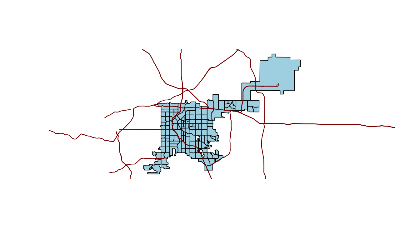
Figure 4.68: Denver tracts with roads
Geographic data outside of R is often stored in shapefiles. If you read in a shapefile from a file (more details on shapefiles later in this section), it will automatically be read in as one of these shape objects. However, you can also convert other data into shape objects. For example, you could convert the dataframes with spatial data on U.S. state boundaries that we used earlier in this book into spatial objects. Functions from sp package (e.g., SpatialPoints, SpatialPointsDataFrame) can be used to convert data stored in dataframes into spatial objects.
There likely will also be cases when you have a spatial object but would like to plot it using ggplot-type mapping. In this case, you need to convert the spatial object to a dataframe, since ggplot will only input dataframes. You can use the fortify function from ggplot2 to do this. For example, to convert the Denver census tracts spatial object to a dataframe, you could call:
denver_tracts_df <- fortify(denver_tracts)
denver_tracts_df %>%
  dplyr::select(1:4) %>% dplyr::slice(1:5)
       long      lat order  hole
1 -104.9405 39.75466     1 FALSE
2 -104.9405 39.75829     2 FALSE
3 -104.9405 39.76196     3 FALSE
4 -104.9319 39.76200     4 FALSE
5 -104.9223 39.76201     5 FALSE
Now you can use the data in to create a map using ggplot2 functions:
denver_tracts_df %>%
  ggplot(aes(x = long, y = lat, group = group)) +
  geom_polygon(fill = "lightblue", color = "black") +
  theme_void()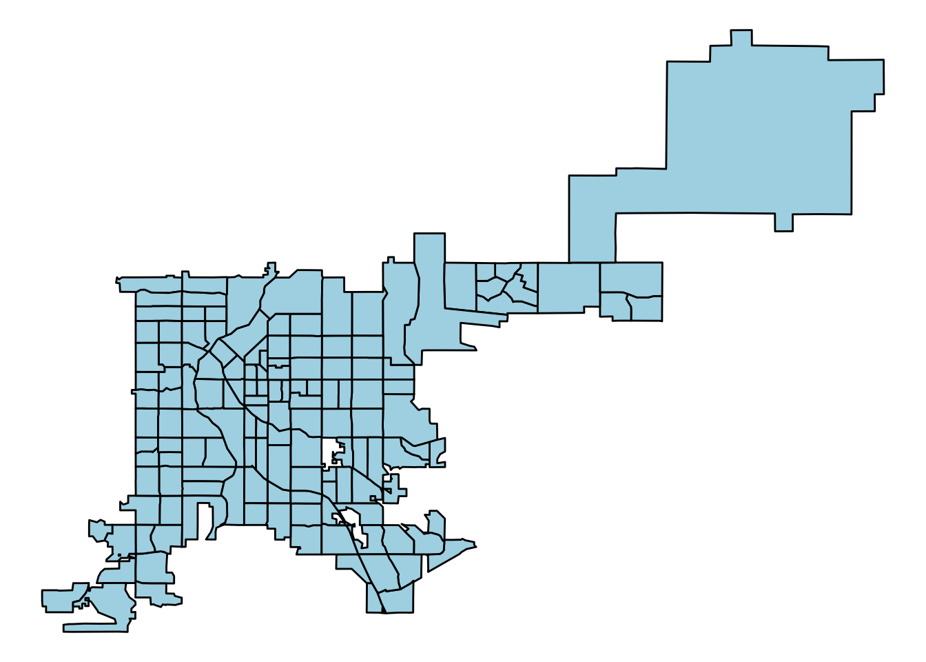
Figure 4.69: Creating a map with ggplot2 functions
4.3.4.2 Coordinate reference systems
Spatial objects will have a Coordinate Reference Systems (CRSs), which specifies how points on a curved earth are laid out on a two-dimensional map. A CRS can be geographic (e.g., WGS84, for longitude-latitude data) or projected (e.g., UTM, NADS83). The full details of map projections is beyond the scope of this course, but if you’d like to find out more details, this section of the documentation for QGIS is very helpful. For working with spatial objects in R, it is important to realize that spatial objects have a Coordinate Reference System attribute and that you can run into problems if you try to work directly with two spatial objects with different Coordinate Reference Systems.
To find out the CRS for a spatial object (like a SpatialPoints object) that already has a CRS, you can use proj4string. For example, to get the CRS of the Denver census tract data, you can run:
proj4string(denver_tracts)
Warning in proj4string(denver_tracts): CRS object has comment, which is lost in
output
[1] "+proj=longlat +datum=NAD83 +no_defs"
If you create a spatial object from a dataframe in R, rather than reading it in from a shapefile, you will need to specify the data’s Coordinate Reference System. You can use proj4string to set this attribute by calling it on the left of the assignment arrow:
## Generic code
proj4string(my_spatial_object) <- "+proj=longlat +datum=NAD83"
Note that this call does not create a projection or reproject the data. Rather, this call is specify to R the CRS the data currently is in.
The CRS function from the sp package creates CRS class objects that can be used in this specification. You input projection arguments into this function as a character string (for example, CRS("+proj=longlat +datum=NAD27")). You can also, however, use a shorter EPSG code for a projection (for example, CRS("+init=epsg:28992")). The http://www.spatialreference.org website lists these projection strings and can be useful in determining a string to use when setting projection information or re-projecting data.
library(sp)
CRS("+proj=longlat +datum=NAD27")
CRS arguments: +proj=longlat +datum=NAD27 +no_defs
CRS("+init=epsg:28992")
Warning in showSRID(uprojargs, format = "PROJ", multiline = "NO", prefer_proj =
prefer_proj): Discarded datum Amersfoort in CRS definition
CRS arguments:
 +proj=sterea +lat_0=52.1561605555556 +lon_0=5.38763888888889
+k=0.9999079 +x_0=155000 +y_0=463000 +ellps=bessel +units=m +no_defs
If a spatial object has a CRS and you want to change it, you should do so using the spTransform function from the rgdal package. You input the spatial object whose CRS you want to change as well as the CRS object to which to change it:
## Generic code
my_spatial_object <- spTransform(my_spatial_object,
                                 CRS = CRS("+init=epsg:4267"))
If you want to ensure that the CRS of two spatial objects agree, you can use proj4string to pull the CRS from one of the spatial objects and specify that as the output CRS for an spTransform call on the other object, like:
## Generic code
my_spatial_object <- spTransform(my_spatial_object,
                                 CRS = proj4string(another_sp_object))
If you are interested in finding out more, Melanie Frazier has created an excellent resource on Coordinate Reference Systems and maps in R: https://www.nceas.ucsb.edu/~frazier/RSpatialGuides/OverviewCoordinateReferenceSystems.pdf
The coord_map function in ggplot2 can help you in plotting maps with different projections. This function does not change any aspect of the data being mapped, but rather changes the projection when mapping the data. In fact, since this function is used with ggplot-style mapping, all data being mapped will be in dataframes rather than spatial objects and so will not have specifications for CRS. The following examples, which are adapted from the help file for the coord_map function, show example output when the coord_map element is added to a map of the United States:
usamap <- map_data("state") %>%
  ggplot(aes(long, lat, group = group)) +
  geom_polygon(fill = "white", colour = "black")

map_1 <- usamap + coord_map() + ggtitle("default")
map_2 <- usamap + coord_map("gilbert") + ggtitle("+ coord_map('gilbert')")
map_3 <- usamap + coord_map("conic", lat0 = 30) +
  ggtitle("+ coord_map('conic', lat0 = 30)")

grid.arrange(map_1, map_2, map_3, ncol = 1)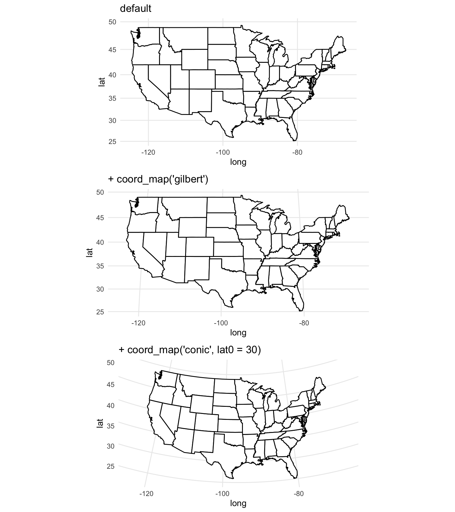
Figure 4.70: Maps with different projections
4.3.4.3 Shapefiles
Shapefiles are a file format that is often used for saving and sharing geographic data, particularly when using GIS software. This format is not R-specific, but R can read in and write out shapefiles. The format is typically not a single file, but rather a directory of related files in a directory. Shapefiles often include both geographic information and also data describing attributes (for example, a shapefile might include the locations of country borders as well as the population of each of the countries).
To read shapefiles into R, use the readOGR function from the rgdal package. You can also write out spatial objects you’ve created or modified in R to shapefiles using the writeOGR from the same package. The readShape* family of functions from the maptools package can also be used to read shapefiles into R. These functions all read the spatial data in as a spatial object. For example, the shapefiles of country borders and populations would be read in as a SpatialPolygonsDataFrame object. Once you read a shapefile into R, you can work with the spatial object in the same way we showed how to work with the Denver census tracts spatial object earlier in this subsection.
I> To find out more about shapefiles, R, and ggplot2, check out the wiki listing at https://github.com/tidyverse/ggplot2/wiki/plotting-polygon-shapefiles.
4.3.4.4 R as GIS
In addition to mapping, you can also use R for a number of GIS-style tasks, including:
- Clipping
- Creating buffers
- Measuring areas of polygons
- Counting points in polygons
These tasks can be done with GIS software, and if you are doing extensive GIS work, it may be worthwhile to use specialized software. However, if you just need to do a few GIS tasks as part of a larger workflow, you should consider using R for these steps. Some advantages to using R for GIS tasks are:
- R is free
- You can write all code in a script, so research is more reproducible
- You save time and effort by staying in one software system, rather than moving data between different software
To show some of the GIS-style tasks that can be done from R, we’ll use some driver-level data from the Fatality Analysis Reporting System (FARS) for 2001–2010, which we have saved as fars_colorado.RData:
load("data/fars_colorado.RData")
driver_data %>%
  dplyr::select(1:5) %>% dplyr::slice(1:5)
  state st_case county                date latitude
1     8   80001     51 2001-01-01 10:00:00 39.10972
2     8   80002     31 2001-01-04 19:00:00 39.68215
3     8   80003     31 2001-01-03 07:00:00 39.63500
4     8   80004     31 2001-01-05 20:00:00 39.71304
5     8   80005     29 2001-01-05 10:00:00 39.09733
This data is currently in a dataframe, which means we can map it using ggplot2:
map_data("county", region = "Colorado") %>%
  ggplot(aes(x = long, y = lat, group = subregion)) +
  geom_polygon(color = "gray", fill = NA) +
  theme_void() +
  geom_point(data = driver_data,
             aes(x = longitud, y = latitude, group = NULL),
alpha = 0.5, size = 0.7) 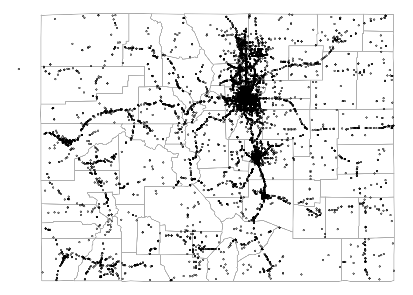
Figure 4.71: FARS data for Colorado
The dataset includes a column for the county in which each accident occurred, so you can also aggregate the data by county and use a function from the choroplethr package to quickly create a county-specific choropleth of accident counts (note that, because the data is driver specific, this will count every car in an accident):
library(stringr)
county_accidents <- driver_data %>%
  dplyr::mutate(county = str_pad(county, width = 3,
                          side = "left", pad = "0")) %>%
  tidyr::unite(region, state, county, sep = "") %>%
  dplyr::group_by(region) %>%
  dplyr::summarize(value = n()) %>%
  dplyr::mutate(region = as.numeric(region))
`summarise()` ungrouping output (override with `.groups` argument)
county_accidents %>% slice(1:4)
# A tibble: 4 x 2
  region value
   <dbl> <int>
1   8001   617
2   8003    77
3   8005   522
4 8007 41county_choropleth(county_accidents, state_zoom = "colorado")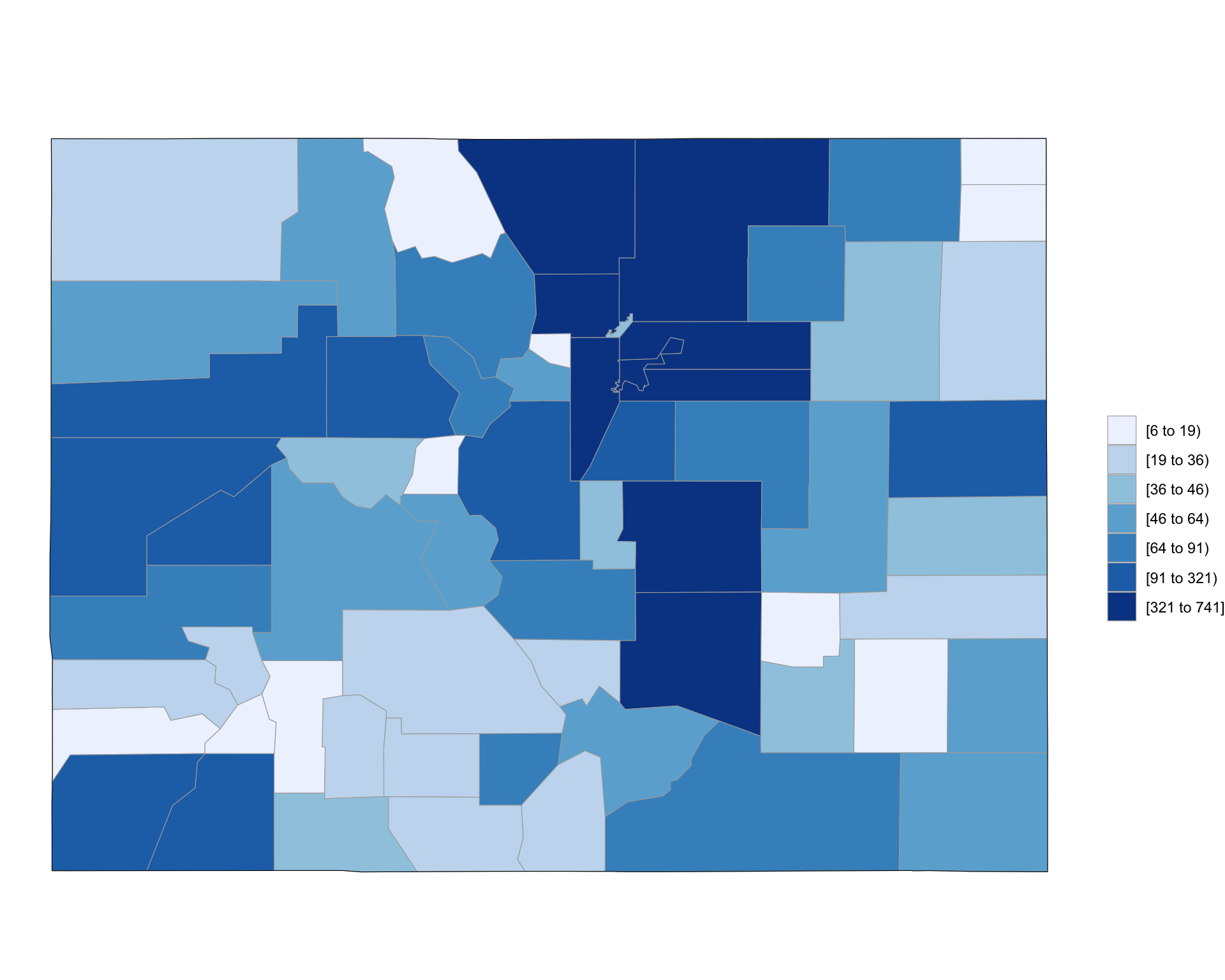
Figure 4.72: Choropleth of Colorado FARS data
As a note, this code uses the str_pad function from the stringr package to pad 1- or 2-digit county FIPS codes with leading zeros before pasting them to the state FIPS code and uses the n function from dplyr with summarize to count the number of observations ins each county.
This technique of creating a choropleth only worked because we had a column in the data linking accidents to counties. In same cases, you will want to create a choropleth based on counts of points but will not have this linking information in the data. For example, we might want to look at accident counts by census tract in Denver. To do this, we’ll need to link each accident (point) to a census tract (polygon), and then we can count up the number of points linked to each polygon. We can do this with some of the GIS-style tools available in R.
To start, we’ve created a dataframe with only accidents in Denver (based on the county column in the accident data):
denver_fars <- driver_data %>%
  filter(county == 31)
Now, we want to count up how many of these accidents occurred in each of the census tract shapes we pulled from the US Census earlier in this section using the tigris package. We can do this using the poly.counts function from GISTools package. However, before we can use that function, we need to make sure both objects are spatial objects, rather than dataframes, and that they have the same CRS.
The census tract data is already in a spatial object. We can change put the denver_fars object in a spatial object by resetting its coordinates attribute to specify which of its columns show longitude and latitude. Next, we need to specify what CRS the data has. Because it is coming from a dataframe of longitude and latitude data, the WSG84 system should be reasonable:
library(sp)
denver_fars_sp <- denver_fars
coordinates(denver_fars_sp) <- c("longitud", "latitude")
proj4string(denver_fars_sp) <- CRS("+init=epsg:4326")
This object is now also a spatial object:
class(denver_fars_sp)
[1] "SpatialPointsDataFrame"
attr(,"package")
[1] "sp"
To be able to pair up polygons and points, the spatial objects need to have the same CRS. To help later with calculating the area of each polygon, we’ll use a projected CRS that is reasonable for Colorado and reproject the spatial data using the spTransform function:
denver_tracts_proj <- spTransform(denver_tracts,
                                  CRS("+init=epsg:26954"))
denver_fars_proj <- spTransform(denver_fars_sp,
                                CRS(proj4string(denver_tracts_proj)))
Warning in proj4string(denver_tracts_proj): CRS object has comment, which is
lost in output
Now that the objects with the accident locations and with the census tracts are both spatial objects with the same CRS, we can combine them on a map. Because they are spatial objects, we can do that using plot:
plot(denver_tracts_proj)
plot(denver_fars_proj, add = TRUE, col = "red", pch = 1)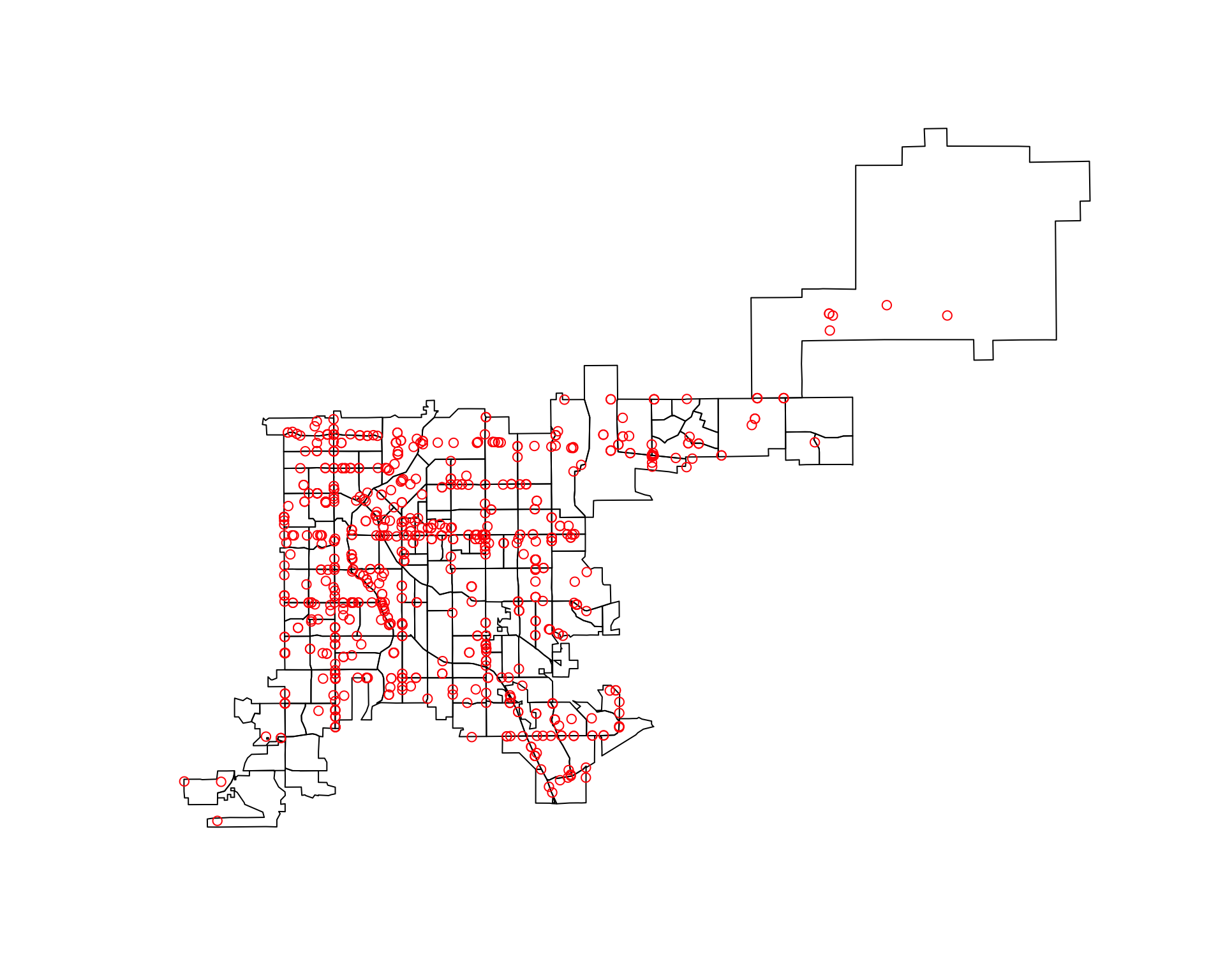
Now, that both datasets are in spatial objects and have the same CRS, you can use the poly.counts function to count how many of the accidents are in each census tract. This function inputs a spatial points object and a spatial polygons object and outputs a numeric vector with the count of points in each polygon:
library(GISTools)
tract_counts <- poly.counts(denver_fars_proj, denver_tracts_proj)
head(tract_counts)
 5  6  8 14 25 39
 3  4  0  1  2 13
You can use a choropleth to show these accident counts. In this case, the quickest way to do this is probably to use the choropleth function in the GISTools package.
choropleth(denver_tracts, tract_counts)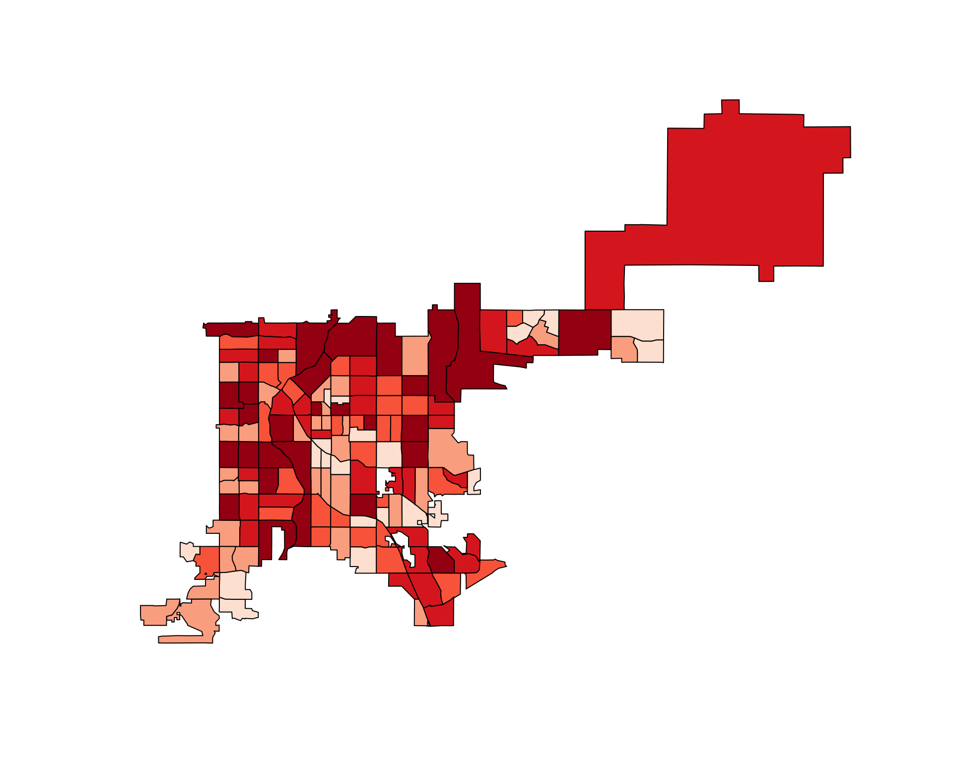
Figure 4.73: Choropleth of accident counts
There are other functions in R that do other GIS tasks. For example, There is function in the GISTools package that calculates the area of each polygon.
head(poly.areas(denver_tracts_proj))
        5         6         8        14        25        39
1896901.7 1904337.5 2429960.4  523286.3 1025737.9 2676766.7
You can use this functionality to create a choropleth of the rate of fatal accidents per population in Denver census tracts:
choropleth(denver_tracts,
           tract_counts / poly.areas(denver_tracts_proj))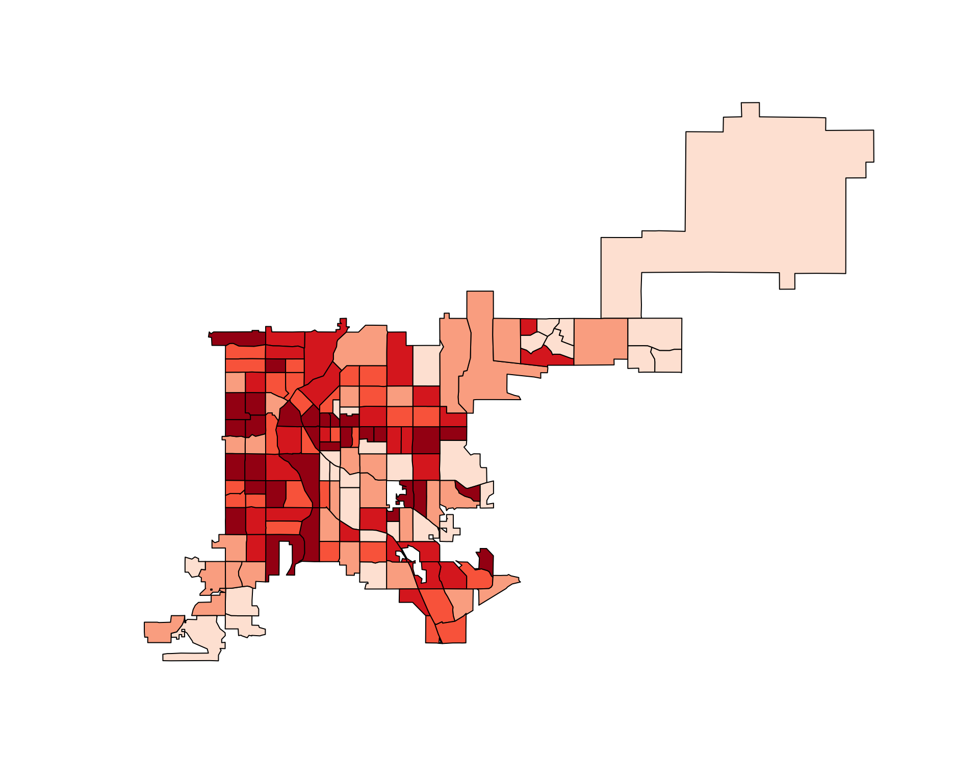
Figure 4.74: Denver accidents adjusted for tract area
4.3.4.5 Raster data
When mapping in R, you may also need to map raster data. You can think of raster data as data shown with pixels— the graphing region is divided into even squares, and color is constant within each square.
There is a function in the raster package that allows you to “rasterize” data. That is, you take spatial points data, divide the region into squares, and count the number of points (or other summary) within each square. When you do this, you need to set the x- and y-range for the raster squares. You can use bbox on a spatial object to get an idea of its ranges to help you specify these limits. You can use the res parameter in raster to set how large the raster boxes should be. For example, here is some code for rasterizing the accident data for Denver:
library(raster)
bbox(denver_fars_sp)
                min       max
longitud -105.10973 -104.0122
latitude   39.61715   39.8381
denver_raster <- raster(xmn = -105.09, ymn = 39.60,
                        xmx = -104.71, ymx = 39.86,
                        res = 0.02)
den_acc_raster <- rasterize(geometry(denver_fars_sp),
                            denver_raster,
                            fun = "count")
You can use the image function to plot this raster alone:
image(den_acc_raster, col = terrain.colors(5))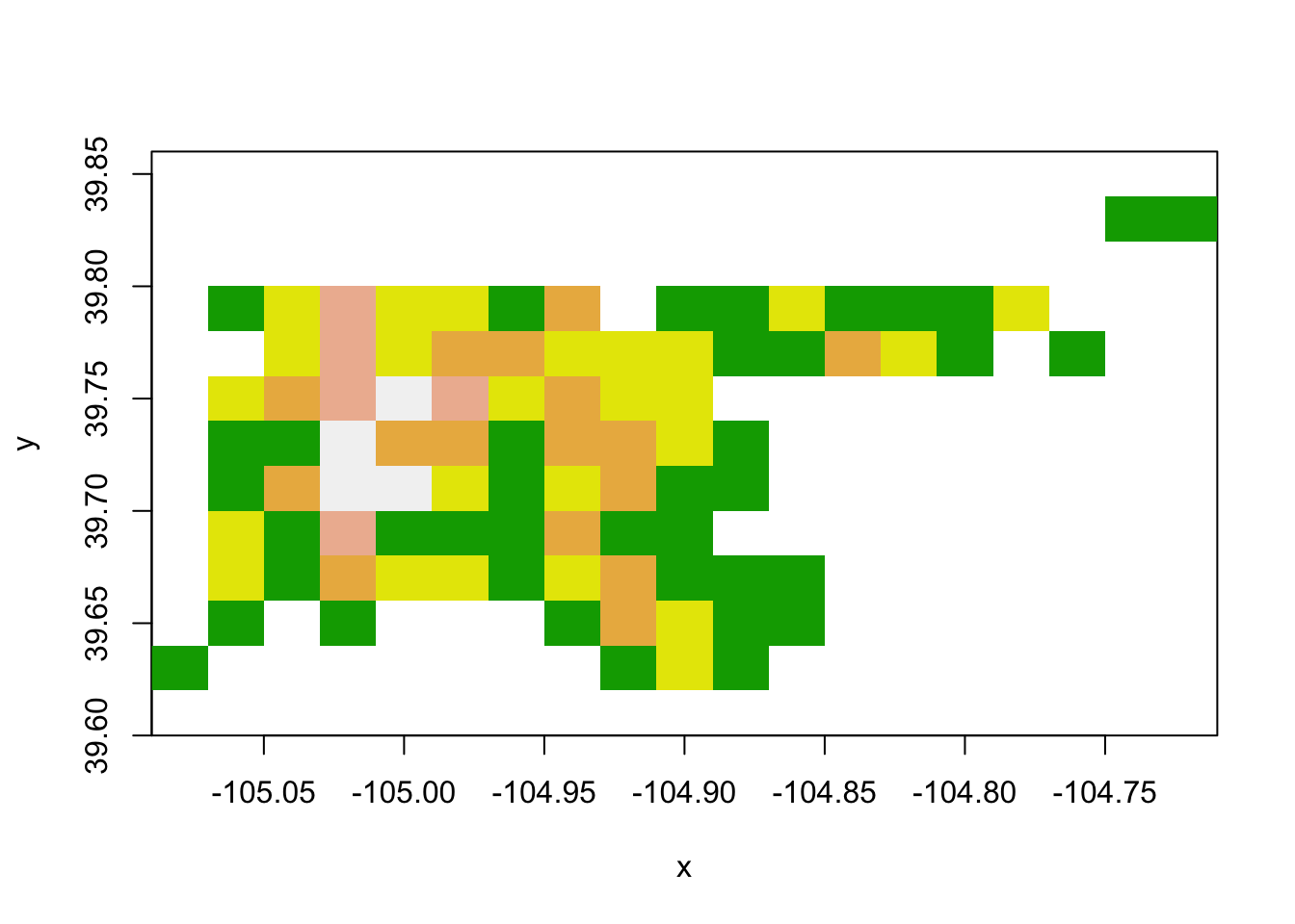
Figure 4.75: Raster data
You can use plot with add = TRUE to add the raster to a base plot of Denver. In this case, you will likely want to set some transparency (alpha) so you can see the base map through the raster:
plot(denver_tracts)
plot(den_acc_raster, add = TRUE, alpha = 0.5)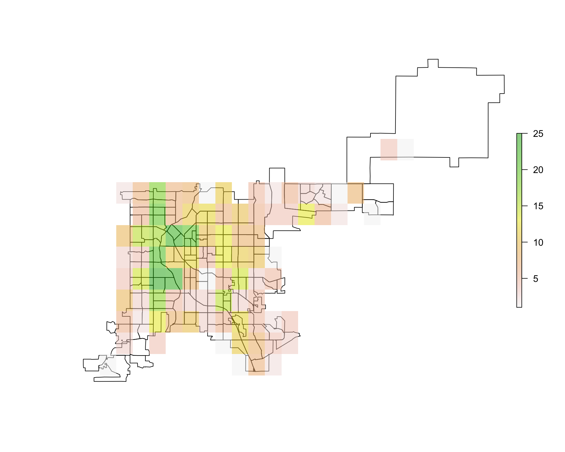
Figure 4.76: Overlaying raster data
4.3.5 Where to find more on mapping with R
There is a lot more you can learn about mapping in R than we could cover here. Here are some good resources if you would like to learn more:
- Applied Spatial Data Analysis with R by Roger Bivand
- An Introduction to R for Spatial Analysis and Mapping by Chris Brunsdon and Lex Comber
- CRAN Spatial Data Task View
- R Spatial Cheatsheet