4.2 Customizing ggplot2 Plots
With slightly more complex code, you can create very interesting and customized plots using ggplot2. In this section, we’ll provide an overview of some guidelines for creating good plots, based on the work of Edward Tufte and others, and show how you can customize ggplot objects to adhere to some of these guidelines. This overview will provide a framework for describing how to customize ggplot objects. We’ll end the subsection by going over scales and color specifically.
4.2.1 Guidelines for good plots
A number of very thoughtful books and articles have been written about creating graphics that effectively communicate information. Some of the authors we highly recommend (and from whose work we’ve pulled and aggregated the guidelines for good graphics we’ll go over) are:
- Edward Tufte (his book The Visual Display of Quantitative Information is a classic)
- Howard Wainer
- Stephen Few
- Nathan Yau
In this section, we’ll overview six guidelines for good graphics, based on the writings of these and other specialists in data display. The guidelines are:
- Aim for high data density.
- Use clear, meaningful labels.
- Provide useful references.
- Highlight interesting aspects of the data.
- Consider using small multiples.
- Make order meaningful.
I> While we overview some guidelines for effective plots here, this is mostly to provide a framework for showing how to customize ggplot objects. If you are interested in learning more about creating effective visualizations, you should read some of the thorough and thoughtful books written by the authors listed above. Howard Wainer’s article “How to display data badly” in The American Statistician is a particularly good place to start.
For the examples in this subsection, we’ll use dplyr for data cleaning and, for plotting, the packages ggplot2, gridExtra, and ggthemes, so you should load those packages if you plan to follow along with the examples.
library(dplyr)
library(ggplot2)
library(gridExtra)
library(ggthemes)
You can load the data for the examples in this subsection with the following code:
# install.packages("faraway")  ## Uncomment and run if you do not have the `faraway` package installed
library(faraway)
data(nepali)
data(worldcup)

# install.packages("dlnm")     ## Uncomment and run if you do not have the `dlnm` package installed
library(dlnm)
data(chicagoNMMAPS)
chic <- chicagoNMMAPS
chic_july <- chic %>%
  filter(month == 7 & year == 1995)
4.2.1.1 High data density
Guideline 1: Aim for high data density.
You should try to increase, as much as possible, the data to ink ratio in your graphs. This is the ratio of “ink” providing information to all ink used in the figure. In other words, if an element of the plot is redundant, take it out.
The two graphs in Figure 4.18 show the same information (“data”), but use very different amounts of ink. Each shows the number of players in each of four positions in the worldcup dataset. Notice how, in the plot on the right, a single dot for each category shows the same information that a whole filled bar is showing on the left. Further, the plot on the right has removed the gridded background, removing even more “ink” from the plot.
`summarise()` ungrouping output (override with `.groups` argument)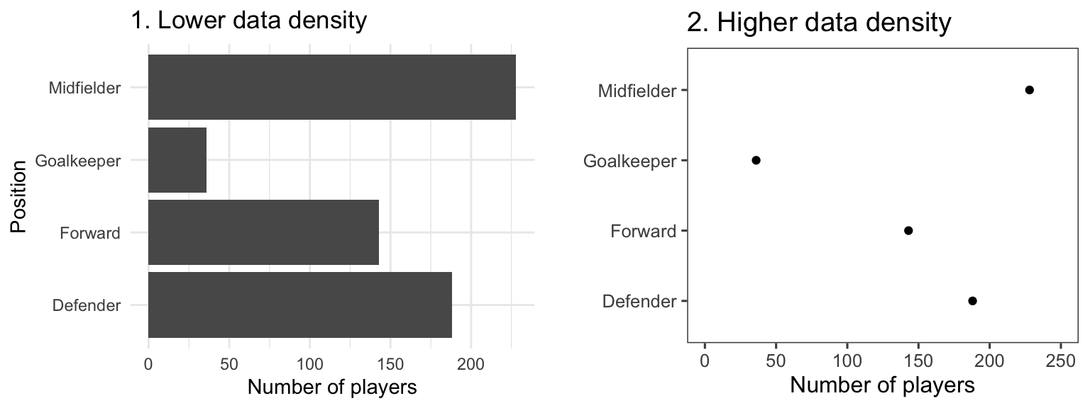
Figure 4.18: Example of plots with lower (left) and higher (right) data-to-ink ratios. Each plot shows the number of players in each position in the worldcup dataset from the faraway package.
Figure 4.19 gives another example of two plots that show the same information but with very different data densities. This figure uses the chicagoNMMAPS data from the dlnm package, which includes daily mortality, weather, and air pollution data for Chicago, IL. Both plots show daily mortality counts during July 1995, when a very severe heat wave hit Chicago. Notice how many of the elements in the plot on the left, including the shading under the mortality time series and the colored background and grid lines, are unnecessary for interpreting the message from the data.
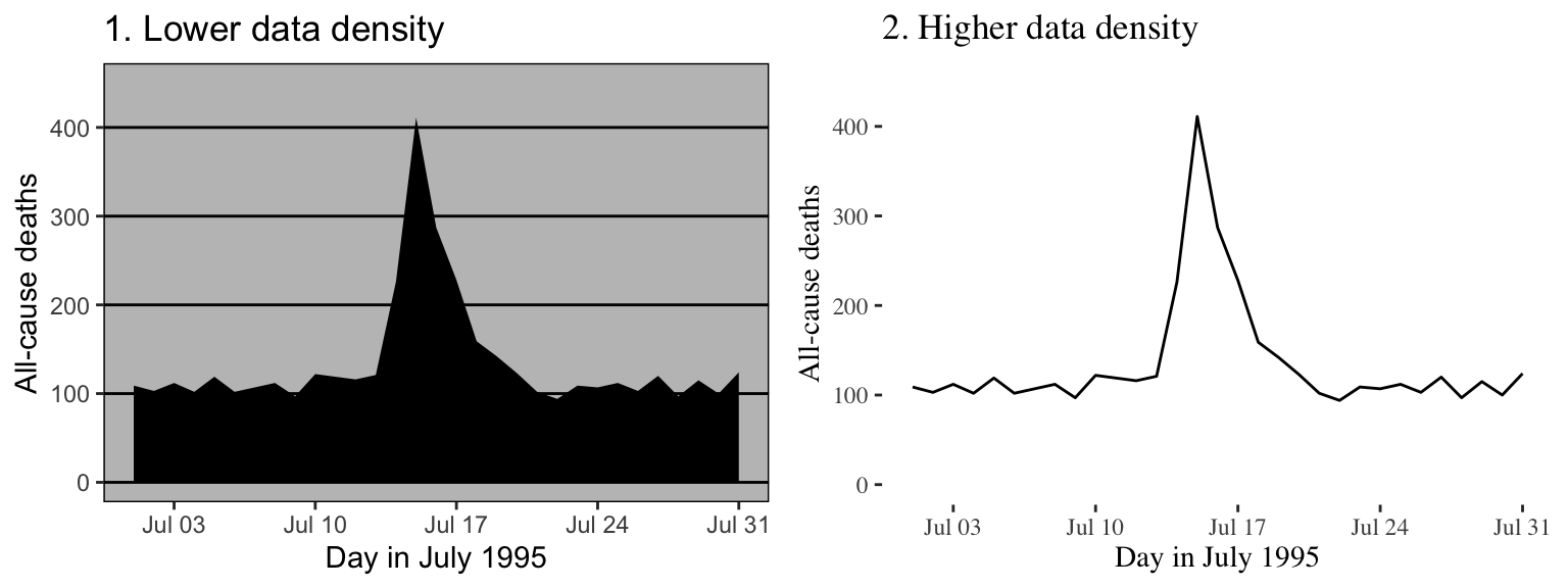
Figure 4.19: Example of plots with lower (left) and higher (right) data-to-ink ratios. Each plot shows daily mortality in Chicago, IL, in July 1995 using the chicagoNMMAPS data from the dlnm package.
By increasing the data-to-ink ratio in a plot, you can help viewers see the message of the data more quickly. A cluttered plot is harder to interpret. Further, you leave room to add some of the other elements we’ll talk about, including elements to highlight interesting data and useful references. Notice how the plots on the left in Figures 4.18 and 4.19 are already cluttered and leave little room for adding extra elements, while the plots on the right of those figures have much more room for additions.
One quick way to increase data density in ggplot2 is to change the theme for the plot, which will quickly change several elements of the plot’s appearance. There are several themes that come with ggplot2, including a black-and-white theme and a minimal theme. To use a theme, you can add it to a ggplot object by using a theme function like theme_bw. For example, to use the “classic” theme for a scatterplot using the World Cup 2010 data, you can run:
ggplot(worldcup, aes(x = Time, y = Shots)) +
  geom_point() +
  theme_classic()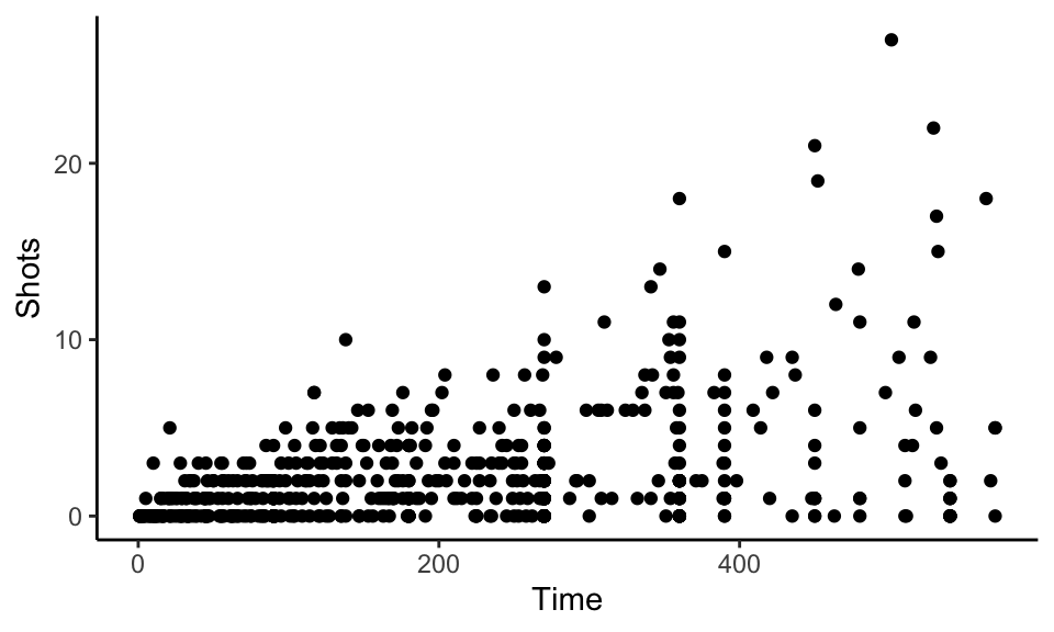
Figure 4.20: Minimal theme
A number of theme functions come directly with ggplot2. These include:
theme_linedrawtheme_bwtheme_minimaltheme_voidtheme_darktheme_classic
You can find even more theme functions in packages that extend ggplot2. The ggthemes package, in particular, has some excellent additional themes. These include themes based on the graphing principles of Stephen Few (theme_few) and Edward Tufte (theme_tufte). Again, you can use one of these themes by adding it to a ggplot object:
library(ggthemes)
ggplot(worldcup, aes(x = Time, y = Shots)) +
  geom_point() +
  theme_tufte()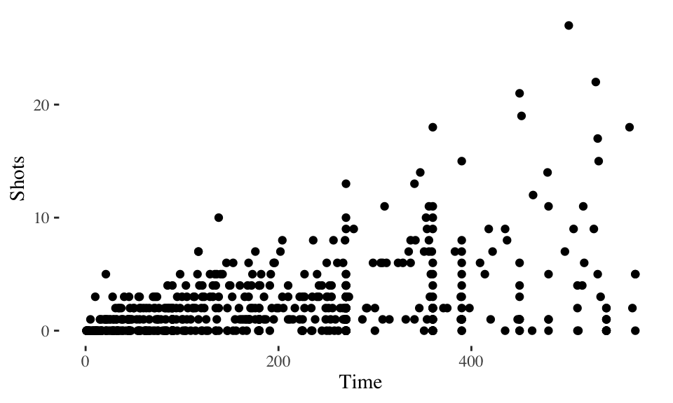
Figure 4.21: Tufte theme
The plots in Figure 4.22 shows some examples of the effects of using different themes. All show the same information– a plot of daily deaths in Chicago in July 1995. The top left graph shows the graph with the default theme. The other plots show the effects of adding different themes, including the black-and-white theme that comes with ggplot2 (top right) and various themes from the ggthemes package.
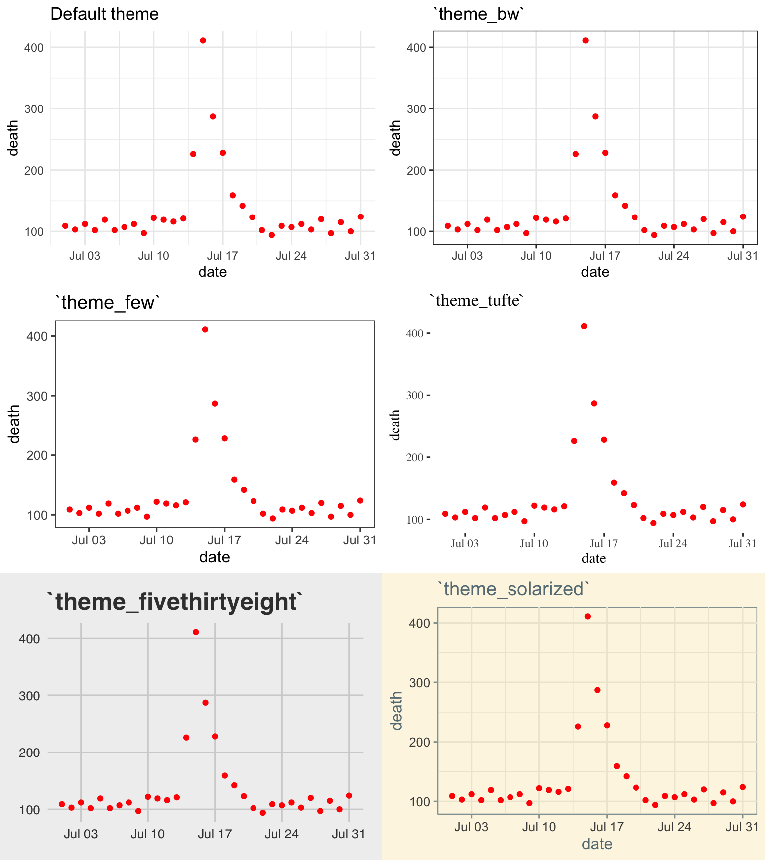
Figure 4.22: Daily mortality in Chicago, IL, in July 1995. This figure gives an example of the plot using different themes.
You can see that these themes can vary sustantially in their data-to-ink ratios. Between changing themes and choosing geoms carefully, you can reduce the data-to-ink ratio in a plot substantially. For example, here is the code for the two plots from 4.19:
chicago_plot <- ggplot(chic_july, aes(x = date, y = death)) +
  xlab("Day in July 1995") +
  ylab("All-cause deaths") +
  ylim(0, 450)

chicago_plot +
  geom_area(fill = "black") +
  theme_excel()

chicago_plot +
  geom_line() +
  theme_tufte()
We will teach you how to make your own ggplot theme later in the course.
4.2.1.2 Meaningful labels
Guideline 2: Use clear, meaningful labels.
Graphs often default to use abbreviations for axis labels and other labeling. For example, the default is for ggplot2 plots to use column names as labels for the x- and y-axes of a scatterplot. While this is convenient for exploratory plots, it’s often not adequate for plots for presentations and papers. You’ll want to use short and easy-to-type column names in your dataframe to make coding easier (e.g., “wt”), but you should use longer and more meaningful labeling in plots and tables that others need to interpret (e.g., “Weight (kg)”).
Furthermore, text labels are often aligned in a way that makes them hard to read. For example, when plotting a categorical variable along the x-axis, it can be difficult to fit categorical labels that are long enough to be meaningful without rotating them and so making them harder to read.
Figure 4.23 gives an example of the same information (number of players in the World Cup data set by position) shown with labels that are harder to read and interpret (left) versus with clear, meaningful labels (right). Notice how the graph on the left is using abbreviations for the categorical variable (“DF” for “Defense”), abbreviations for axis labels (“Pos” for “Position” and “count” for “Number of players”), and has the player position labels in a vertical alignment. On the right graph, we have made the graph easier to quickly read and interpret by spelling out all labels and switching the x- and y-axes, so that there’s room to fully spell out each position while still keeping the alignment horizontal, so the reader doesn’t have to turn the page (or his head) to read the values.
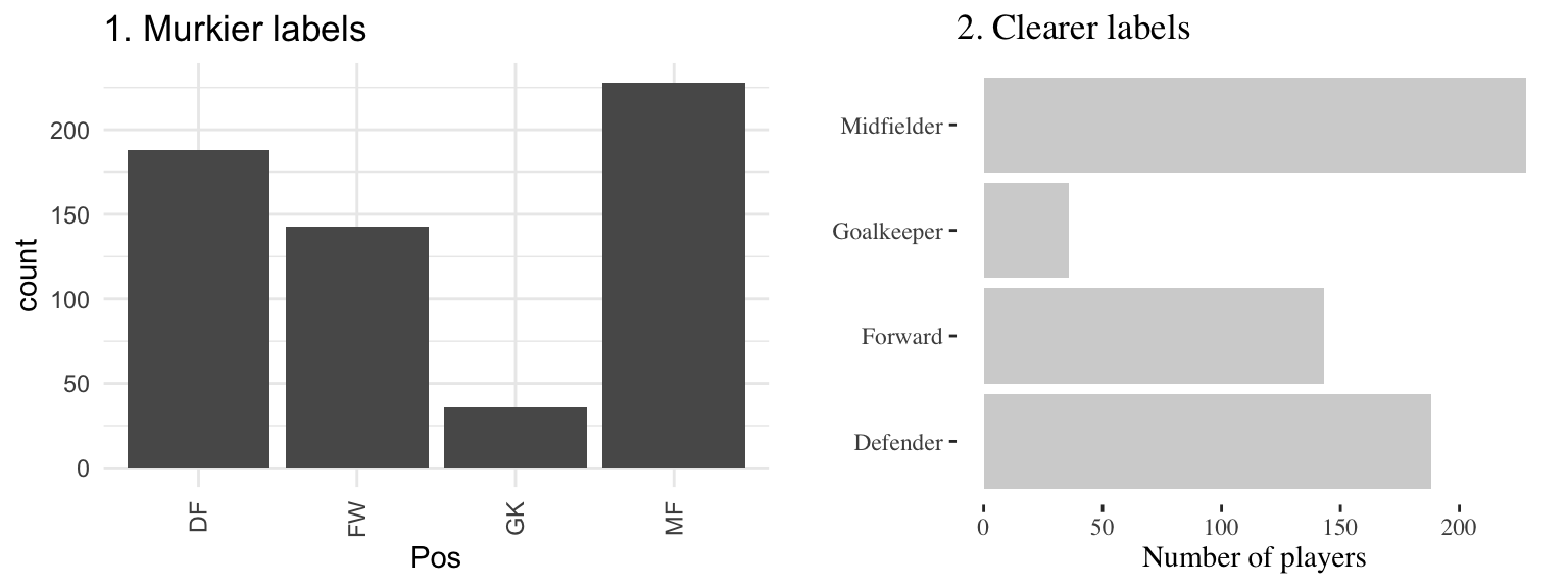
Figure 4.23: The number of players in each position in the worldcup data from the faraway package. Both graphs show the same information, but the left graph has murkier labels, while the right graph has labels that are easier to read and interpret.
There are a few strategies you can use to make labels clearer when plotting with ggplot2:
- You can use the
xlabandylabfunctions to customize the axis labels on a ggplot object, rather than using the column names in the original data. You can use thenameparameter of thescalefamily of functions (e.g.,scale_x_continuous) to relabel x- and y-axes— these functions also give you the power to make other changes to the x- and y-axes (e.g., changing break points for the axis ticks). However, if you only need to change axis labels,xlabandylabare often quicker. - Use tidyverse functions to clean your data before plotting it. This is particularly useful if you need to change the labels of categorical data. You can pipe directly from tidyverse data cleaning into a ggplot call (see the example code below).
- Include units of measurement in axis titles when relevant. If units are dollars or percent, check out the
scalespackage, which allows you to add labels directly to axis elements by including arguments likelabels = percentinscaleelements. See the helpfile forscale_x_continuousfor some examples. - If the x-variable requires longer labels, as is often the case with categorical data (for example, player positions Figure 4.23), consider flipping the coordinates, rather than abbreviating or rotating the labels. You can use
coord_flipto do this.
For example, here is the code used to generate the plots similar to those in Figure 4.23 (we first create a version of the worldcup data with worse column names and factor labels to show how to improve these when creating a ggplot object):
library(forcats)
# Create a messier example version of the data
wc_example_data <- worldcup %>%
  dplyr::rename(Pos = Position) %>%
  mutate(Pos = fct_recode(Pos,
                          "DC" = "Defender",
                          "FW" = "Forward",
                          "GK" = "Goalkeeper",
                          "MF" = "Midfielder"))

wc_example_data %>%
  ggplot(aes(x = Pos)) +
  geom_bar()

wc_example_data %>%
  mutate(Pos = fct_recode(Pos,
                          "Defender" = "DC",
                          "Forward" = "FW",
                          "Goalkeeper" = "GK",
                          "Midfielder" = "MF")) %>%
  ggplot(aes(x = Pos)) +
  geom_bar(fill = "lightgray") +
  xlab("") +
  ylab("Number of players") +
  coord_flip() +
  theme_tufte()
I> In this code example, we’ve used the fct_recode function from the forcats package to both create the messier example data and also to clean up category names for the second plot. The forcats package has a number of useful functions for working with factors in R.
W> In R, once you load a library, you do not specify that library when calling it’s function (e.g., once you’ve loaded dplyr, you can call rename). Usually, R does a good job of finding the right function under this system. However, if you have several packages loaded that have functions with the same name, you can run into problems. As you add on packages for plotting and mapping, you may find that some of your data cleaning code suddenly doesn’t work. If this happens, it may be that you’ve added code that loads the plyr package, which has several functions with the same name as dplyr functions. If this happens to you, try using the package::function notation to clarify that you want to use the dplyr function. You can see an example of this in the above code, where we’ve specified dplyr::rename when creating the messier example dataset.
4.2.1.3 References
Guideline 3: Provide useful references.
Data is easier to interpret when you add references. For example, if you show what it typical, it helps viewers interpret how unusual outliers are.
Figure 4.24 shows daily mortality during July 1995 in Chicago, IL. The graph on the right has added shading showing the range of daily death counts in July in Chicago for neighboring years (1990–1994 and 1996–2000). This added reference helps clarify for viewers how unusual the number of deaths during the July 1995 heat wave was.
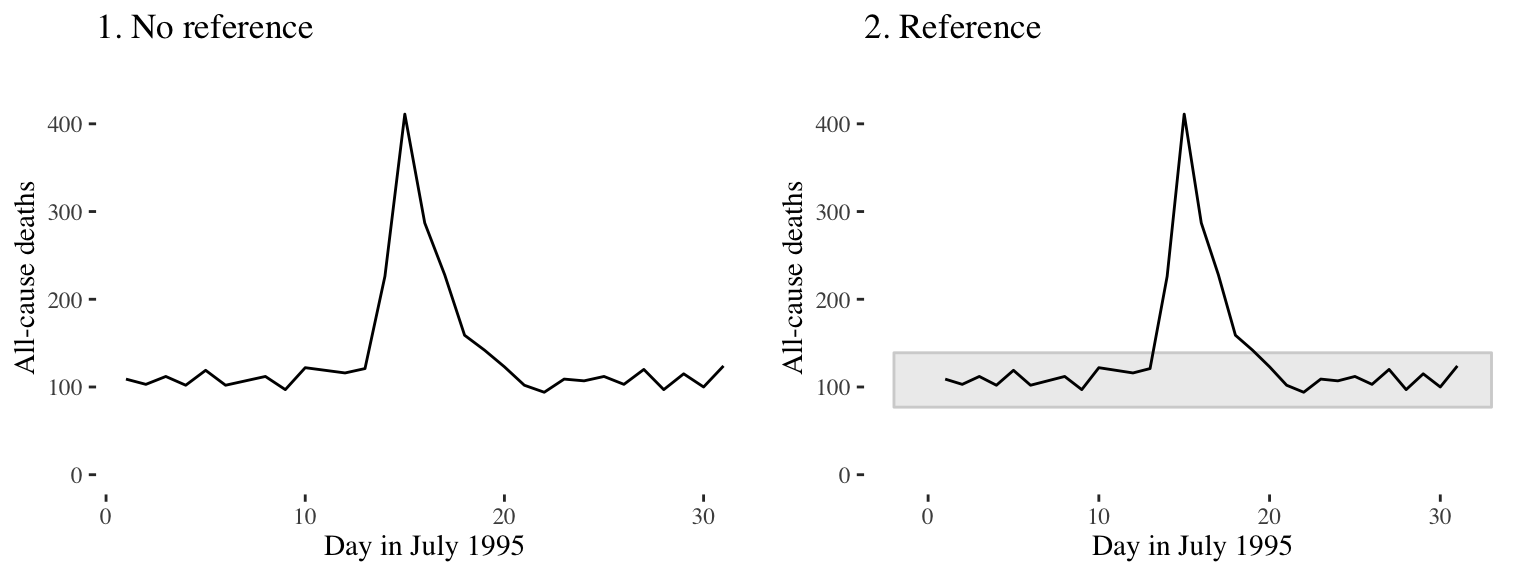
Figure 4.24: Daily mortality during July 1995 in Chicago, IL. In the graph on the right, we have added a shaded region showing the range of daily mortality counts for neighboring years, to show how unusual this event was.
Another useful way to add references is to add a linear or smooth fit to the data, to show trends in the data. Figure 4.25 shows the relationship between passes and shots for Forwards in the worldcup dataset. The plot on the right has an added smooth function to help show the relationship between these two variables.
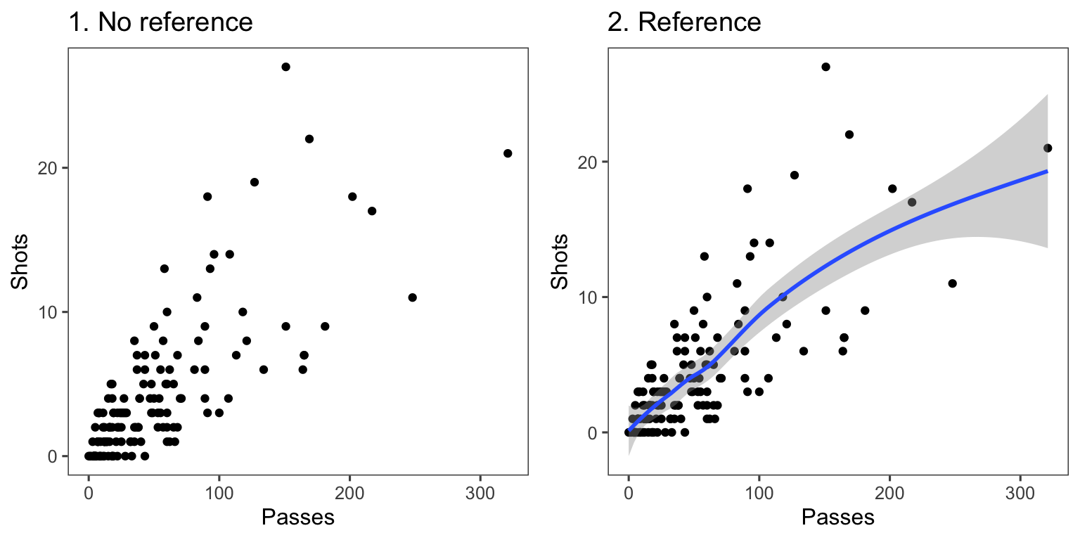
Figure 4.25: Relationship between passes and shots taken among Forwards in the worldcup dataset from the faraway package. The plot on the right has a smooth function added to help show the relationship between these two variables.
For scatterplots created with ggplot2, you can use the function geom_smooth to add a smooth or linear reference line. Here is the code that produces Figure 4.26:
ggplot(filter(worldcup, Position == "Forward"), aes(x = Passes, y = Shots)) +
        geom_point(size = 1.5) +
        theme_few()  +
        geom_smooth()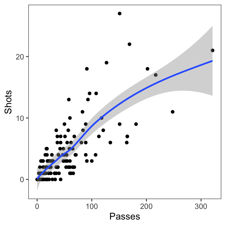
Figure 4.26: Relationship between passes and shots taken among Forwards in the worldcup dataset from the faraway package. The plot has a smooth function added to help show the relationship between these two variables.
The most useful geom_smooth parameters to know are:
method: The default is to add a loess curve if the data includes less than 1000 points and a generalized additive model for 1000 points or more. However, you can change to show the fitted line from a linear model usingmethod = "lm"or from a generalized linear model usingmethod = "glm".span: How wiggly or smooth the smooth line should be (smaller value: more flexible; larger value: more smooth)se: TRUE or FALSE, indicating whether to include shading for 95% confidence intervals.level: Confidence level for confidence interval (e.g.,0.90for 90% confidence intervals)
Lines and polygons can also be useful for adding references, as in Figure 4.24. Useful geoms for such shapes include:
geom_hline,geom_vline: Add a horizontal or vertical linegeom_abline: Add a line with an intercept and slopegeom_polygon: Add a filled polygongeom_path: Add an unfilled polygon
You want these references to support the main data shown in the plot, but not overwhelm it. When adding these references:
- Add reference elements first, so they will be plotted under the data, instead of on top of it.
- Use
alphato add transparency to these elements. - Use colors that are unobtrusive (e.g., grays).
- For lines, consider using non-solid line types (e.g.,
linetype = 3).
4.2.1.4 Highlighting
Guideline 4: Highlight interesting aspects.
Consider adding elements to highlight noteworthy elements of the data. For example, in the graph on the right of Figure 4.27, the days of the heat wave (based on temperature measurements) have been highlighted over the mortality time series by using a thick red line.
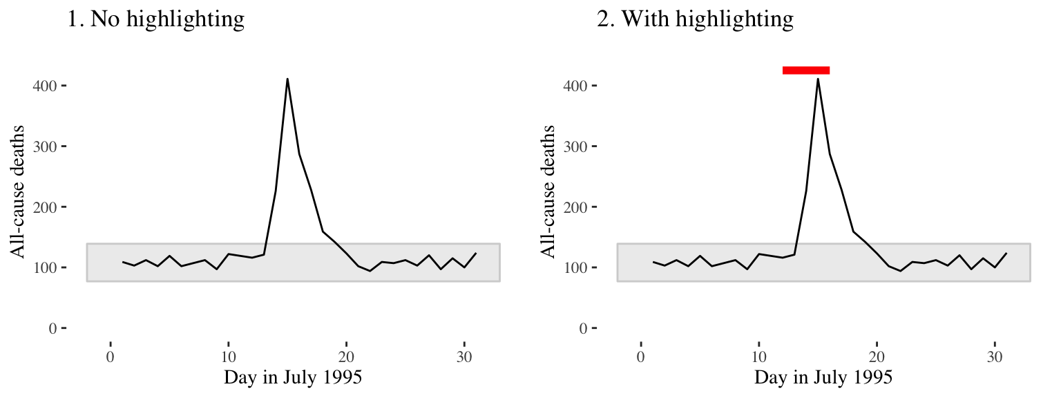
Figure 4.27: Mortality in Chicago, July 1995. In the plot on the right, a thick red line has been added to show the dates of a heat wave.
In Figure 4.28, the names of the players with the most shots and passes have been added to highlight these unusual points.
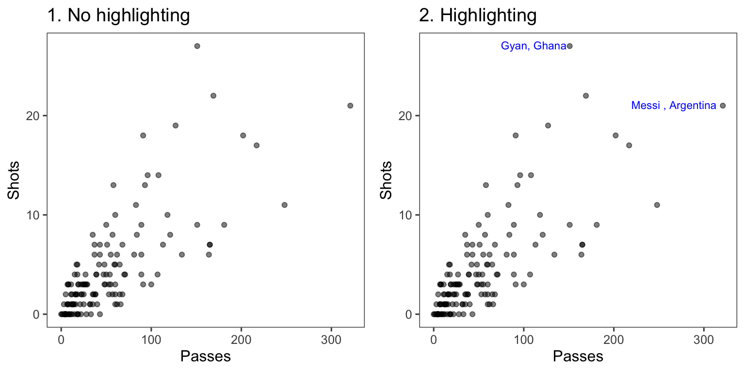
Figure 4.28: Passes versus shots for World Cup 2010 players. In the plot on the right, notable players have been highlighted.
You can add highlighting elements using geoms like geom_text and geom_line. Often, you will need to use a different dataframe for this highlighting geom. For example, you may want to create a subset of the original dataframe with notable points to which you want to add text labels. You can specify a new dataframe for a geom using the data parameter in the function that adds that geom. For example, to create the right plot in Figure 4.28, we first created a subset dataframe with only the players with the most shots and passes (when creating this subset, we also included some code to create the text label we want to use in the plot):
noteworthy_players <- worldcup %>%
  filter(Shots == max(Shots) | Passes == max(Passes)) %>%
  mutate(point_label = paste0(Team, Position, sep = ", "))
noteworthy_players
   Team   Position Time Shots Passes Tackles Saves       point_label
1 Ghana    Forward  501    27    151       1     0    GhanaForward,
2 Spain Midfielder  515     4    563       6     0 SpainMidfielder,
Now you can create a ggplot object based on the worldcup data, add a point geom to create the scatterplot with all data, and then add the text geom with the data from noteworthy players to add labels for those players:
ggplot(worldcup, aes(x = Passes, y = Shots)) +
  geom_point(alpha = 0.5) +
  geom_text(data = noteworthy_players, aes(label = point_label),
            vjust = "inward", hjust = "inward", color = "blue") +
  theme_few()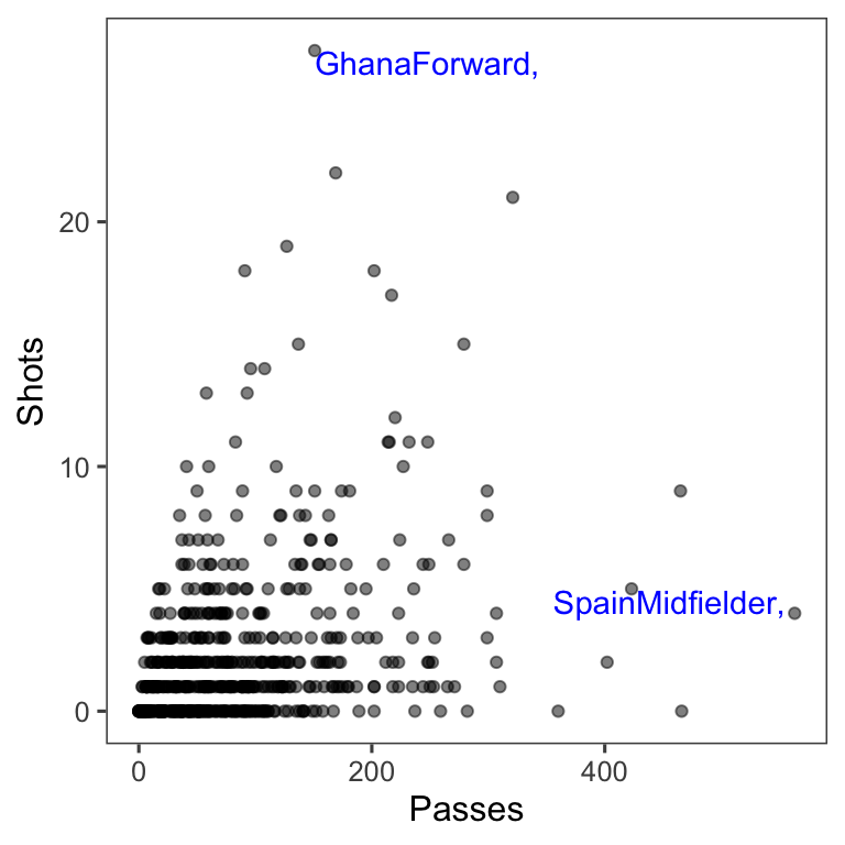
4.2.1.5 Small multiples
Guideline 5: When possible, use small multiples.
Small multiples are graphs that use many small plots to show different subsets of the data. Typically in small multiples, all plots use the same ranges for the x- and y-axes. This makes it easier to compare across plots, and it also allows you to save room by limiting axis annotation. In ggplot2, you can use faceting to creates small multiples.
For example, the worldcup dataset used in earlier examples includes each player’s position. If you want to explore a relationship (e.g., time played vs. shots on goal), you could try using color:
data(worldcup)
worldcup %>%
  ggplot(aes(x = Time, y = Shots, color = Position)) +
geom_point() 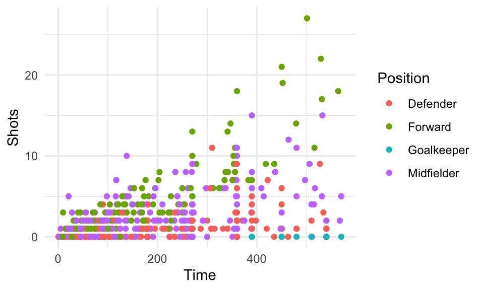
Figure 4.29: Shots vs. Time by Position
However, often it’s clearer to see relationships if you use faceting instead to create a small separate plot for each position. You can do this with either the facet_grid function or the facet_wrap function:
worldcup %>%
  ggplot(aes(x = Time, y = Shots)) +
  geom_point() +
facet_grid(. ~ Position) 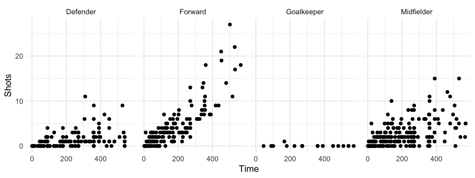
Figure 4.30: Small multiples with facet_grid
The facet_grid and facet_wrap functions differ in whether the small graphs are placed with one faceting variable per dimension (facet_grid) or whether the plots are wrapped across several rows (facet_wrap).
The facet_grid function can facet by one or two variables. One will be shown by rows, and one by columns:
## Generic code
facet_grid([factor for rows] ~ [factor for columns])
The facet_wrap() function can facet by one or more variables, and it “wraps” the small graphs, so they don’t all have to be in one row or column:
## Generic code
facet_wrap(~ [formula with factor(s) for faceting],
           ncol = [number of columns])
For example, if you wanted to show relationships for the final two teams in World Cup 2010 (Spain and Holland) and facet by both position and team, you could run:
worldcup %>%
  filter(Team %in% c("Spain", "Netherlands")) %>%
  ggplot(aes(x = Time, y = Shots)) +
  geom_point() +
facet_grid(Team ~ Position) 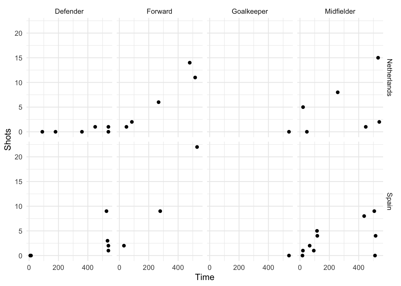
Figure 4.31: Faceting by Position and Team
With facet_wrap, you can specify how many columns you want to use, which makes it useful if you want to facet across a variable with a lot of variables. For example, there are 32 teams in the World Cup. You can create a faceted graph of time played versus shots taken by team by running:
worldcup %>%
  ggplot(aes(x = Time, y = Shots)) +
  geom_point(alpha = 0.25) +
facet_wrap(~ Team, ncol = 6) 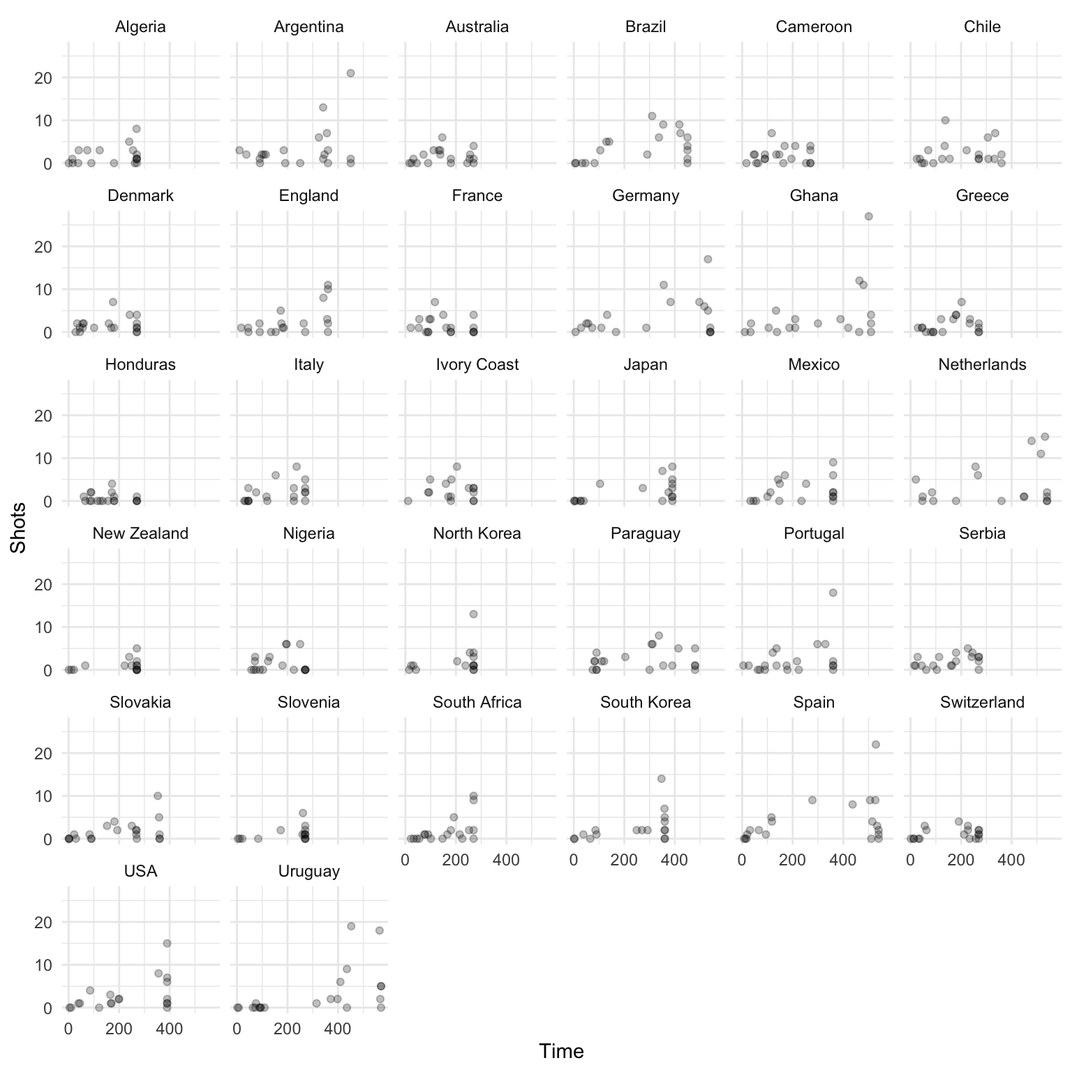
Figure 4.32: Using facet_wrap
Often, when you facet a plot, you’ll want to re-name your factors levels or re-order them. For this, you’ll need to use the factor() function on the original vector, or use some of the tools from the forcats package. For example, to rename the sex factor levels from “1” and “2” to “Male” and “Female,” you can run:
nepali <- nepali %>%
  mutate(sex = factor(sex, levels = c(1, 2),
                      labels = c("Male", "Female")))
Notice that the labels for the two graphs have now changed:
ggplot(nepali, aes(ht, wt)) +
        geom_point() +
        facet_grid(. ~ sex)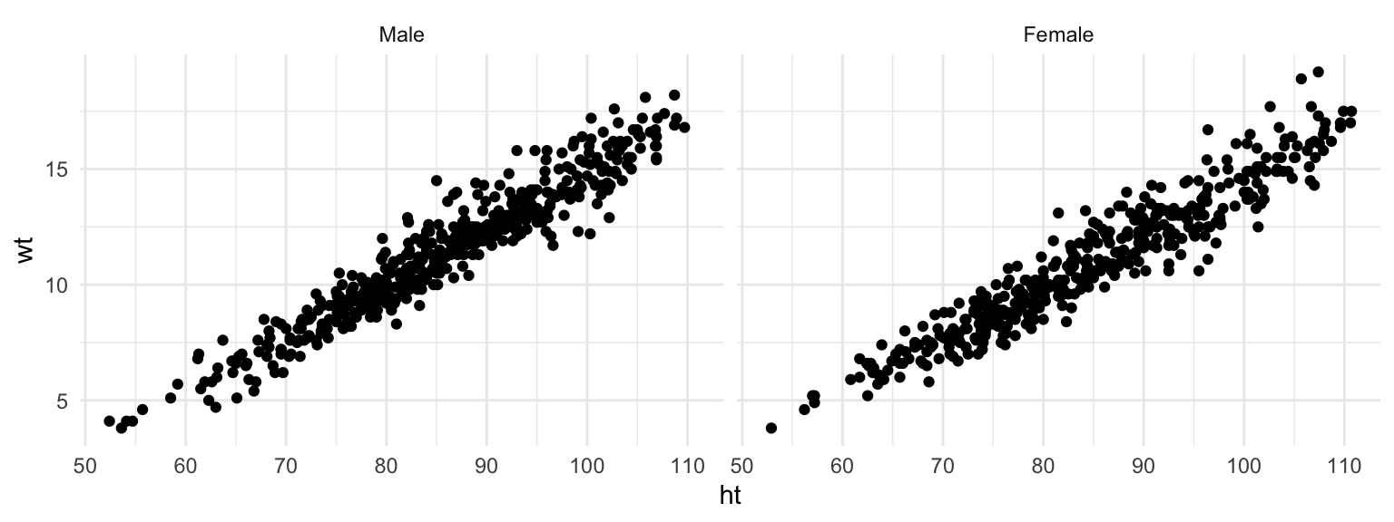
Figure 4.33: Facets with labeled factor
To re-order the factor and show the plot for “Female” first, you can use factor to change the order of the levels:
nepali <- nepali %>%
  mutate(sex = factor(sex, levels = c("Female", "Male")))
Now notice that the order of the plots has changed:
ggplot(nepali, aes(ht, wt)) +
        geom_point() +
        facet_grid(. ~ sex)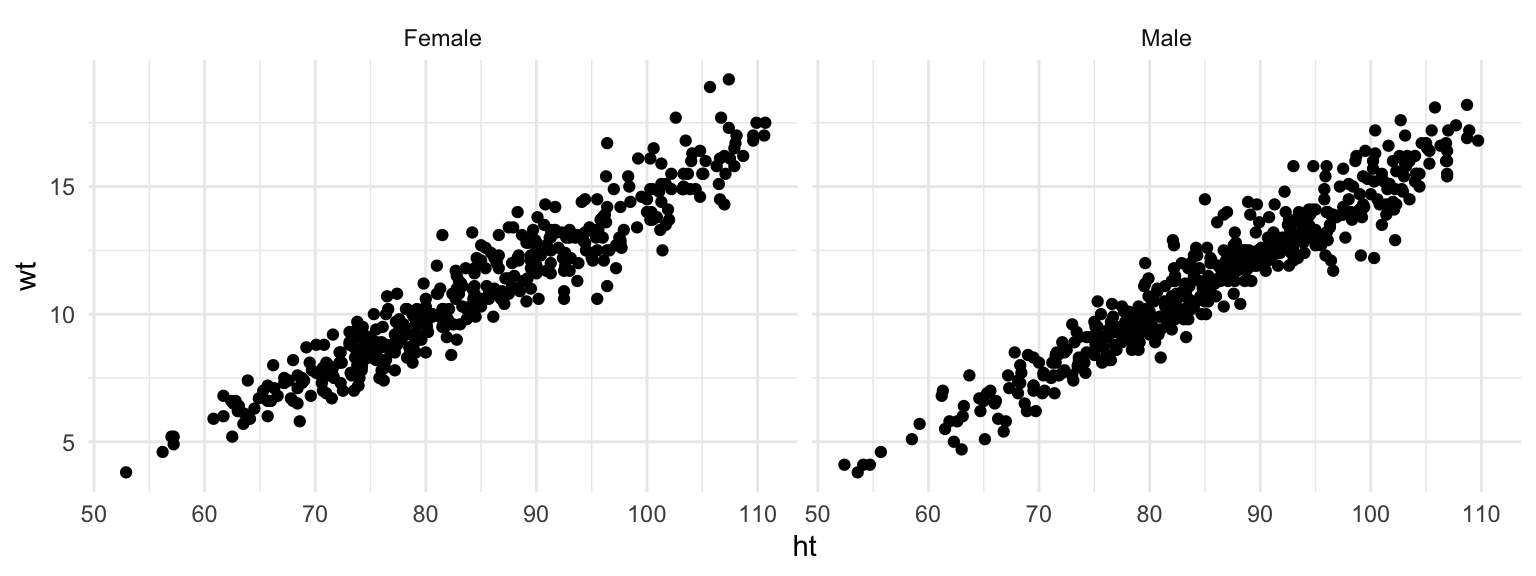
Figure 4.34: Facets with re-labeled factor
4.2.1.6 Order
Guideline 6: Make order meaningful.
Adding order to plots can help highlight interesting findings. Often, factor or categorical variables are ordered by something that is not interesting, like alphabetical order (Figure 4.35, left plot).
`summarise()` ungrouping output (override with `.groups` argument)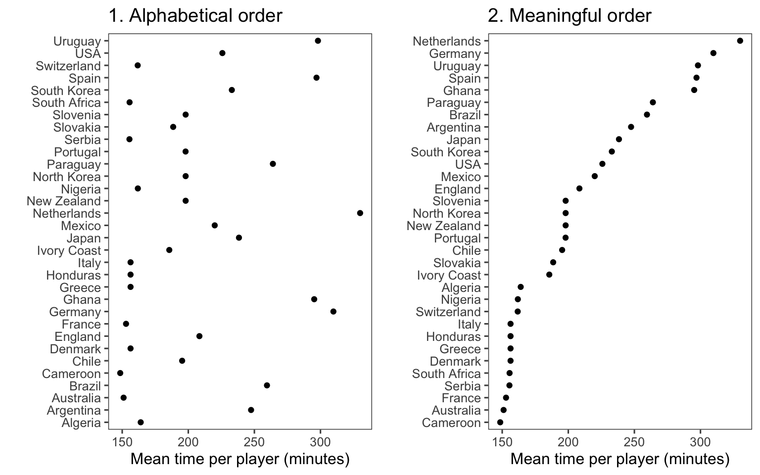
Figure 4.35: Mean time per player in World Cup 2010 by team. The plot on the right has reordered teams to show patterns more clearly.
You can make the ranking of data clearer from a graph by using order to show rank (Figure 4.35, right). You can re-order factor variables in a graph by resetting the factor using the factor function and changing the order that levels are included in the levels parameter. For example, here is the code for the two plots in Figure 4.35:
## Left plot
worldcup %>%
  group_by(Team) %>%
  summarize(mean_time = mean(Time)) %>%
  ggplot(aes(x = mean_time, y = Team)) +
  geom_point() +
  theme_few() +
  xlab("Mean time per player (minutes)") + ylab("")

## Right plot
worldcup %>%
  group_by(Team) %>%
  summarize(mean_time = mean(Time)) %>%
  arrange(mean_time) %>%                         # re-order and re-set
  mutate(Team = factor(Team, levels = Team)) %>% # factor levels before plotting
  ggplot(aes(x = mean_time, y = Team)) +
  geom_point() +
  theme_few() +
  xlab("Mean time per player (minutes)") + ylab("")
As another example, you can customize the faceted plot created in the previous subsection to order these plots from least to most average shots for a position using the following code. This example also has some added code to highlight the top players in each position in terms of shots on goal, as well as customizing colors and the theme.
worldcup %>%
  select(Position, Time, Shots) %>%
  group_by(Position) %>%
  mutate(ave_shots = mean(Shots),
         most_shots = Shots == max(Shots)) %>%
  ungroup() %>%
  arrange(ave_shots) %>%
  mutate(Position = factor(Position, levels = unique(Position))) %>%
  ggplot(aes(x = Time, y = Shots, color = most_shots)) +
  geom_point(alpha = 0.5) +
  scale_color_manual(values = c("TRUE" = "red", "FALSE" = "black"),
                     guide = FALSE) +
  facet_grid(. ~ Position) +
  theme_few()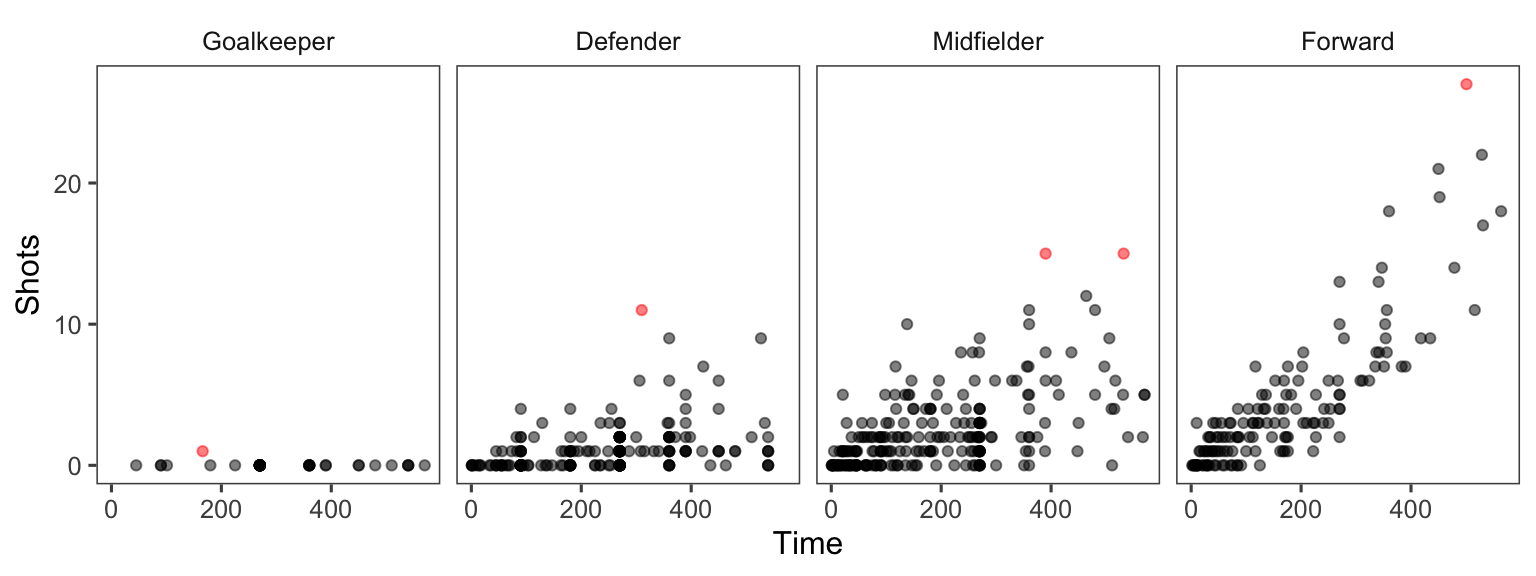
Figure 4.36: More customization in faceting
As another example of ordering, suppose you wanted to show how playing times were distributed among players from each team for the World Cup data, with teams ordered by the average time for all their players. You can link up dplyr tools with ggplot to do this by using group_by to group the data by team, mutate to average player time within each team, arrange to order teams by that average player time, and mutate to reset the factor levels of the Team variable, using this new order, before plotting with ggplot:
worldcup %>%
  dplyr::select(Team, Time) %>%
  dplyr::group_by(Team) %>%
  dplyr::mutate(ave_time = mean(Time),
                min_time = min(Time),
                max_time = max(Time)) %>%
  dplyr::arrange(ave_time) %>%
  dplyr::ungroup() %>%
  dplyr::mutate(Team = factor(Team, levels = unique(Team))) %>%
  ggplot(aes(x = Time, y = Team)) +
  geom_segment(aes(x = min_time, xend = max_time, yend = Team),
               alpha = 0.5, color = "gray") +
  geom_point(alpha = 0.5) +
  geom_point(aes(x = ave_time), size = 2, color = "red", alpha = 0.5) +
  theme_minimal() +
  ylab("")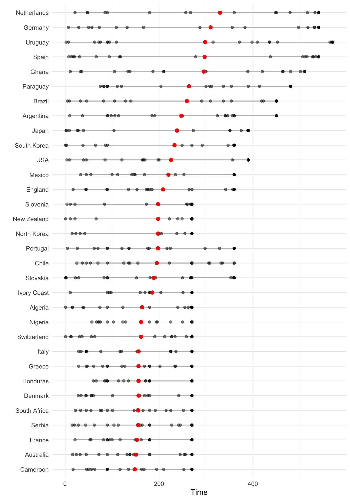
4.2.2 Scales and color
We’ll finish this section by going into a bit more details about how to customize the scales and colors for ggplot objects, including more on scales and themes.
There are a number of different scale functions that allow you to customize the scales of ggplot objects. Because color is often mapped to an aesthetic, you can adjust colors in many ggplot objects using scales, as well (the exception is if you are using a constant color for an element). The functions from the scale family follow the following convention:
## Generic code
scale_[aesthetic]_[vector type]
For example, to adjust the x-axis scale for a continuous variable, you’d use scale_x_continuous. You can use a scale function to change a variety of elements of an axis, including the axis label (which you could also change with xlab or ylab) as well as position and labeling of breaks. For aesthetics other than x and y, the “axis” will typically be the plot legend for that aesthetic, so these scale functions can be used to set the name, breaks, labels, and colors of plot legends.
For example, here is a plot of Time versus Passes for the World Cup 2010 data, with the number of shots taken shown by size and position shown by color, using the default scales for each aesthetic:
ggplot(worldcup, aes(x = Time, y = Passes, color = Position, size = Shots)) +
  geom_point(alpha = 0.5)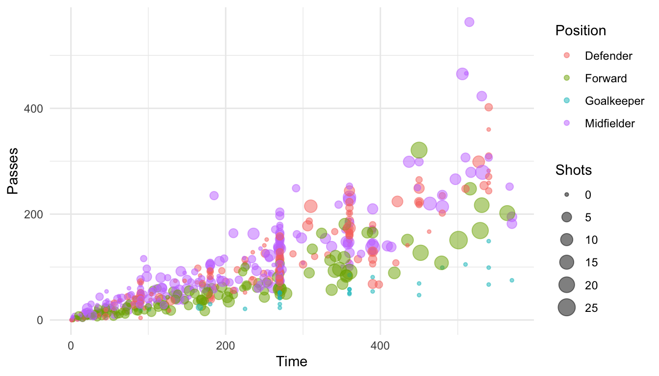
You may want to customize the x-axis for this plot, changing the scale to show breaks every 90 minutes (the approximate length of each game). Further, you may want to give that axis a different axis title. Because you want to change the x axis and the aesthetic mapping is continuous (this aesthetic is mapped to the “Time” column of the data, which is numeric), you can make this change using scale_x_continuous:
ggplot(worldcup, aes(x = Time, y = Passes, color = Position, size = Shots)) +
  geom_point(alpha = 0.5) +
  scale_x_continuous(name = "Time played (minutes)",
                     breaks = 90 * c(2, 4, 6),
                     minor_breaks = 90 * c(1, 3, 5))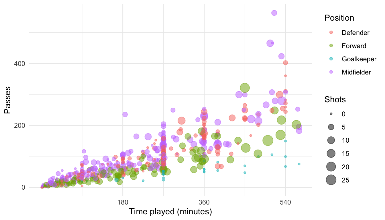
You may also want to change the legend for “Shots” to have the title “Shots on goal” and to only show the sizes for 0, 10, or 20 shots. The data on shots is mapped to the size aesthetic, and the data is continuous, so you can change that legend using scale_size_continuous:
ggplot(worldcup, aes(x = Time, y = Passes, color = Position, size = Shots)) +
  geom_point(alpha = 0.5) +
  scale_x_continuous(name = "Time played (minutes)",
                     breaks = 90 * c(2, 4, 6),
                     minor_breaks = 90 * c(1, 3, 5)) +
  scale_size_continuous(name = "Shots on goal",
                        breaks = c(0, 10, 20))
Legends for color and fill can be manipulated in a somewhat similar way, which we explain in more detail later in this subsection.
The scale functions allow a number of different parameters. Some you may find helpful are:
| Parameter | Description |
|---|---|
| name | Label or legend name |
| breaks | Vector of break points |
| minor_breaks | Vector of minor break points |
| labels | Labels to use for each break |
| limits | Limits to the range of the axis |
For are mapping data that is in a date format, you can use date-specific scale functions like scale_x_date and scale_x_datetime. For example, here’s a plot of deaths in Chicago in July 1995 using default values for the x-axis:
ggplot(chic_july, aes(x = date, y = death)) +
geom_line() 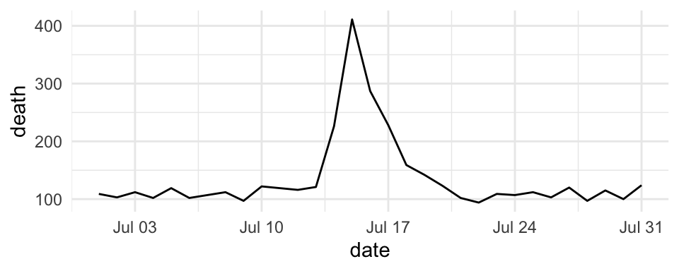
Figure 4.37: Mortality in Chicago for July 1995
These date-specific scale functions allow you to change the formatting of the date (with the date_labels parameter), as well as do some of the tasks you would do with a non-date scale function, like change the name of the axis:
ggplot(chic_july, aes(x = date, y = death)) +
  geom_line() +
  scale_x_date(name = "Date in July 1995",
               date_labels = "%m-%d")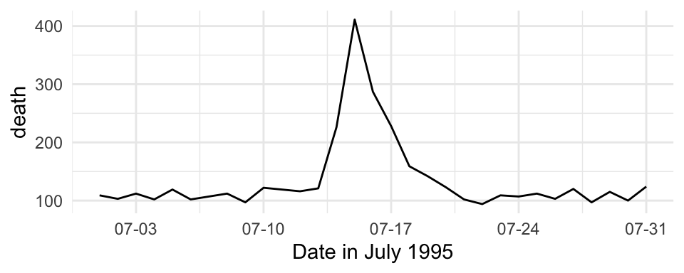
Figure 4.38: Mortality in Chicago for July 1995
You can also use the scale functions to transform an axis. For example, to show the Chicago plot with “deaths” on a log scale, you can run:
ggplot(chic_july, aes(x = date, y = death)) +
  geom_line() +
  scale_y_log10(breaks = c(1:4 * 100))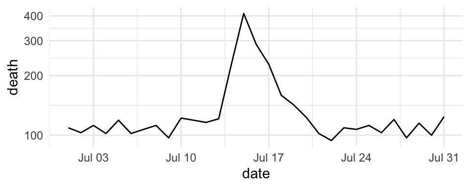
Figure 4.39: Transforming the y axis
For color and fill aesthetics, the conventions for naming the scale functions vary a bit, and there are more options. For example, to adjust the color scale when you’re mapping a discrete variable (i.e., categorical, like gender or animal breed) to color, one option is to use scale_color_hue, but you can also use scale_color_manual and a few other scale functions. To adjust the color scale for a continuous variable, like age, one option is the scale_color_gradient function.
There are custom scale functions you can use if you want to pull specific color palettes. One option is to use one of the “Brewer” color palettes, which you can do with functions like scale_color_brewer and scale_color_distiller.
The Brewer palettes fall into three categories: sequential, divergent, and qualitative. You should use sequential or divergent for continuous data and qualitative for categorical data. You can explore the Brewer palettes at http://colorbrewer2.org/. You can also use display.brewer.pal to show the palettes within R:
library(RColorBrewer)
display.brewer.pal(name = "Set1", n = 8)
display.brewer.pal(name = "PRGn", n = 8)
display.brewer.pal(name = "PuBuGn", n = 8)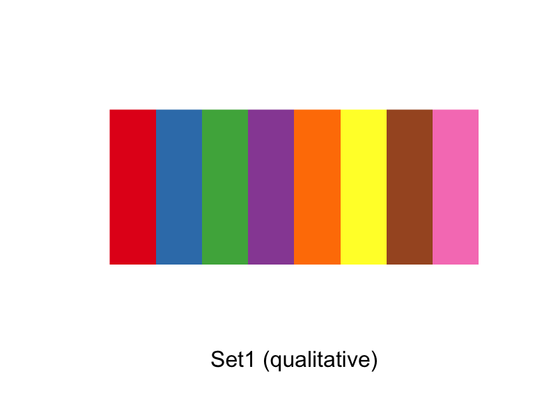
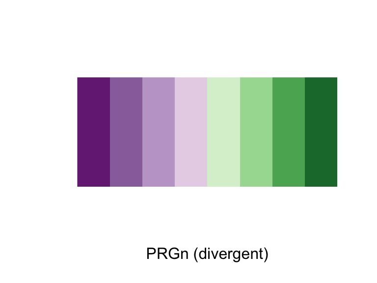
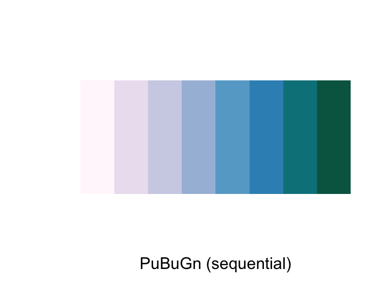
Figure 4.40: ColorBrewer palettes
Once you have picked a Brewer palette you would like to use, you can specify it with the palette argument within brewer scale function. The following plot shows examples of the same plot with three different Brewer palettes (a dark theme is also added with the pastel palette to show those points more clearly):
wc_example <- ggplot(worldcup, aes(x = Time, y = Passes,
                     color = Position, size = Shots)) +
  geom_point(alpha = 0.5)

a <- wc_example +
  scale_color_brewer(palette = "Set1") +
  ggtitle("Set1")
b <- wc_example +
  scale_color_brewer(palette = "Dark2") +
  ggtitle("Dark2")
c <- wc_example +
  scale_color_brewer(palette = "Pastel2") +
  ggtitle("Pastel2") +
  theme_dark()
d <- wc_example +
  scale_color_brewer(palette = "Accent") +
  ggtitle("Accent")
grid.arrange(a, b, c, d, ncol = 2)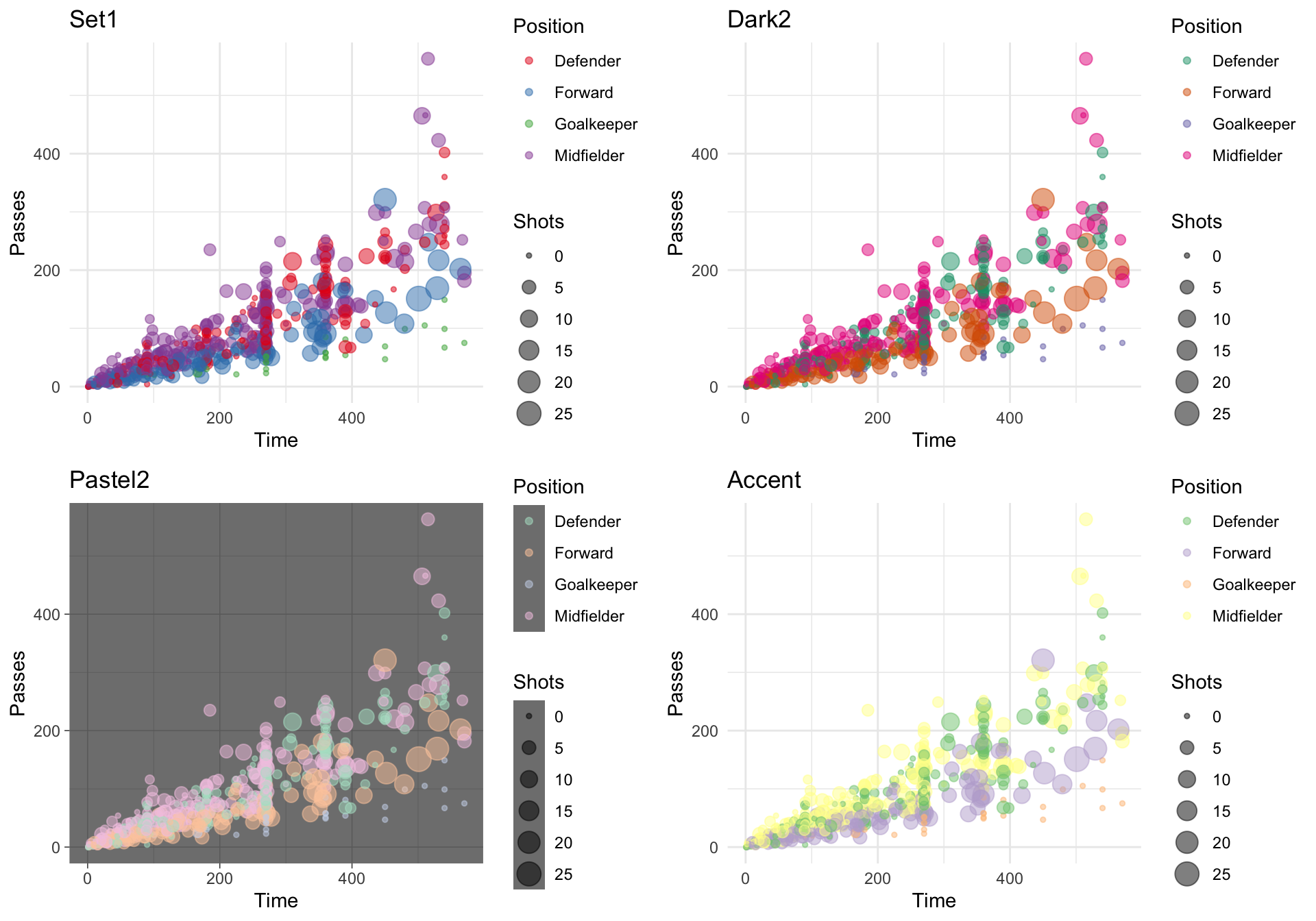
Figure 4.41: Using ColorBrewer palettes
You can set discrete colors manually using scale_color_manual and scale_fill_manual:
ggplot(worldcup, aes(x = Time, y = Passes,
                     color = Position, size = Shots)) +
  geom_point(alpha = 0.5) +
  scale_color_manual(values = c("blue", "red",
                                "darkgreen", "darkgray"))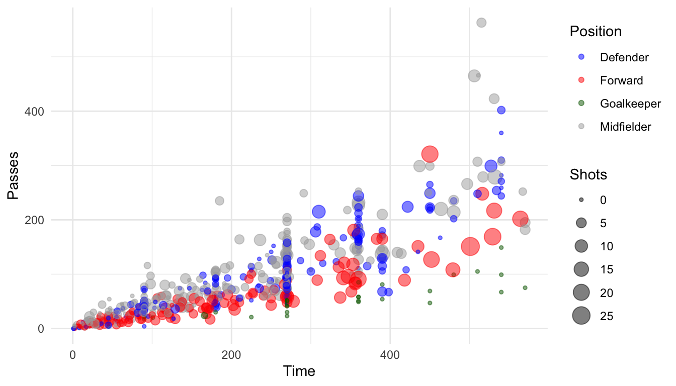
Figure 4.42: Setting colors manually
W> It is very easy to confuse the color and fill aesthetics. If you try to use a scale function for color or fill and it doesn’t seem to be doing anything, make sure you’ve picked the correct aesthetic of these two. The fill aesthetic specifies the color to use for the interior of an element. The color aesthetic specifies the color to use for the border of an element. Many elements, including lines and some shapes of points, will only take a color aesthetic. In other cases, like polygon geoms, you may find you often accidently specify a color aesthetic when you meant to specify a fill aesthetic.
4.2.2.0.1 Viridis color map
Some packages provide additional color palettes. For example, there is a package called viridis with four good color palettes that are gaining population in visualization. From the package’s GitHub repository:
“These four color maps are designed in such a way that they will analytically be perfectly perceptually-uniform, both in regular form and also when converted to black-and-white. They are also designed to be perceived by readers with the most common form of color blindness.”
This package includes new color scale functions, scale_color_viridis and scale_fill_viridis, which can be added to a ggplot object to use one of the four palettes. For example, to use the viridis color palette for a plot of time versus shots for the World Cup data, you can run:
library(viridis)
Loading required package: viridisLite
worldcup %>%
  ggplot(aes(x = Time, y = Shots, color = Passes)) +
  geom_point(size = 0.9) +
  facet_wrap(~ Position) +
  scale_color_viridis()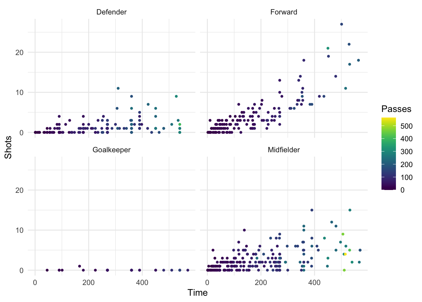
Figure 4.43: Viridis color map
You can use these colors for discrete values, as well, by setting the discrete parameter in the scale_color_viridis function to TRUE:
worldcup %>%
  ggplot(aes(x = Time, y = Shots, color = Position)) +
  geom_point(alpha = 0.7) +
  scale_color_viridis(discrete = TRUE)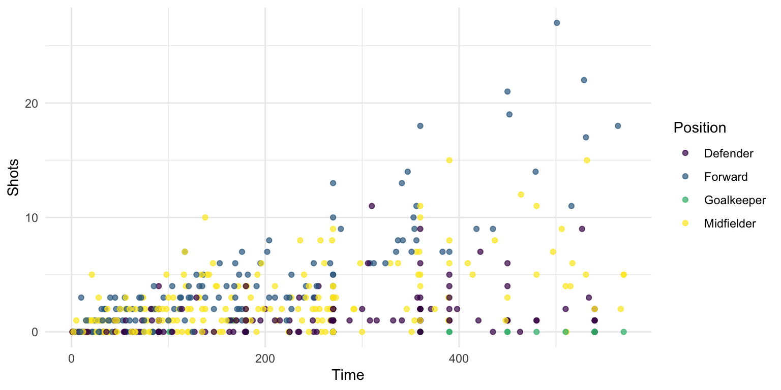
Figure 4.44: Viridis discrete color map
The option argument allows you to pick between four palettes: Magma, Inferno, Plasma, and Viridis. Here are examples of each of those palettes applies to the World Cup example plot:
library(gridExtra)

worldcup_ex <- worldcup %>%
  ggplot(aes(x = Time, y = Shots, color = Passes)) +
  geom_point(size = 0.9)

magma_plot <- worldcup_ex +
  scale_color_viridis(option = "A") +
  ggtitle("magma")
inferno_plot <- worldcup_ex +
  scale_color_viridis(option = "B") +
  ggtitle("inferno")
plasma_plot <- worldcup_ex +
  scale_color_viridis(option = "C") +
  ggtitle("plasma")
viridis_plot <- worldcup_ex +
  scale_color_viridis(option = "D") +
  ggtitle("viridis")

grid.arrange(magma_plot, inferno_plot, plasma_plot, viridis_plot, ncol = 2)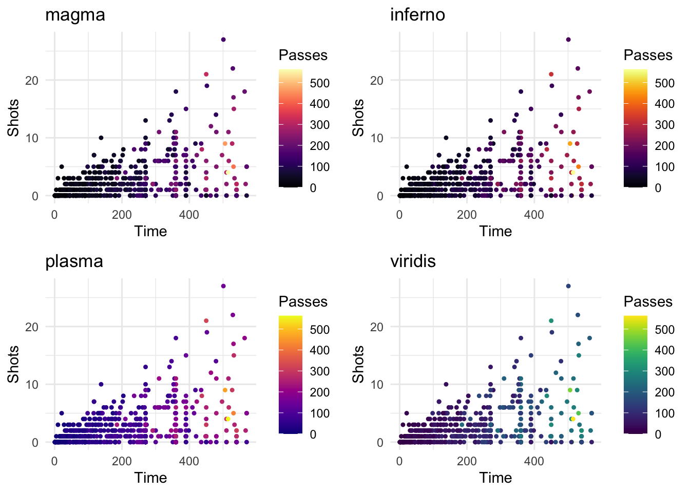
Figure 4.45: Color maps included in viridis package
4.2.3 To find out more
There are some excellent resources available for finding out more about creating plots using the gpplot2 package.
If you want to get more practical tips on how to plot with ggplot2, check out:
- R Graphics Cookbook by Winston Chang: This “cookbook” style book is a useful reference to have to flip through when you have a specific task you want to figure out how to do with ggplot2 (e.g., flip the coordinate axes, remove the figure legend).
- http://www.cookbook-r.com/Graphs/: Also created by Winston Chang, this website goes with the R Graphics Cookbook and is an excellent reference for quickly finding out how to do something specific in ggplot2.
- Google images: If you want to find example code for how to create a specific type of plot in R, try googling the name of the plot and “R,” and then search through the “Images” results. For example, if you wanted to plot a wind rose in R, google “wind rose r” and click on the “Images” tab. Often, the images that are returned will link back to a page that includes the example code to create the image (a blog post, for example).
For more technical details about plotting in R, check out:
- ggplot2: Elegant Graphics for Data Analysis by Hadley Wickham: Now in its second edition, this book was written by the creator of grid graphics and goes deeply into the details of why ggplot2 was created and how to use it.
- R Graphics by Paul Murrell: Also in its second edition, this book explains grid graphics, the graphics system that ggplot2 is built on. This course covers the basics of grid graphics in a later section to give you the tools to create your own ggplot2 extensions. However, if you want the full details on grid graphics, this book is where to find them.