4.1 Basic Plotting With ggplot2
The ggplot2 package allows you to quickly plot attractive graphics and to visualize and explore data. Objects created with ggplot2 can also be extensively customized with ggplot2 functions (more on that in the next subsection), and because ggplot2 is built using grid graphics, anything that cannot be customized using ggplot2 functions can often be customized using grid graphics. While the structure of ggplot2 code differs substantially from that of base R graphics, it offers a lot of power for the required effort. This first subsection focuses on useful, rather than attractive graphs, since this subsection focuses on exploring rather than presenting data. Later sections will give more information about making more attractive or customized plots, as you’d want to do for final reports, papers, etc.
To show how to use basic ggplot2, we’ll use a dataset of Titanic passengers, their characteristics, and whether or not they survived the sinking. This dataset has become fairly famous in data science, because it’s used, among other things, for one of Kaggle’s long-term “learning” competitions, as well as in many tutorials and texts on building classification models.
I> Kaggle is a company that runs predictive modeling competitions, with top competitors sometimes winning cash prizes or interviews at top companies. At any time, Kaggle is typically is hosting several competitions, including some with no cash reward that are offered to help users get started with predictive modeling.
To get this dataset, you’ll need to install and load the titanic package, and then you can load and rename the training datasets, which includes data on about two-thirds of the Titanic passengers:
# install.packages("titanic") # If you don't have the package installed
library(titanic)
data("titanic_train", package = "titanic")
titanic <- titanic_train
The other data example we’ll use in this subsection is some data on players in the 2010 World Cup. This is available from the faraway package:
# install.packages("faraway") # If you don't have the package installed
library(faraway)
data("worldcup")
I> Unlike most data objects you’ll work with, the data that comes with an R package will often have its own help file. You can access this using the ? operator. For example, try running: ?worldcup.
All of the plots we’ll make in this subsection will use the ggplot2 package (another member of the tidyverse!). If you don’t already have that installed, you’ll need to install it. You then need to load the package in your current session of R:
# install.packages("ggplot2")  ## Uncomment and run if you don't have `ggplot2` installed
library(ggplot2)
The process of creating a plot using ggplot2 follows conventions that are a bit different than most of the code you’ve seen so far in R (although it is somewhat similar to the idea of piping we introduced in an earlier course). The basic steps behind creating a plot with ggplot2 are:
- Create an object of the
ggplotclass, typically specifying the data and some or all of the aesthetics; - Add on geoms and other elements to create and customize the plot, using
+.
You can add on one or many geoms and other elements to create plots that range from very simple to very customized. We’ll focus on simple geoms and added elements first, and then explore more detailed customization later.
4.1.1 Initializing a ggplot object
The first step in creating a plot using ggplot2 is to create a ggplot object. This object will not, by itself, create a plot with anything in it. Instead, it typically specifies the data frame you want to use and which aesthetics will be mapped to certain columns of that data frame (aesthetics are explained more in the next subsection).
Use the following conventions to initialize a ggplot object:
## Generic code
object <- ggplot(dataframe, aes(x = column_1, y = column_2))
## or, if you don't need to save the object
ggplot(dataframe, aes(x = column_1, y = column_2))
The dataframe is the first parameter in a ggplot call and, if you like, you can use the parameter definition with that call (e.g., data = dataframe). Aesthetics are defined within an aes function call that typically is used within the ggplot call.
I> In ggplot2, life is much easier if everything you want to plot is included in a dataframe as a column, and the first argument to ggplot must be a dataframe. This format has been a bit hard for some base R graphics users to adjust to, since base R graphics tends to plot based on vector, rather than dataframe, inputs. Trying to pass in a vector rather than a dataframe can be a common reason for ggplot2 errors for all R users.
4.1.2 Plot aesthetics
Aesthetics are properties of the plot that can show certain elements of the data. For example, in Figure 4.1, color shows (i.e., is mapped to) gender, x-position shows height, and y-position shows weight in a sample data set of measurements of children in Nepal.
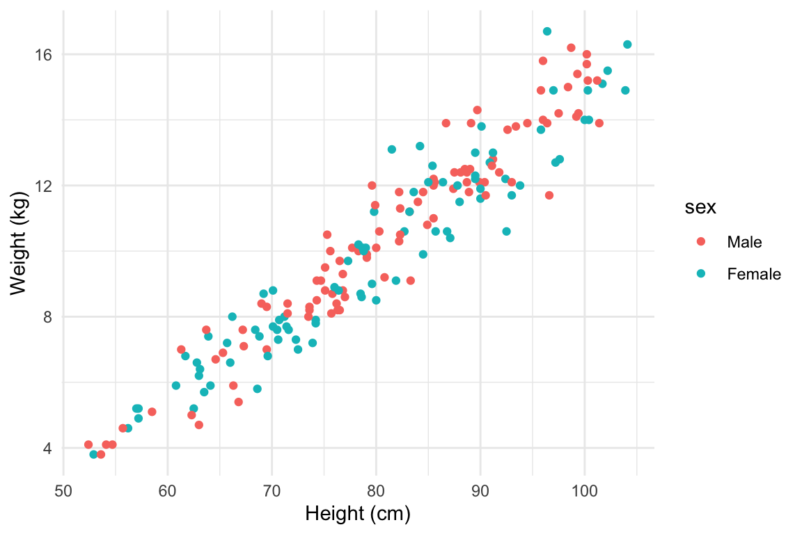
Figure 4.1: Example of how different properties of a plot can show different elements to the data. Here, color indicates gender, position along the x-axis shows height, and position along the y-axis shows weight. This example is a subset of data from the nepali dataset in the faraway package.
I> Any of these aesthetics could also be given a constant value, instead of being mapped to an element of the data. For example, all the points could be red, instead of showing gender. Later in this section, we will describe how to use these constant values for aesthetics. We’ll discuss how to code this later in this section.
Which aesthetics are required for a plot depend on which geoms (more on those in a second) you’re adding to the plot. You can find out the aesthetics you can use for a geom in the “Aesthetics” section of the geom’s help file (e.g., ?geom_point). Required aesthetics are in bold in this section of the help file and optional ones are not. Common plot aesthetics you might want to specify include:
| Code | Description |
|---|---|
x |
Position on x-axis |
y |
Position on y-axis |
shape |
Shape |
color |
Color of border of elements |
fill |
Color of inside of elements |
size |
Size |
alpha |
Transparency (1: opaque; 0: transparent) |
linetype |
Type of line (e.g., solid, dashed) |
4.1.3 Creating a basic ggplot plot
To create a plot, you need to add one of more geoms to the ggplot object. The system of creating a ggplot object, mapping aesthetics to columns of the data, and adding geoms makes more sense once you try a few plots. For example, say you’d like to create a histogram showing the fares paid by passengers in the example Titanic data set. To plot the histogram, you’ll first need to create a ggplot object, using a dataframe with the “Fares” column you want to show in the plot. In creating this ggplot object, you only need one aesthetic (x, which in this case you want to map to “Fares”), and then you’ll need to add a histogram geom. In code, this is:
ggplot(data = titanic, aes(x = Fare)) +
  geom_histogram()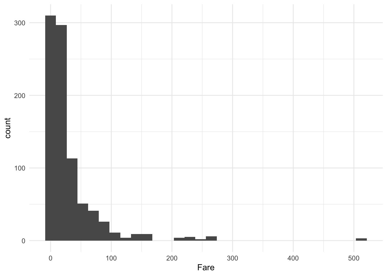
Figure 4.2: Titanic data
This code sets the dataframe as the titanic object in the user’s working session, maps the values in the Fare column to the x aesthetic, and adds a histogram geom to generate a histogram.
W> If R gets to the end of a line and there is not some indication that the call is not over (e.g., %>% for piping or + for ggplot2 plots), R interprets that as a message to run the call without reading in further code. A common error when writing ggplot2 code is to put the + to add a geom or element at the beginning of a line rather than the end of a previous line— in this case, R will try to execute the call too soon. To avoid errors, be sure to end lines with +, don’t start lines with it.
There is some flexibility in writing the code to create this plot. For example, you could specify the aesthetic for the histogram in an aes statement when adding the geom (geom_histogram) rather than in the ggplot call:
ggplot(data = titanic) +
  geom_histogram(aes(x = Fare))
Similarly, you could specify the dataframe when adding the geom rather than in the ggplot call:
ggplot() +
  geom_histogram(data = titanic, aes(x = Fare))
Finally, you can pipe the titanic dataframe into a ggplot call, since the ggplot function takes a dataframe as its first argument:
titanic %>%
  ggplot() +
  geom_histogram(aes(x = Fare))
# or
titanic %>%
  ggplot(aes(x = Fare)) +
  geom_histogram()
While all of these work, for simplicity we will use the syntax of specifying the data and aesthetics in the ggplot call for most examples in this subsection. Later, we’ll show how this flexibility can be used to use data from differents dataframe for different geoms or change aesthetic mappings between geoms.
A key thing to remember, however, is that ggplot is not flexible about whether you specify aesthetics within an aes call or not. We will discuss what happens if you do not later in the book, but it is very important that if you want to show values from a column of the data using aesthetics like color, size, shape, or position, you remember to make that specification within aes. Also, be sure that you specify the dataframe before or when you specify aesthetics (i.e., you can’t specify aesthetics in the ggplot statement if you haven’t specified the dataframe yet), and if you specify a dataframe within a geom, be sure to use data = syntax rather than relying on parameter position, as data is not the first parameter expected for geom functions.
I> When you run the code to create a plot in RStudio, the plot will be shown in the “Plots” tab in one of the RStudio panels. If you would like to save the plot, you can do so using the “Export” button in this tab. However, if you would like to use code in an R script to save a plot, you can do so (and it’s more reproducible!).
I>
I> To save a plot using code in a script, take the following steps: (1) open a graphics device (e.g., using the function pdf or png); (2) run the code to draw the map; and (3) close the graphics device using the dev.off function. Note that the function you use to open a graphics device will depend on the type of device you want to open, but you close all devices with the same function (dev.off).
4.1.4 Geoms
Geom functions add the graphical elements of the plot; if you do not include at least one geom, you’ll get a blank plot space. Each geom function has its own arguments to adjust how the graph is created. For example, when adding a historgram geom, you can use the bins argument to change the number of bins used to create the histogram— try:
ggplot(titanic, aes(x = Fare)) +
  geom_histogram(bins = 15)
As with any R functions, you can find out more about the arguments available for a geom function by reading the function’s help file (e.g., ?geom_histogram).
Geom functions differ in the aesthetic inputs they require. For example, the geom_histogram funciton only requires a single aesthetic (x). If you want to create a scatterplot, you’ll need two aesthetics, x and y. In the worldcup dataset, the Time column gives the amount of time each player played in the World Cup 2010 and the Passes column gives the number of passes he made. To see the relationship between these two variables, you can create a ggplot object with the dataframe, mapping the x aesthetic to Time and the y aesthetic to Passes, and then adding a point geom:
ggplot(worldcup, aes(x = Time, y = Passes)) +
  geom_point()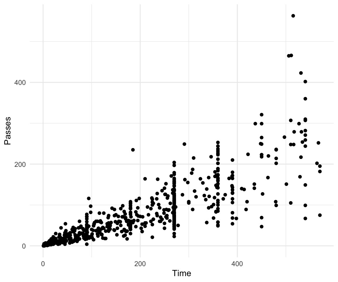
Figure 4.3: Scatterplot of Time and Passes from worldcup data
All geom functions have both required and accepted aesthetics. For example, the geom_point function requires x and y, but the function will also accept alpha (transparency), color, fill, group, size, shape, and stroke aesthetics. If you try to create a geom without one its required aesthetics, you will get an error:
ggplot(worldcup, aes(x = Time)) +
  geom_point()
Error: geom_point requires the following missing aesthetics: yYou can, however, add accepted aesthetics to the geom if you’d like; for example, to use color to show player position and size to show shots on goal for the World Cup data, you could call:
ggplot(worldcup, aes(x = Time, y = Passes,
                     color = Position, size = Shots)) +
  geom_point()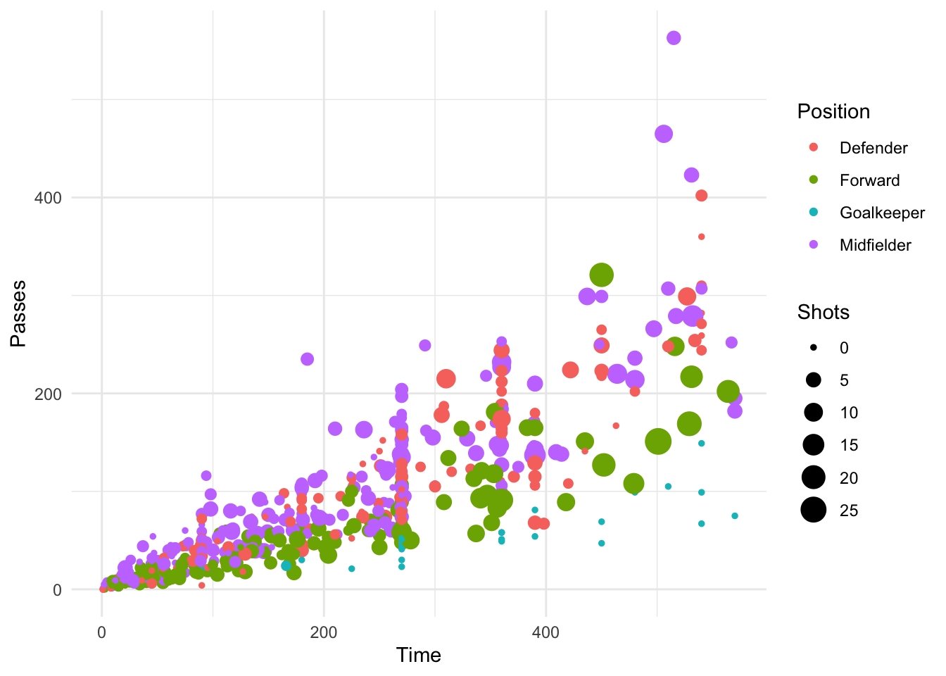
Figure 4.4: Using color and size to show Position and Shots
The following table gives some of the geom functions you may find useful in ggplot2, along with the required aesthetics and some of the most useful some useful specific arguments for each geom function (there are other useful arguments that can be applied to many different geom functions, which will be covered later). The elements created by these geom functions are usually clear from the function names (e.g., geom_point plots points; geom_segment plots segments).
| Function | Common aesthetics | Common arguments |
|---|---|---|
geom_point() |
x, y |
|
geom_line() |
x, y |
arrow, na.rm |
geom_segment() |
x, y, xend, yend |
arrow, na.rm |
geom_path() |
x, y |
na.rm |
geom_polygon() |
x, y |
|
geom_histogram() |
x |
bins, binwidth |
geom_abline() |
intercept, slope |
|
geom_hline() |
yintercept |
|
geom_vline() |
xintercept |
|
geom_smooth() |
x, y |
method, se, span |
geom_text() |
x, y, label |
parse, nudge_x, nudge_y |
4.1.5 Using multiple geoms
Several geoms can be added to the same ggplot object, which allows you to build up layers to create interesting graphs. For example, we previously made a scatterplot of time versus shots for World Cup 2010 data. You could make that plot more interesting by adding label points for noteworthy players with those players’ team names and positions. First, you can create a subset of data with the information for noteworthy players and add a column with the text to include on the plot. Then you can add a text geom to the previous ggplot object:
library(dplyr)
noteworthy_players <- worldcup %>% filter(Shots == max(Shots) |
                                            Passes == max(Passes)) %>%
  mutate(point_label = paste(Team, Position, sep = ", "))

ggplot(worldcup, aes(x = Passes, y = Shots)) +
  geom_point() +
  geom_text(data = noteworthy_players, aes(label = point_label),
vjust = "inward", hjust = "inward") 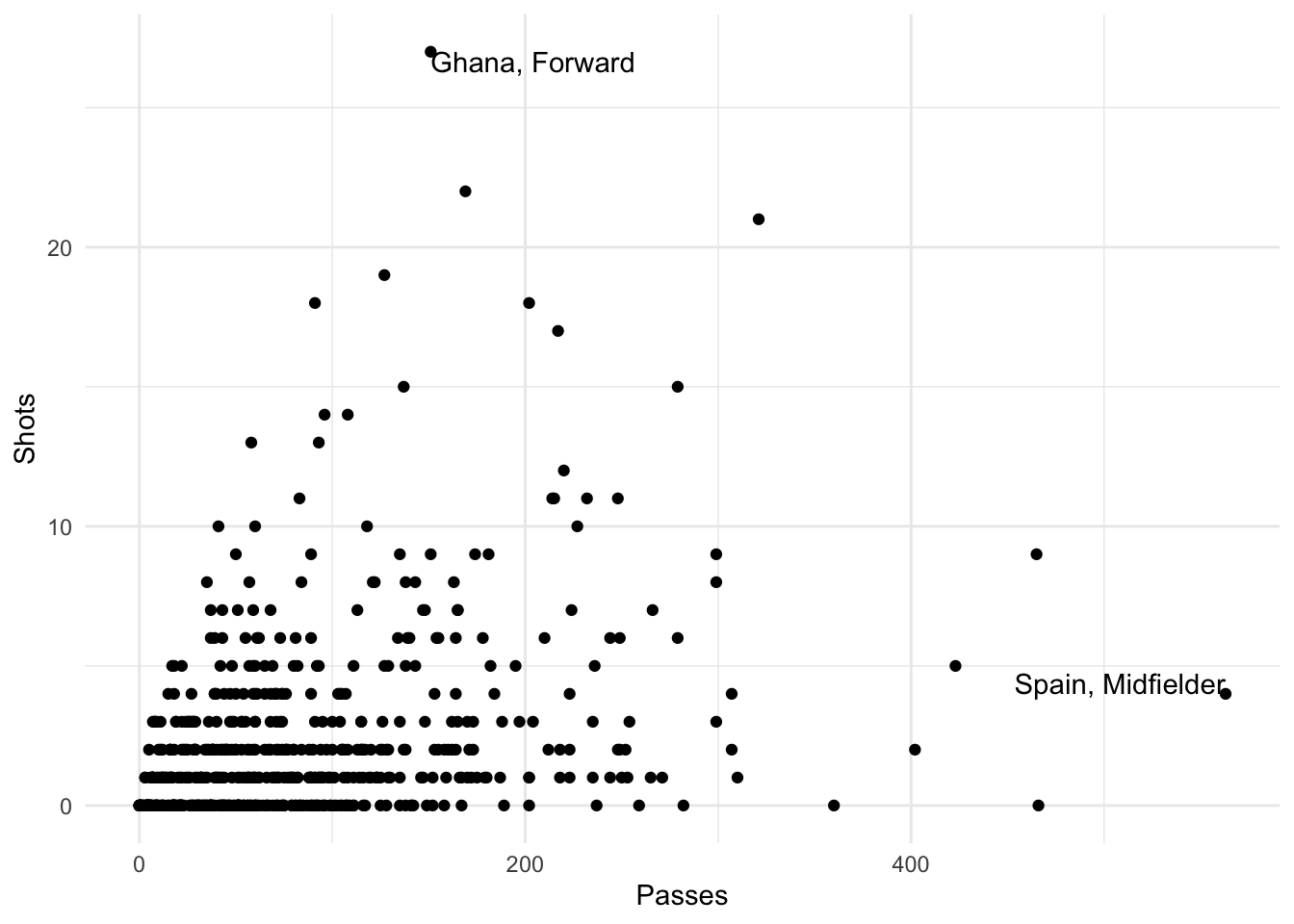
Figure 4.5: Adding label points to a scatterplot
I> In this example, we’re using data from different dataframes for different geoms. We’ll discuss how that works more later in this section.
As another example, there seemed to be some horizontal clustering in the scatterplot we made of player time versus passes made for the worldcup data. Soccer games last 90 minutes each, and different teams play a different number of games at the World Cup, based on how well they do. To check if horizontal clustering is at 90-minute intervals, you can plot a histogram of player time (Time), with reference lines every 90 minutes. First initialize the ggplot object, with the dataframe to use and appropriate mapping to aesthetics, then add geoms for a histogram as well as vertical reference lines:
ggplot(worldcup, aes(x = Time)) +
        geom_histogram(binwidth = 10) +
        geom_vline(xintercept = 90 * 0:6,
                   color = "blue", alpha = 0.5)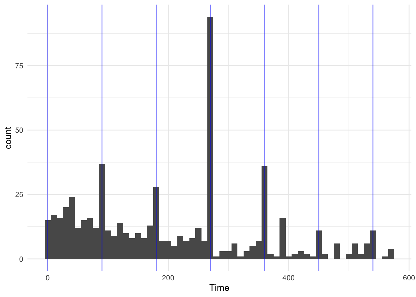
Figure 4.6: Histogram with reference lines
Based on this graph, player’s times do cluster at 90-minute marks, especially at 270 minutes, which would be approximately after three games, the number played by all teams that fail to make it out of the group stage.
4.1.6 Constant aesthetics
Instead of mapping an aesthetic to an element of your data, you can use a constant value for it. For example, you may want to make all the points green in the World Cup scatterplot. You can do that by specifying the color aesthetic outside of an aes call when adding the points geom. For example:
ggplot(worldcup, aes(x = Time, y = Passes)) +
  geom_point(color = "darkgreen")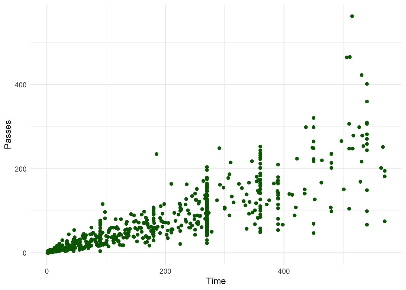
Figure 4.7: Using a constant color aesthetic
You can do this with any of the aesthetics for a geom, including color, fill, shape, and size. If you want to change the shape of points, in R, you use a number to specify the shape you want to use. Figure 4.8 shows the shapes that correspond to the numbers 1 to 25 in the shape aesthetic. This figure also provides an example of the difference between the color aesthetic (black for all these example points) and fill aesthetic (red for these examples). If a geom has both a border and an interior, the color aesthetic specifies the color of the border while the fill aesthetic specifies the color of the interior. You can see that, for point geoms, some shapes include a fill (21 for example), while some are either empty (1) or solid (19).
Warning: `data_frame()` is deprecated as of tibble 1.1.0.
Please use `tibble()` instead.
This warning is displayed once every 8 hours.
Call `lifecycle::last_warnings()` to see where this warning was generated.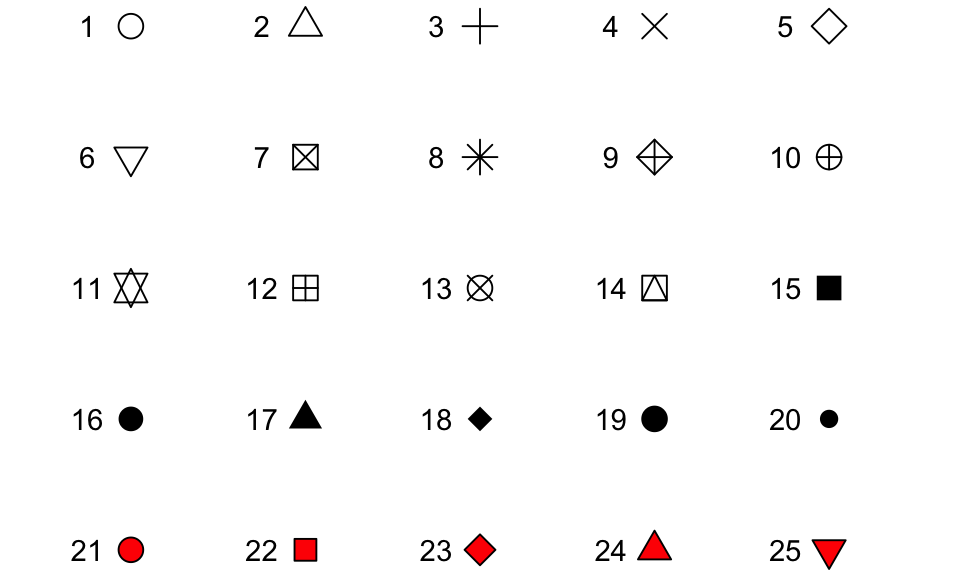
Figure 4.8: Examples of the shapes corresponding to different numeric choices for the shape aesthetic. For all examples, color is set to black and fill to red.
If you want to set color to be a constant value, you can do that in R using character strings for different colors. Figure 4.9 gives an example of a few of the different blues available in R. To find images that show all these named choices for colors in R, google “R colors” and search by “Images” (for example, there is a pdf here: http://www.stat.columbia.edu/~tzheng/files/Rcolor.pdf).
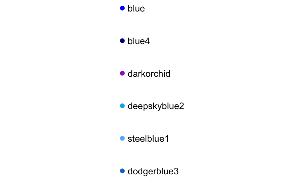
Figure 4.9: Example of a few available shades of blue in R.
I> Later we will cover additioal ways of handling colors in R, including different color palettes you can use. However, these “named” colors just shown can be a fast way to customize constant colors in R plots.
4.1.7 Other useful plot additions
There are also a number of elements besides geoms that you can add onto a ggplot object using +. A few that are used very frequently are:
| Element | Description |
|---|---|
ggtitle |
Plot title |
xlab, ylab |
x- and y-axis labels |
xlim, ylim |
Limits of x- and y-axis |
You can also use this syntax to customize plot scales and themes, which we will discuss later in this section.
4.1.8 Example plots
In this subsection, we’ll show a few more examples of basic plots created with ggplot2. For the example plots in this subsection, we’ll use a dataset in the faraway package called nepali. This gives data from a study of the health of a group of Nepalese children. You can load this data using:
# install.packages("faraway") ## Uncomment if you do not have the faraway package installed
library(faraway)
data(nepali)
Each observation in this dataframe represents a measurement for a child, including some physiological measurements like height and weight, and some children were measured multiple times and so have multiple observations in this data. Before plotting this data, we cleaned it a bit. We used tidyverse functions to select a subset of the columns: child id, sex, weight, height, and age. We also used the distinct function from dplyr to limit the dataset to the first measurement for each child.
nepali <- nepali %>%
  select(id, sex, wt, ht, age) %>%
  mutate(id = factor(id),
         sex = factor(sex, levels = c(1, 2),
                      labels = c("Male", "Female"))) %>%
  distinct(id, .keep_all = TRUE)
After this cleaning, the data looks like this:
head(nepali)
      id    sex   wt    ht age
1 120011   Male 12.8  91.2  41
2 120012 Female 14.9 103.9  57
3 120021 Female  7.7  70.1   8
4 120022 Female 12.1  86.4  35
5 120023   Male 14.2  99.4  49
6 120031   Male 13.9  96.4  46
We’ll use this cleaned dataset to show how to use ggplot2 to make histograms, scatterplots, and boxplots.
4.1.8.1 Histograms
Histograms show the distribution of a single variable. Therefore, geom_histogram() requires only one main aesthetic, x, which should be numeric. For example, to create a histogram of children’s heights for the Nepali dataset (Figure 4.10), create a ggplot object with the data nepali and with the height column (ht) mapped to the ggplot object’s x aesthetic. Then add a histogram geom:
ggplot(nepali, aes(x = ht)) +
  geom_histogram()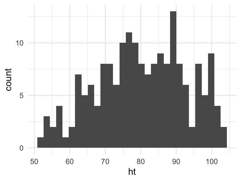
Figure 4.10: Basic example of plotting a histogram with ggplot2. This histogram shows the distribution of heights for the first recorded measurements of each child in the nepali dataset.
I> If you run the code with no arguments for binwidth or bins in geom_histogram, you will get a message saying “stat_bin() using bins = 30. Pick better value with binwidth.” This message is just saying that a default number of bins was used to create the histogram. You can use arguments to change the number of bins used, but often this default is fine. You may also get a message that observations with missing values were removed.
You can add some elements to this plot to customize it a bit. For example (Figure 4.11), you can add a figure title (ggtitle) and clearer labels for the x-axis (xlab). You can also change the range of values shown by the x-axis (xlim).
ggplot(nepali, aes(x = ht)) +
  geom_histogram(fill = "lightblue", color = "black") +
  ggtitle("Height of children") +
  xlab("Height (cm)") + xlim(c(0, 120))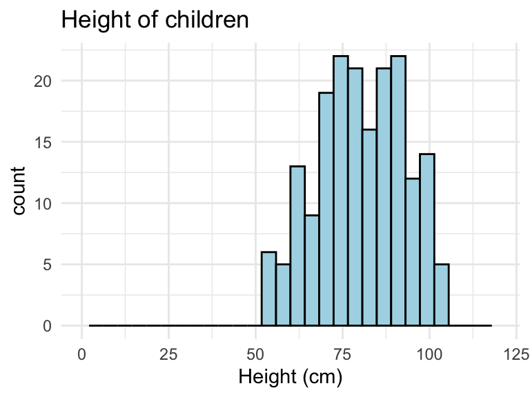
Figure 4.11: Example of adding ggplot elements to customize a histogram.
Note that these additional graphical elements are added on by adding function calls to ggtitle, xlab, and xlim to our ggplot object.
4.1.8.2 Scatterplots
A scatterplot shows the association between two variables. To create a scatterplot, add a point geom (geom_point) to a ggplot object. For example, to create a scatterplot of height versus age for the Nepali data (Figure 4.12), you can run the following code:
ggplot(nepali, aes(x = ht, y = wt)) +
  geom_point()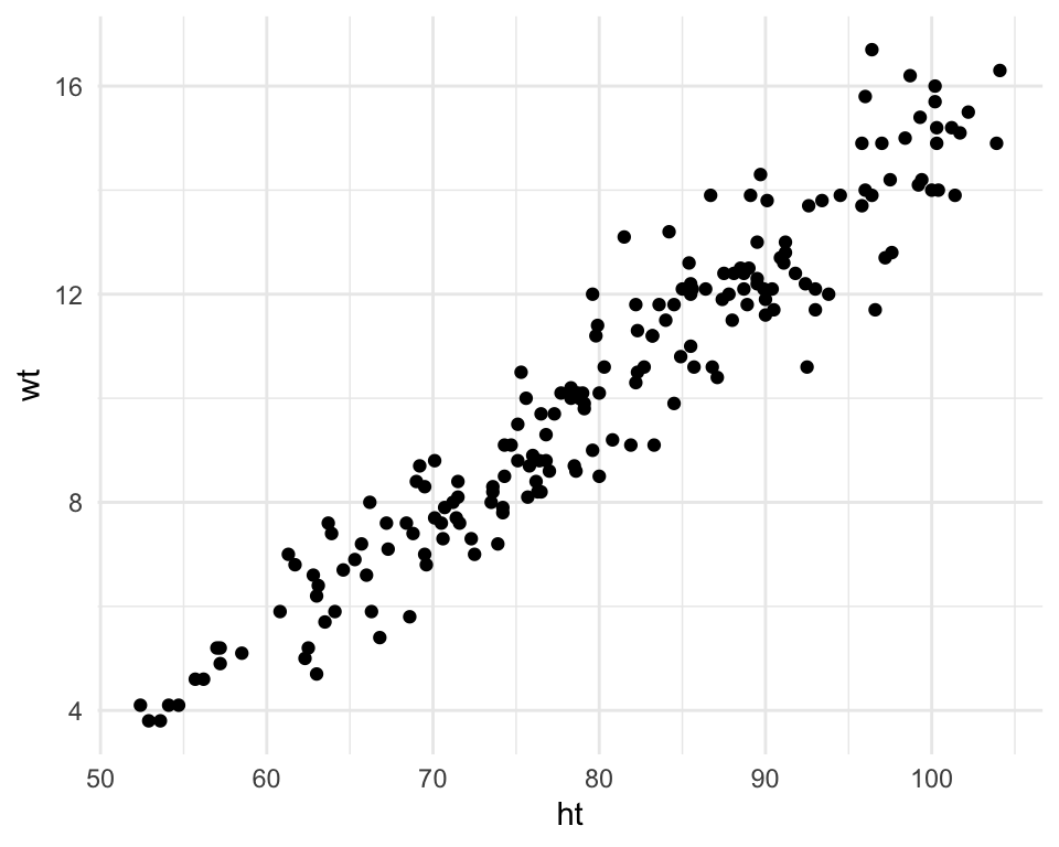
Figure 4.12: Example of creating a scatterplot. This scatterplot shows the relationship between children’s heights and weights within the nepali dataset.
Again, you can use some of the options and additions to change the plot appearance. For example, to add a title, change the x- and y-axis labels, and change the color and size of the points on the scatterplot (Figure 4.13), you can run:
ggplot(nepali, aes(x = ht, y = wt)) +
  geom_point(color = "blue", size = 0.5) +
  ggtitle("Weight versus Height") +
  xlab("Height (cm)") + ylab("Weight (kg)")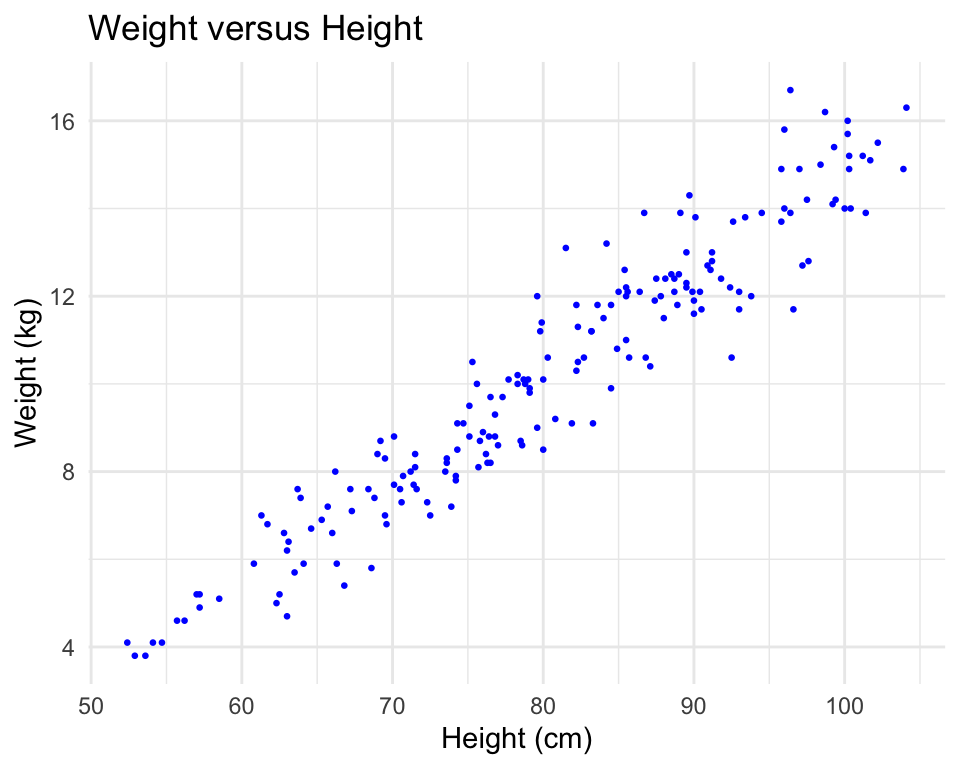
Figure 4.13: Example of adding ggplot elements to customize a scatterplot.
You can also try mapping a variable to the color aesthetic of the plot. For example, to use color to show the sex of each child in the scatterplot (Figure 4.14), you can run add an additional mapping of this optional aesthetic to the sex column of the nepali dataframe with the following code:
ggplot(nepali, aes(x = ht, y = wt, color = sex)) +
  geom_point(size = 0.5) +
  ggtitle("Weight versus Height") +
  xlab("Height (cm)") + ylab("Weight (kg)")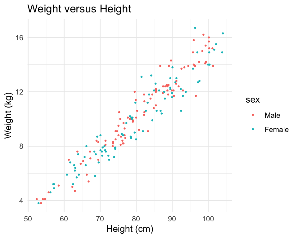
Figure 4.14: Example of mapping color to an element of the data in a scatterplot.
4.1.8.3 Boxplots
Boxplots are one way to show the distribution of a continuous variable. You can add a boxplot geom with the geom_boxplot function. To plot a boxplot for a single, continuous variable, you can map that variable to y in the aes call and map x to the constant 1. For example, to create a boxplot of the heights of children in the Nepali dataset (Figure 4.15), you can run:
ggplot(nepali, aes(x = 1, y = ht)) +
  geom_boxplot() +
  xlab("")+ ylab("Height (cm)")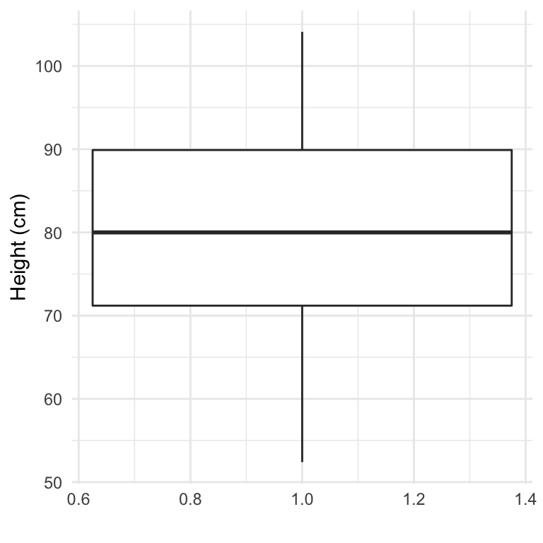
Figure 4.15: Example of creating a boxplot. The example shows the distribution of height data for children in the nepali dataset.
You can also create separate boxplots, one for each level of a factor (Figure 4.16). In this case, you’ll need to map columns in the input dataframe to two aesthetics (x and y) when initializing the ggplot object The y variable is the variable for which the distribution will be shown, and the x variable should be a discrete (categorical or TRUE/FALSE) variable, which will be used to group the variable.
ggplot(nepali, aes(x = sex, y = ht)) +
  geom_boxplot() +
xlab("Sex")+ ylab("Height (cm)") 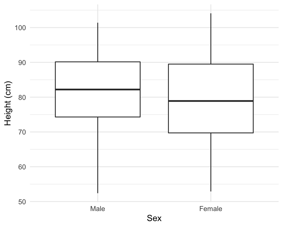
Figure 4.16: Example of creating separate boxplots, divided by a categorical grouping variable in the data.
4.1.9 Extensions of ggplot2
There are a number of packages that extend ggplot2 and allow you to create a variety of interesting plots. For example, you can use the ggpairs function from the GGally package to plot all pairs of scatterplots for several variables (Figure 4.17).
library(GGally)
ggpairs(nepali %>% select(sex, wt, ht, age))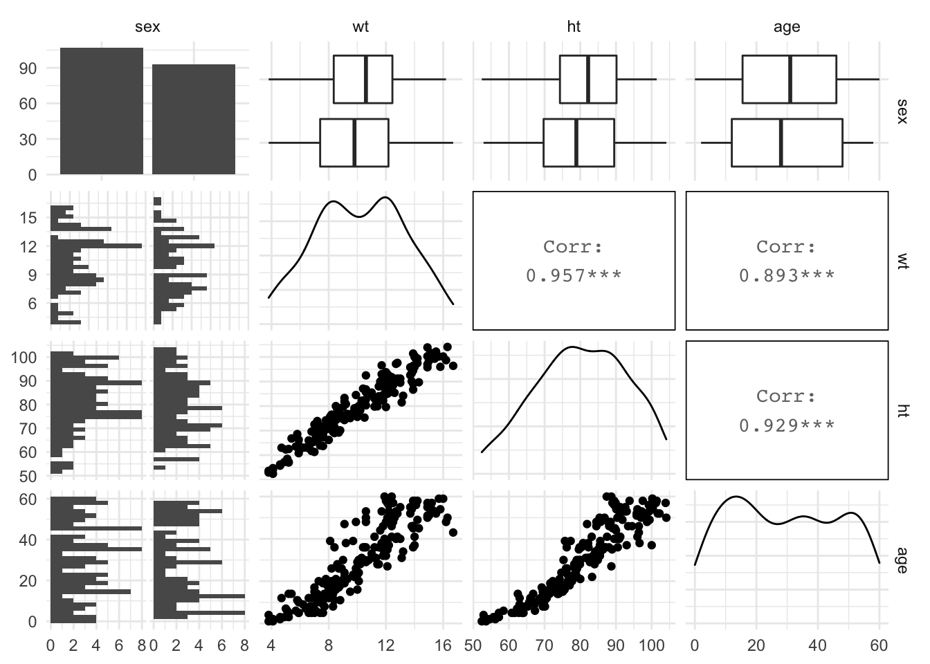
Figure 4.17: Example of using ggpairs from the GGally package for exploratory data analysis.
Notice how this output shows continuous and binary variables differently. For example, the center diagonal shows density plots for continuous variables, but a bar chart for the categorical variable.