4.6 Building a New Theme
Building and modifying a theme in ggplot2 is a key feature of the ggplot2 package and system for building data graphics. The original base graphics system in R did not have a notion of a “theme” for how graphical elements are presented—users were left to individually customize each graphic without any clear way to programmatically implement shared elements across plots.
The ggplot2 package implements the notion of a theme for its plots by allowing you to modify many different elements of a plot and to store all those modifications as a special “theme” object. Those elements that can be modified are documented in the help page ?theme, which documents the theme() function.
The default theme for ggplot2 is encapsulated by the theme_gray() function. Like other elements in the ggplot2 universe, themes can be “added” using the + operator to plot commands in order to change the look and feel of a plot. Adding a theme (either existing or custom built by you) will override elements of any default theme.
For example, here is a plot that uses the theme_classic() function:
library(ggplot2)
ggplot(data = mtcars, aes(x = disp, y = mpg)) +
        geom_point() +
        theme_classic()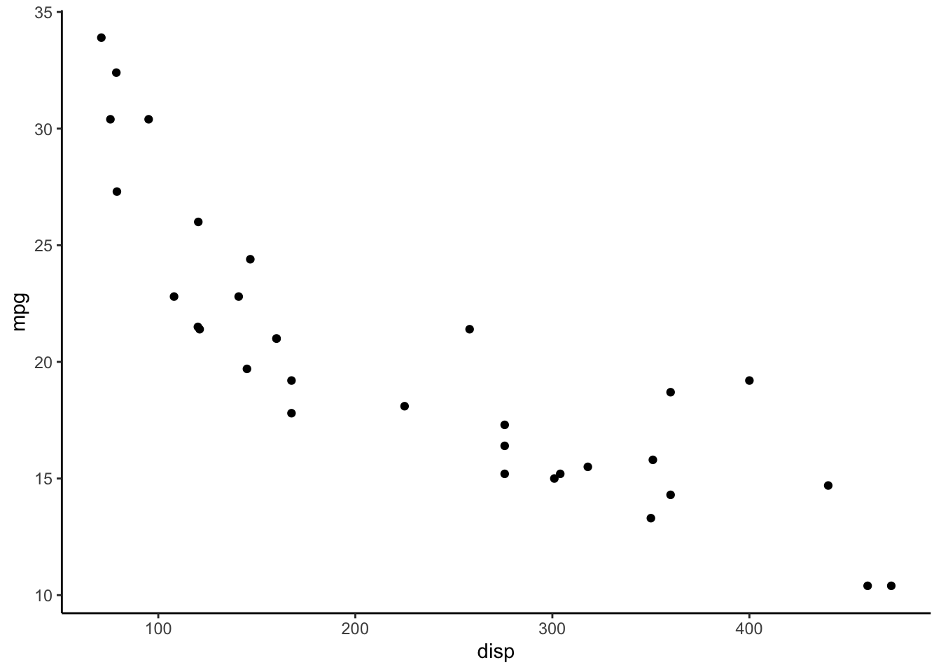
Figure 4.114: Classic theme
Notice how the look and the feel of the plot is substantially different from the default gray theme of ggplot2. The key differences in the theme_classic() setup are the background color (white instead of gray), the colors of the grid lines (none instead of white), and the presence of solid black x- and y-axes. Other elements are the same, like the plotting character (solid circle) and fonts.
I> Note that themes in ggplot2 only allow you to modify the non-data elements of a plot. Things like the title, axis labels, background, etc. can be modified with a theme. If you want to change data elements, like the plotting symbol or colors, you can modify those things separately in their respective geom_* functions.
4.6.1 Why Build a New Theme?
Why would one want to build a new theme? For many people, it is a matter of personal preference with respect to colors, shapes, fonts, positioning of labels, etc. Because plots, much like writing, are an expression of your ideas, it is often desirable to customize those plots so that they accurately represent your vision.
In corporate or institutional settings, developing themes can be a powerful branding tool. Plots that are distributed on the web or through marketing materials that have a common theme can be useful for reinforcing a brand. For example, plots made by the FiveThirtyEight.com web site have a distinct look and feel (see this article by Walt Hickey for one of many examples). When you see one of those plots you instinctively know that it is a “FiveThirtyEight” plot. Developing a theme for your organization can help to get others to better understand what your organization is about when it produces data graphics.
Another advantage of having a pre-programmed theme is that it removes the need for you to think about it later! One key reason why news organizations like FiveThirtyEight or the New York Times have common themes for their data graphics is because they are constantly producing those graphics on a daily basis. If every plot required a custom look and feel with a separate palette of colors, the entire process would grind to a halt. If you are in an environment where there is a need for reproducible graphics with a consistent feel, then developing a custom theme is probably a good idea. While using the default ggplot2 theme is perfectly fine from a data presentation standpoint, why not try to stand out from the crowd?
4.6.2 Default Theme
As noted above, ggplot2 has a default theme, which is theme_gray(). This theme produces the familiar gray-background-white-grid-lines plot. You can obtain the default theme using the theme_get() function.
x <- theme_get()
class(x)
[1] "theme" "gg"
The object returned by theme_get() is rather large so it’s not recommended to print it to the console. Notice that the object returned by theme_get() is an S3 object of class "theme" and "gg". This is the kind of object you will need to create or modify in order to customize your theme.
You can modify the default theme by using the theme_set() function and passing it a theme object. For example, if we want all my plots to use the theme_minimal() theme, we could do
new_theme <- theme_minimal()
theme_set(new_theme)
Now your plots will use the theme_minimal() theme without you having to specify it.
ggplot(data = mtcars, aes(disp, mpg)) +
        geom_point() +
        facet_grid( . ~ gear)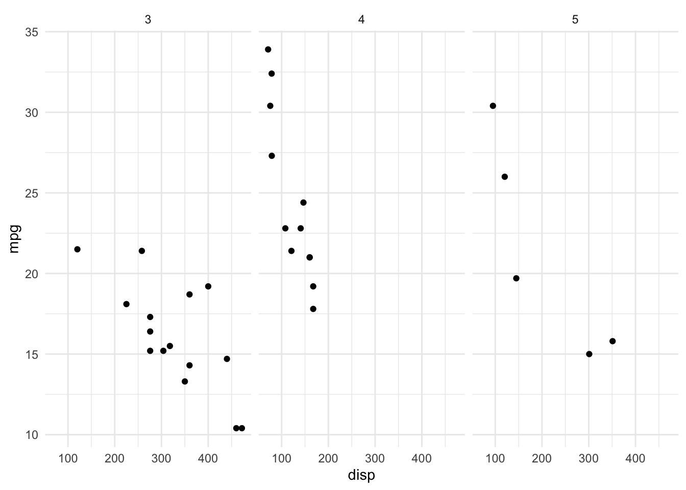
Figure 4.115: Using new default theme
Quitting R will erase the default theme setting. If you load ggplot2 in a future session it will revert to the default gray theme. If you’d like for ggplot2 to always use a different theme (either yours or one of the built-in ones), you can set a load hook and put it in your .Rprofile file. For example, the following hook sets the default theme to be theme_minimal() every time the ggplot2 package is loaded.
setHook(packageEvent("ggplot2", "onLoad"),
        function(...) ggplot2::theme_set(ggplot2::theme_minimal()))
Of course, you can always override this default theme by adding a theme object to any of your plots that you construct in ggplot2.
4.6.3 Creating a New Theme
Perhaps the easiest thing to start with when customizing your own theme is to modify an existing theme (i.e. one that comes built-in to ggplot2). In case your are interested in thoroughly exploring this area and learning from others, there is also the ggthemes package on CRAN which provides a number of additional themes for ggplot2.
Looking at the help page ?theme you’ll see that there are many things to modify. We will start simple here by illustrating the general approach to making theme modifications. We will begin with the theme_bw() theme. This theme is a simple black and white theme that has little ornamentation and few features.
4.6.3.1 Modifying theme attributes
Suppose we want to make the default color for plot titles to be dark red. We can change just that element by adding a theme() modification to the existing theme.
newtheme <- theme_bw() + theme(plot.title = element_text(color = "darkred"))Note that in our call to theme(), when we modify the plot.title attribute, we cannot simply say color = "darkred". This must be wrapped in a call to the element_text() function so that the elements of plot.title are appropriately modified. In the help page for theme(), you will see that each attribute of a theme is modified by using one of four element_* functions:
element_text(): specify the display of text elementselement_line(): specify the display of lines (i.e. axis lines)element_rect(): specify the display of borders and backgroundselement_blank(): draw nothing
All of these functions work in the same way (although they contain different elements) and each of them returns a list of values inheriting from the class “element.” The ggplot2 functions know how to handle objects of this class and will modify the theme of a plot accordingly.
Let’s change a few more things about our new theme. We can make the box surrounding the plot to look a little different by modifying the panel.border element of the theme. First let’s take a look at what the value is by default.
newtheme$panel.border
List of 5
 $ fill         : logi NA
 $ colour       : chr "grey20"
 $ size         : NULL
 $ linetype     : NULL
 $ inherit.blank: logi TRUE
 - attr(*, "class")= chr [1:2] "element_rect" "element"
You can see that this is an object of class element_rect and there are 5 elements in this list, including the fill, colour (or color), size, and linetype. These attributes have the same meaning as they do in the usual ggplot2 context.
We can modify the color attribute to make it “steelblue” and modify the size attribute to make it a little bigger.
newtheme <- newtheme +
        theme(panel.border = element_rect(color = "steelblue", size = 2))
Now let’s see what a typical plot might look like. The following is a plot of minutes played an shots attempted from the worldcup dataset in the faraway package.
library(faraway)
ggplot(data = worldcup, aes(Time, Shots)) +
        geom_point() +
        ggtitle("World Cup Data") +
        newtheme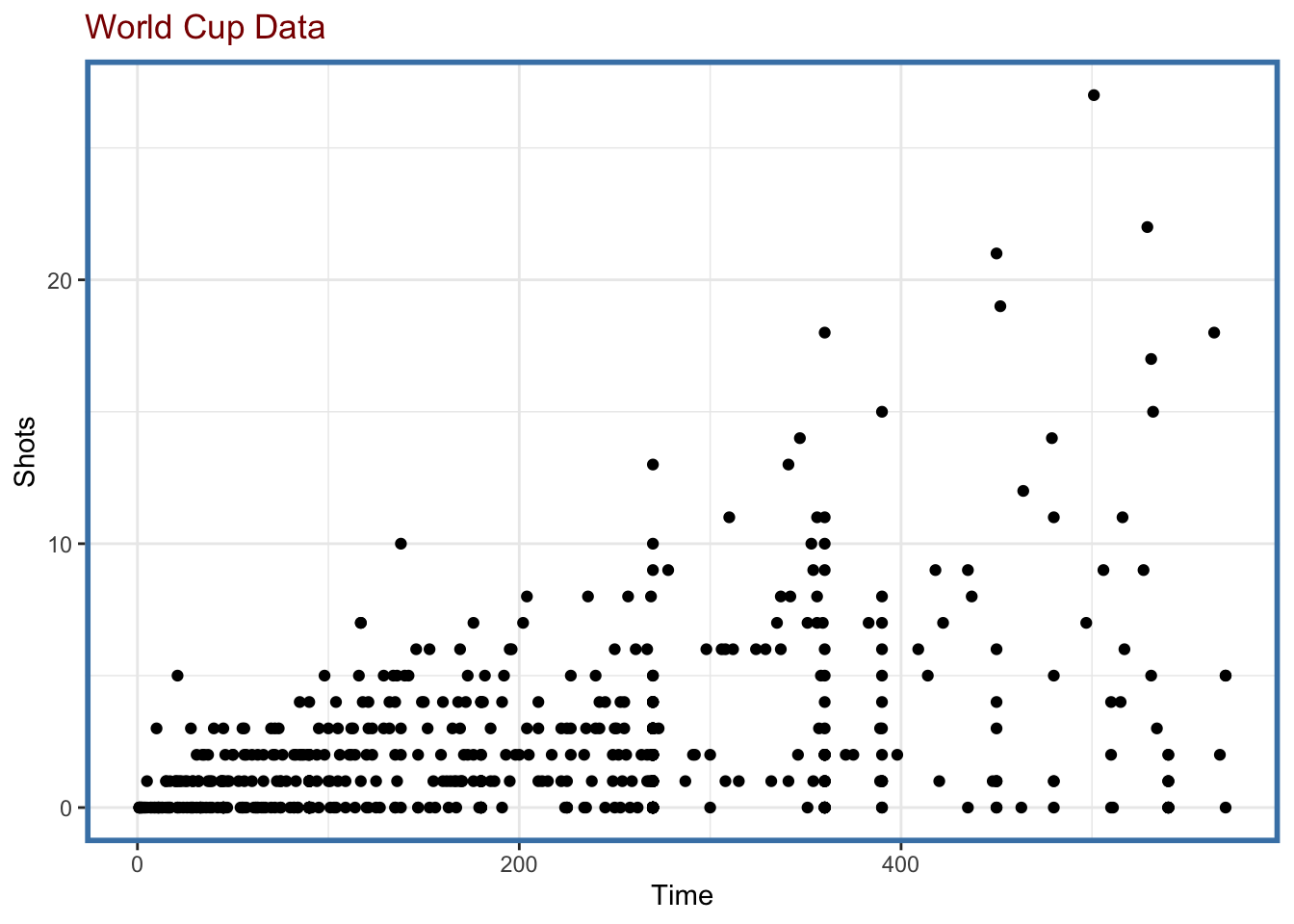
Figure 4.116: Revised theme
This may not be your idea of a great-looking theme, but it is certainly different! If we were to facet the data by Position the theme attributes would extend to the individual panels, which is a nice thing to get for free.
ggplot(data = worldcup, aes(Time, Shots)) +
        geom_point() +
        facet_wrap(facets = ~ Position, ncol = 2) +
        ggtitle("World Cup Data") +
        newtheme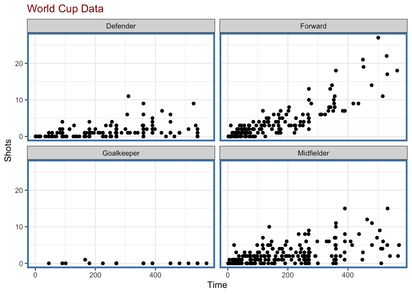
Figure 4.117: Faceting with revised theme
4.6.3.2 Complete themes
When using the theme() function to modify specific elements of an existing theme, the default value for the argument complete is FALSE. This simply indicates, that the theme() function is not returning a complete theme where every element is appropriately specified. Rather, it is just modifying the theme element that you specified.
Setting complete = TRUE in the call to theme() tells ggplot2 that the theme() function is returning a complete theme along the lines of theme_gray() or theme_bw(). In particular, all of the theme elements will inherit from the blank element, meaning that there will be no values to “fall back” on in the event that you do not specify them. Setting complete = TRUE only if you plan to specify every single theme element that is meaningful to you. If you are creating a brand new theme specific to you, then you may well be doing that. But if you are simply tweaking an existing theme, it’s appropriate to set complete = FALSE.
4.6.4 Summary
Building a new theme allows you to customize the look and feel of a plot to match your personal preferences. It also allows you to define a consistent “branded” presentation of your data graphics that can be clearly identified with your organization or company.